
Dynamic brand experiences
for a changing world

End-to-end-solutions
for your brand
The brandcycle group consists of experienced professionals with skills ranging from brand creation to implementation, with expertise in design, architecture, technical product design to interior design as well as creative and technical know-how in project management and construction.
This enables the team to deliver comprehensive end-to-end solutions for trade fairs, live marketing, retail, POS and modern working environments. Each project is approached from the outset with sustainability in mind as well as the use of AI and digital solutions to maximize the experience of your brand.
// The brandcycle group

Holistic view
The brandcycle group is a dynamic and multidisciplinary team that accompanies companies holistically through the entire brand life cycle – from the initial idea to long-term optimization.
Multidisciplinary approach to the goal
The brandcycle
// Our solutions
The brandcycle group offers comprehensive end-to-end solutions that cover every phase of the brand lifecycle. Our approach is practice-oriented, measurable and geared towards long-term brand loyalty.
// Sustainability
// Reality check
As part of the brandcycle approach, we integrate sustainability into every phase of the brand life cycle. From analysis and strategic planning to creative implementation and evaluation.
We consult
Even in the consulting phase, we attach great importance in developing sustainable brand strategies. This includes analysing the environmental and social impact of a brand and integrating sustainability goals into the brand positioning. Through strategic planning, we help companies to credibly integrate sustainable values into their brand core.
We create
During creative implementation, we pay attention to sustainable materials, energy-efficient design processes and resource-saving solutions. Our designs are not only aesthetically and emotionally appealing, but also designed to have minimal environmental impact. One example is the use of recyclable materials for brand displays and the implementation of sustainable production processes.
We implement
We evaluate
// Projects
Our projects demonstrate how we are making an impact worldwide—through innovation, strategic partnerships, and sustainable solutions. Insights into selected initiatives can be found here and on our LinkedIn page.
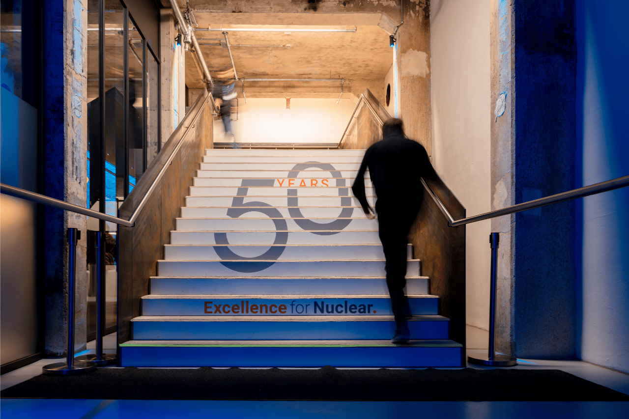
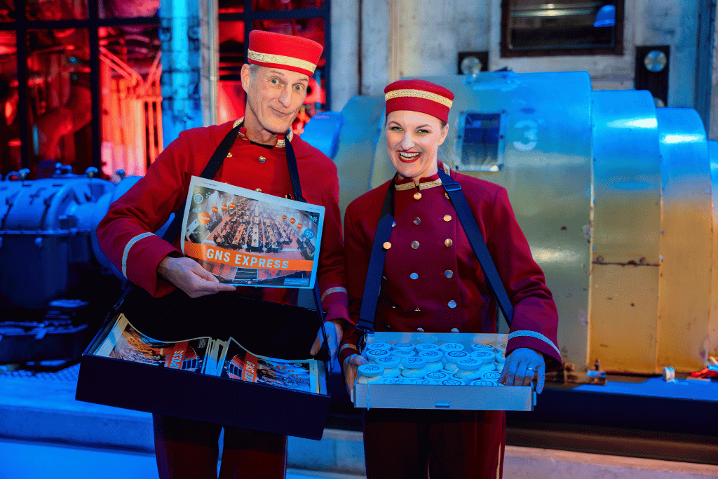
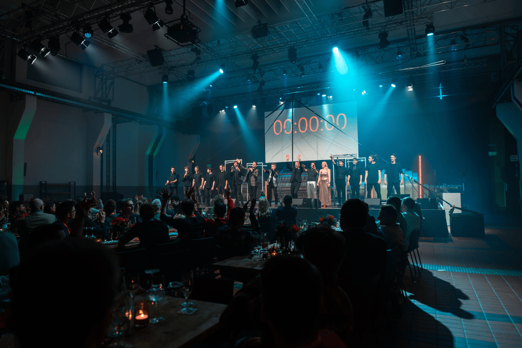
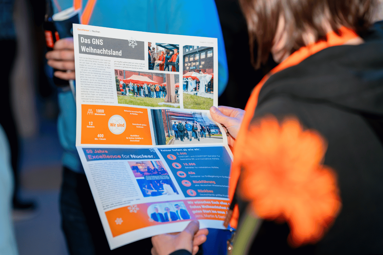
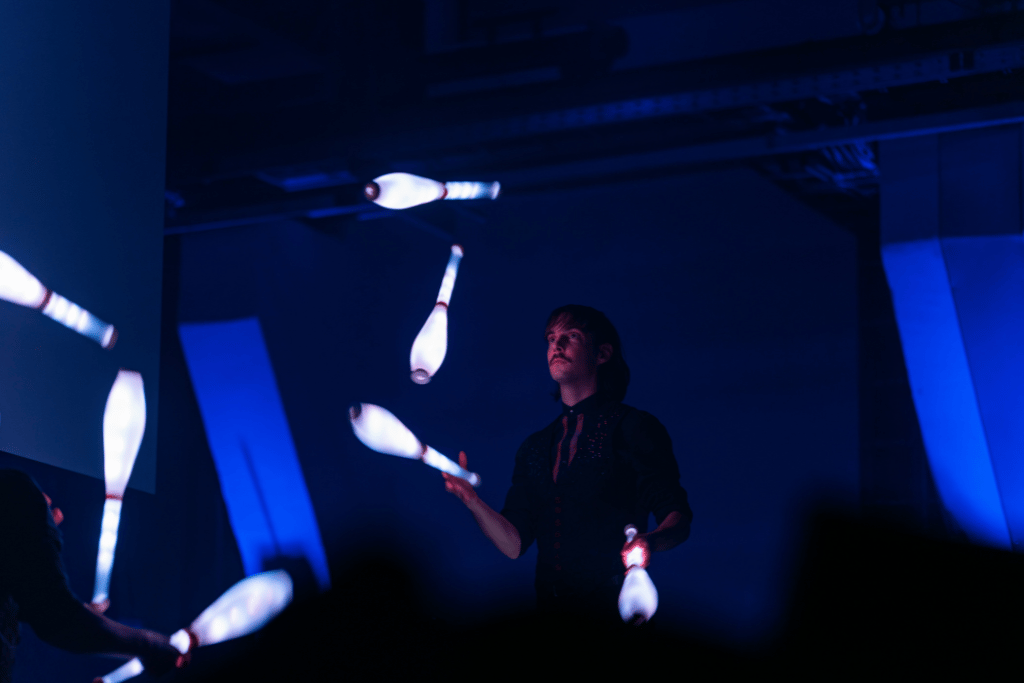
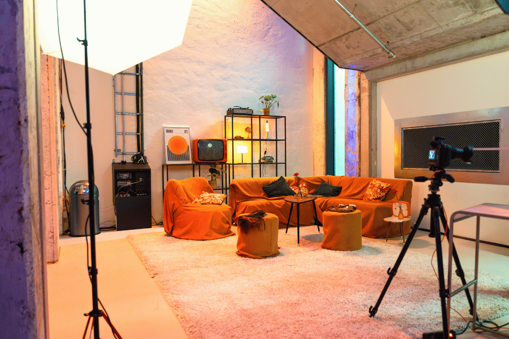
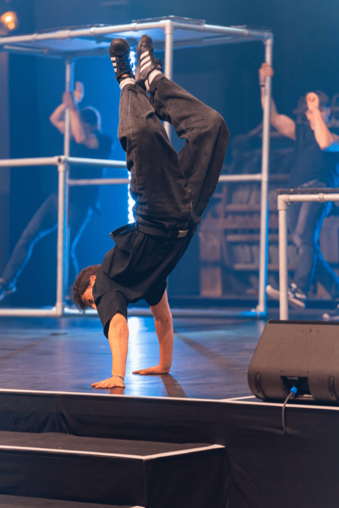
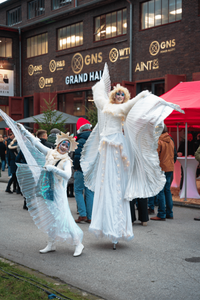
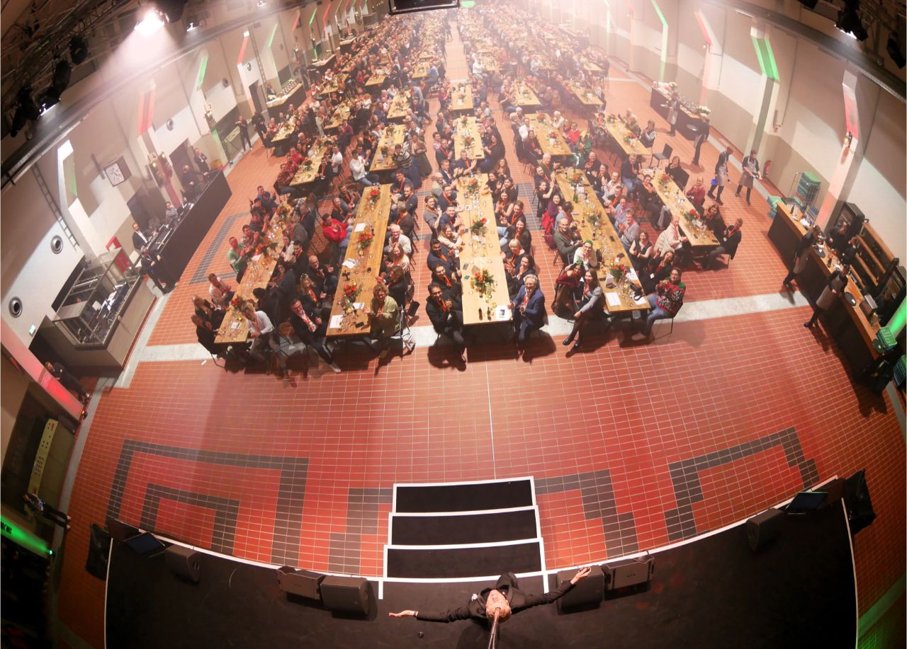
group photo @ Martin Mall
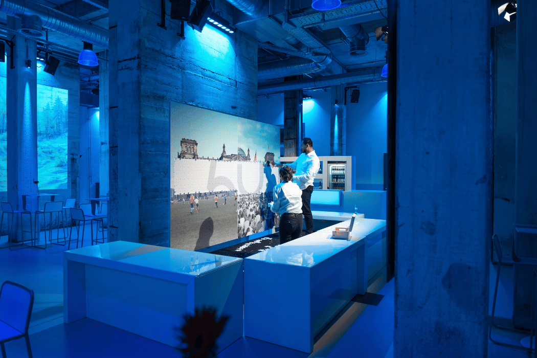
// GNS – 50th Anniversary Celebration
Scope of Services / Areas of Responsibility
- UNDUZO (a cappella performance)
- Urbanatix Parcour-Crew (parkour show)
- Canavaltwins (juggling & music)
- Martin Mall (moderation & live acts incl. giant selfie)
- Concept co-developed with Karl-Heinz Helmschrot
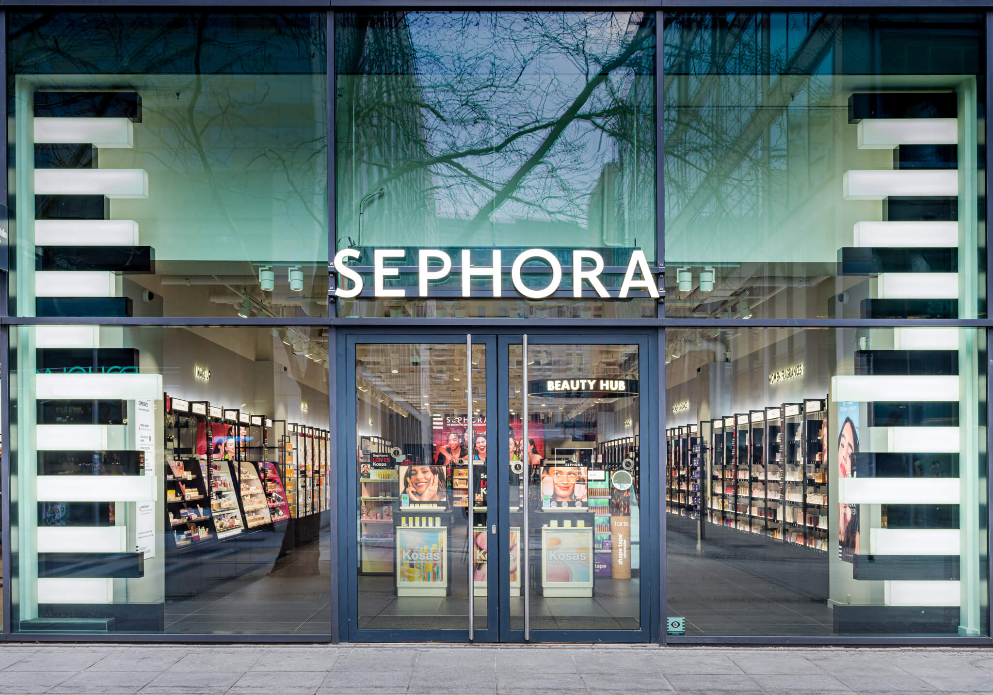
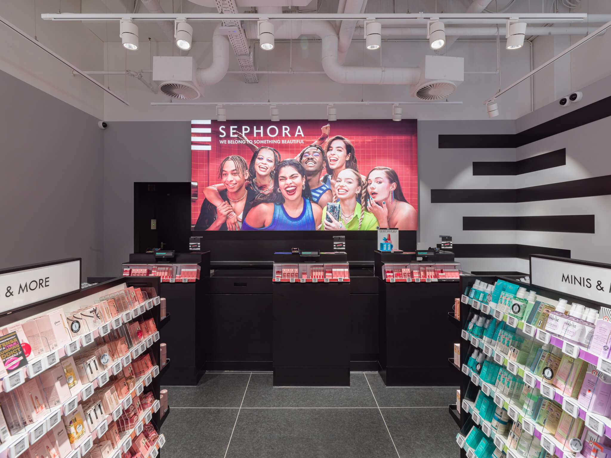
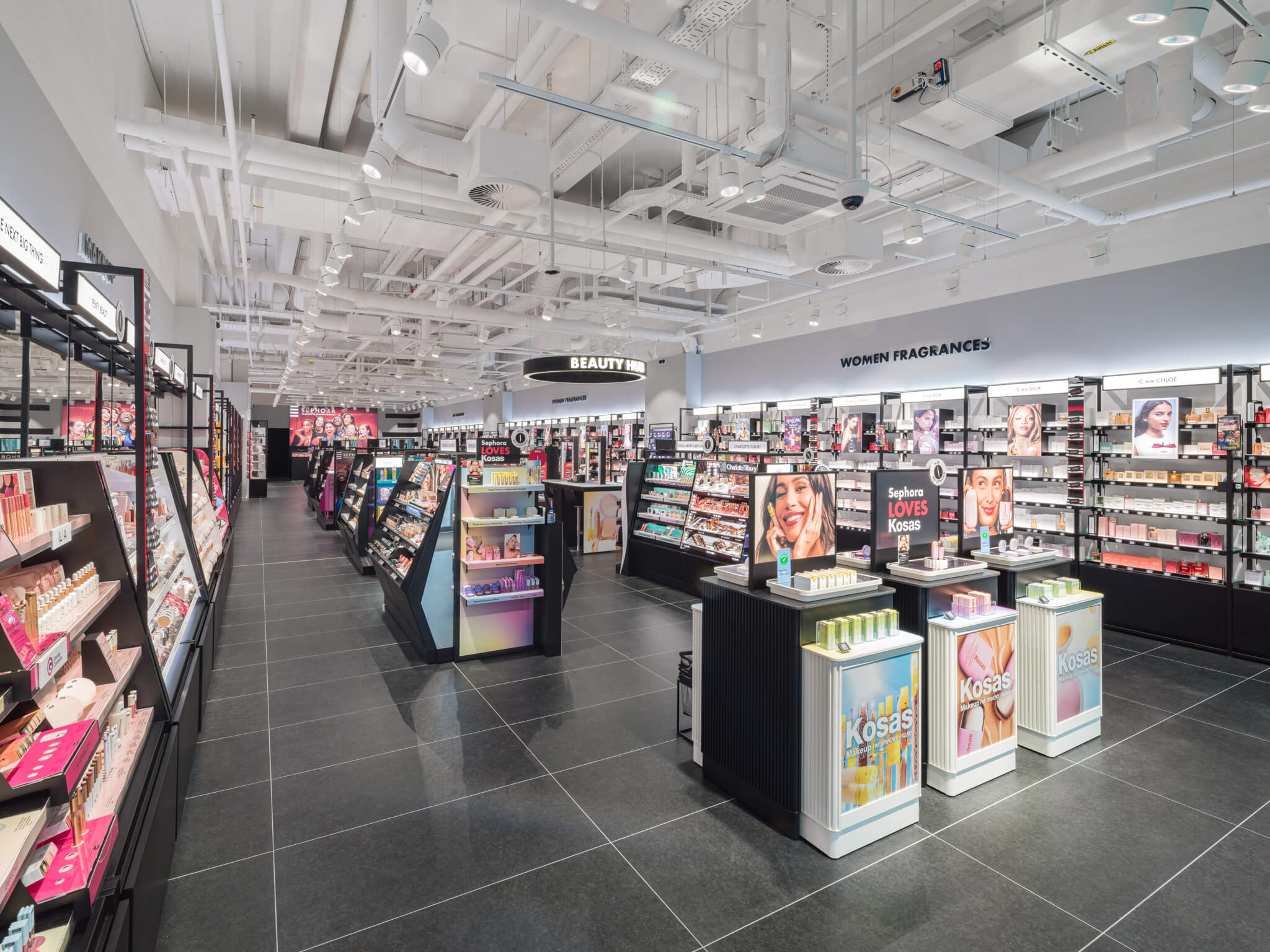
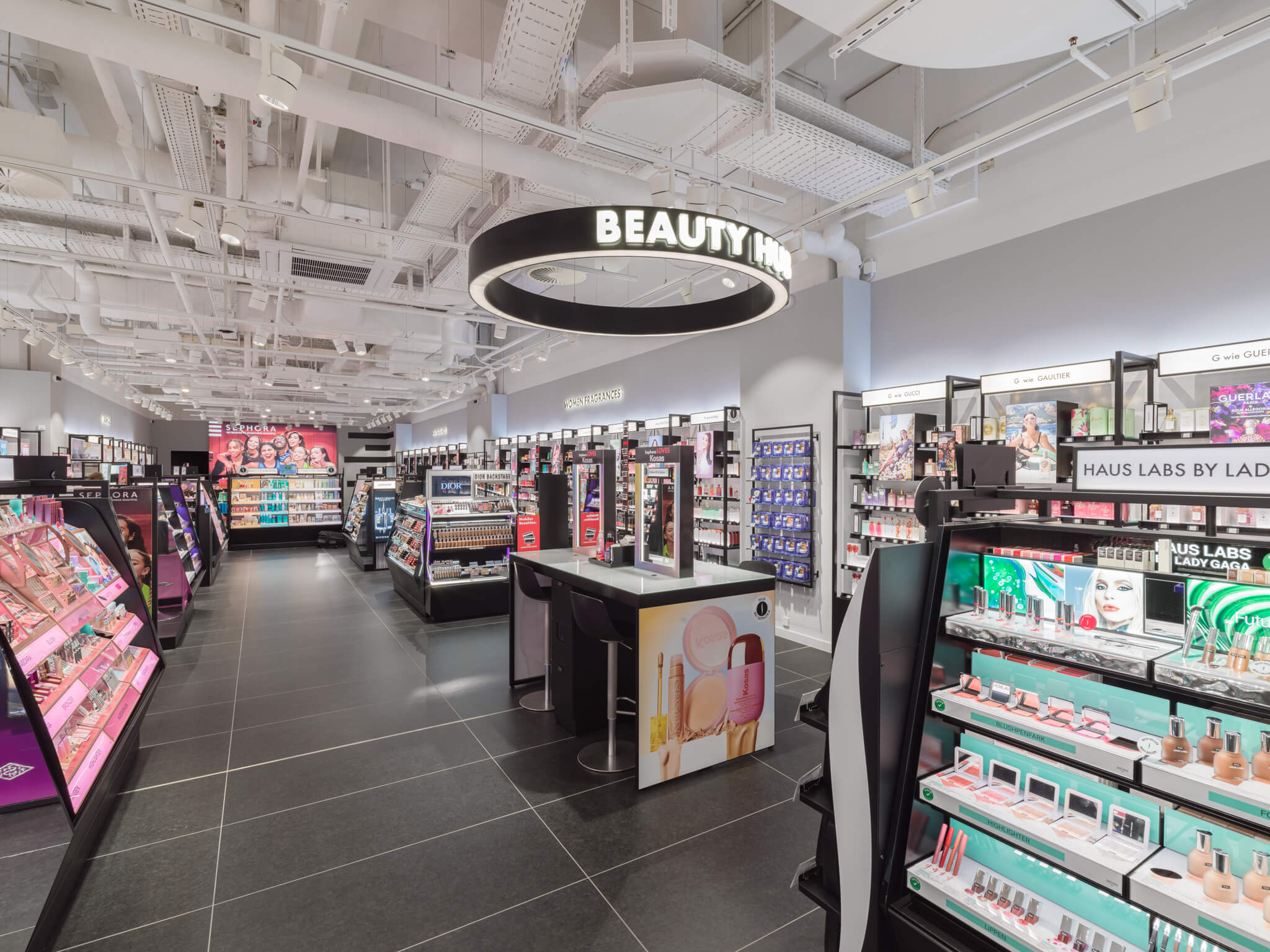
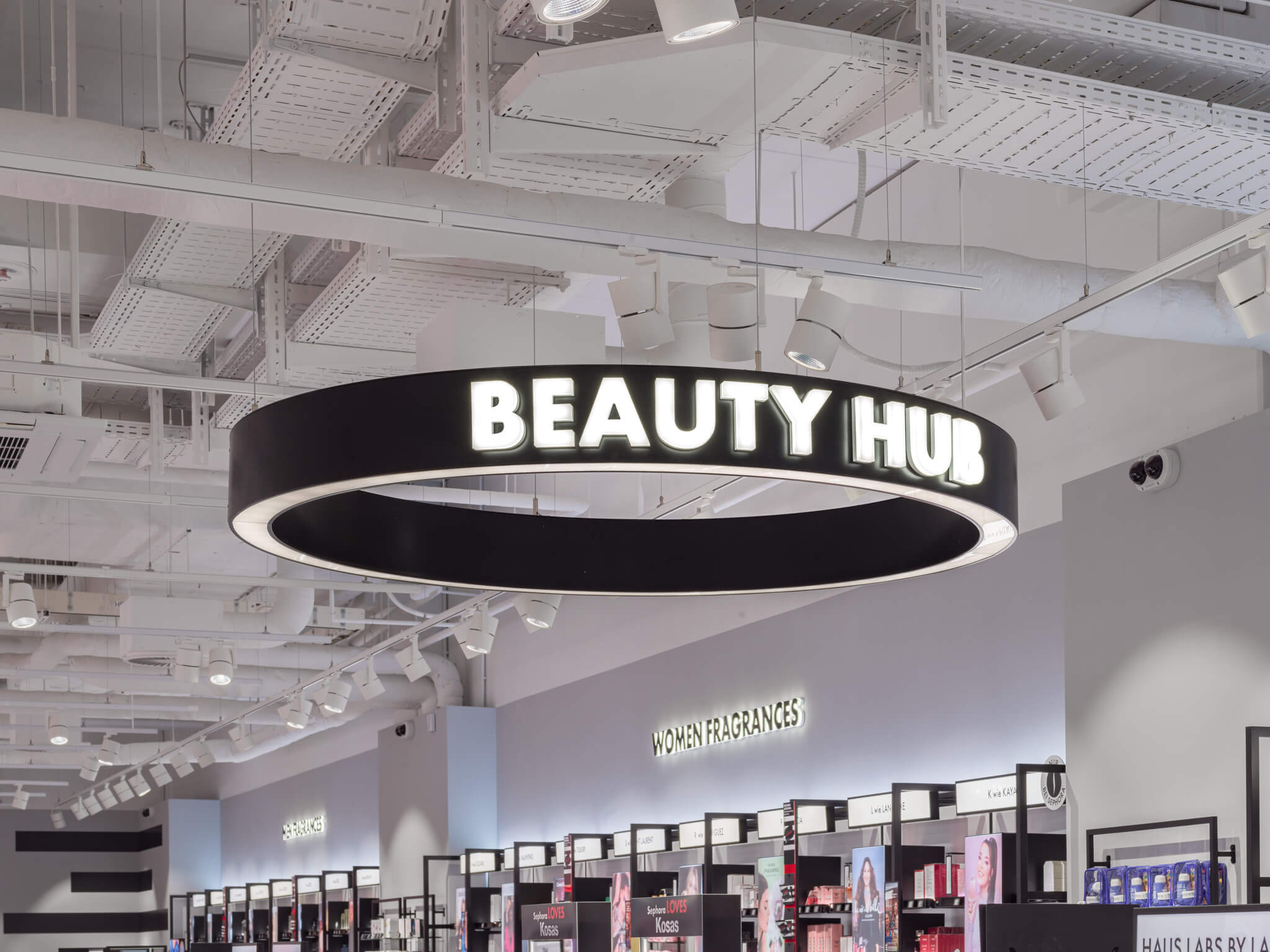
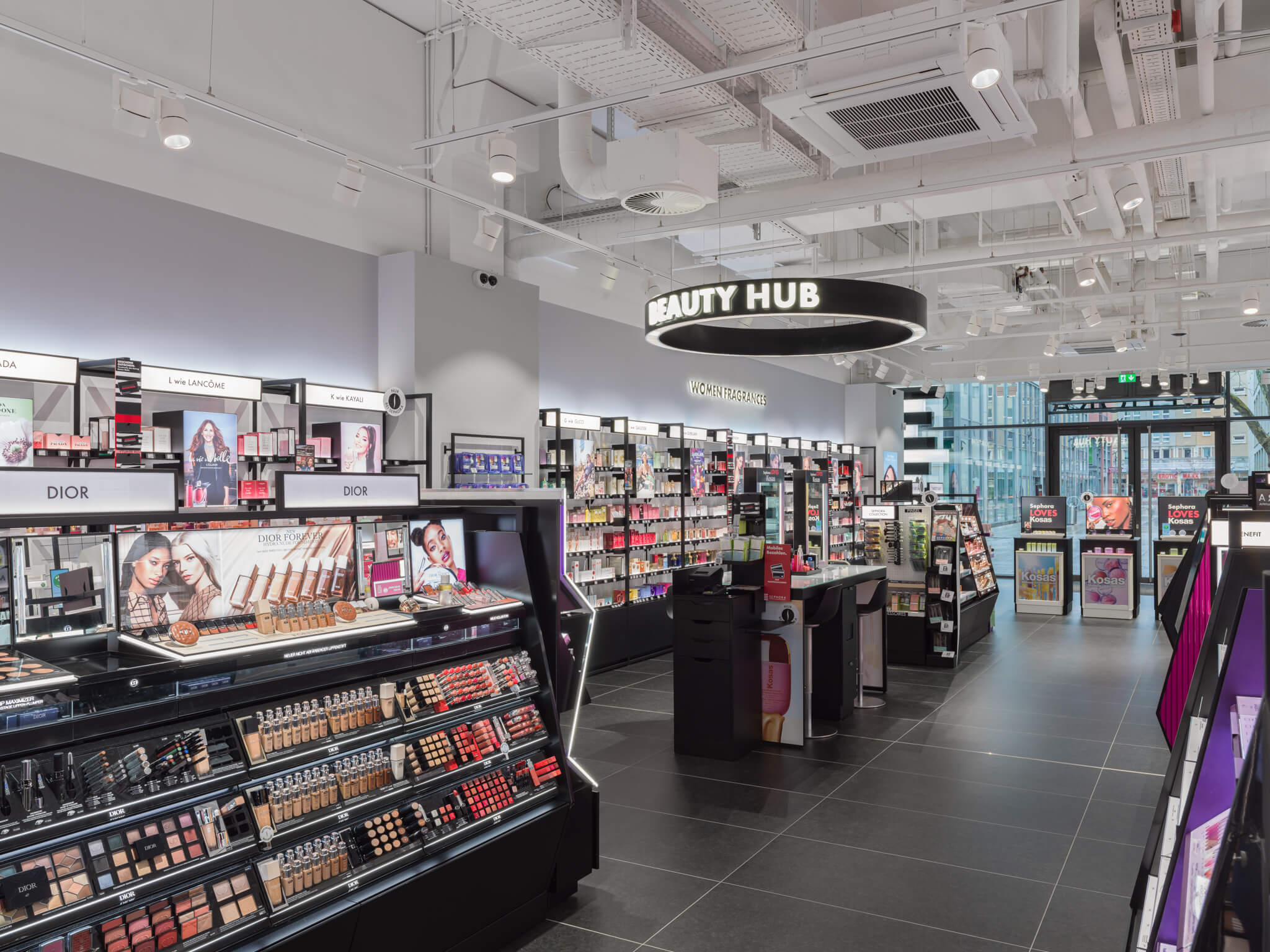
// Sephora Dresden
Scope of Services / Areas of Responsibility
Retail fit-out
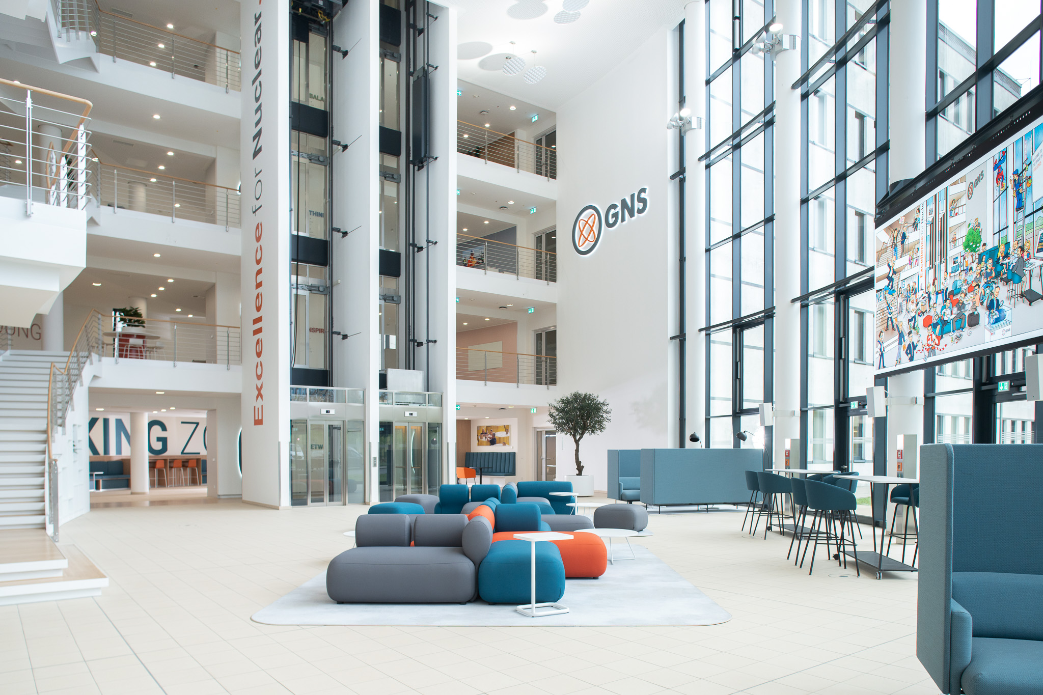
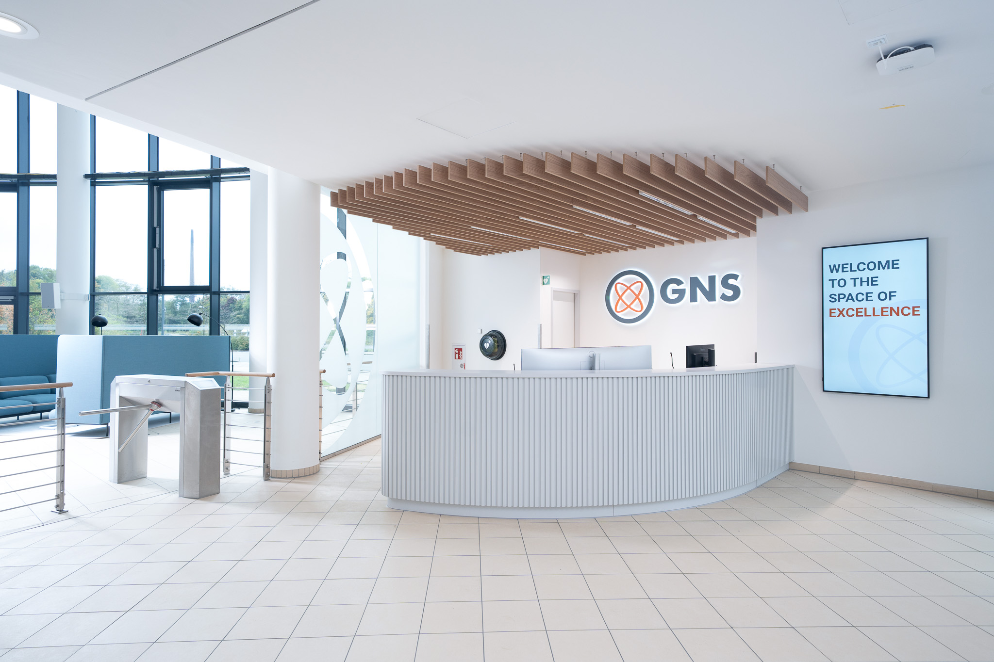
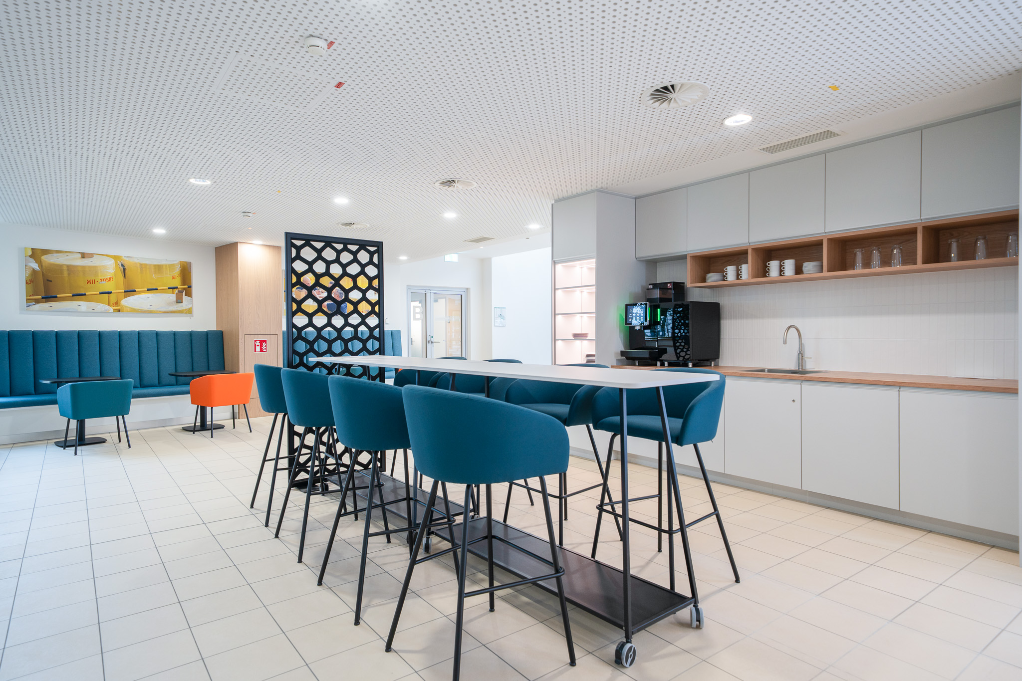
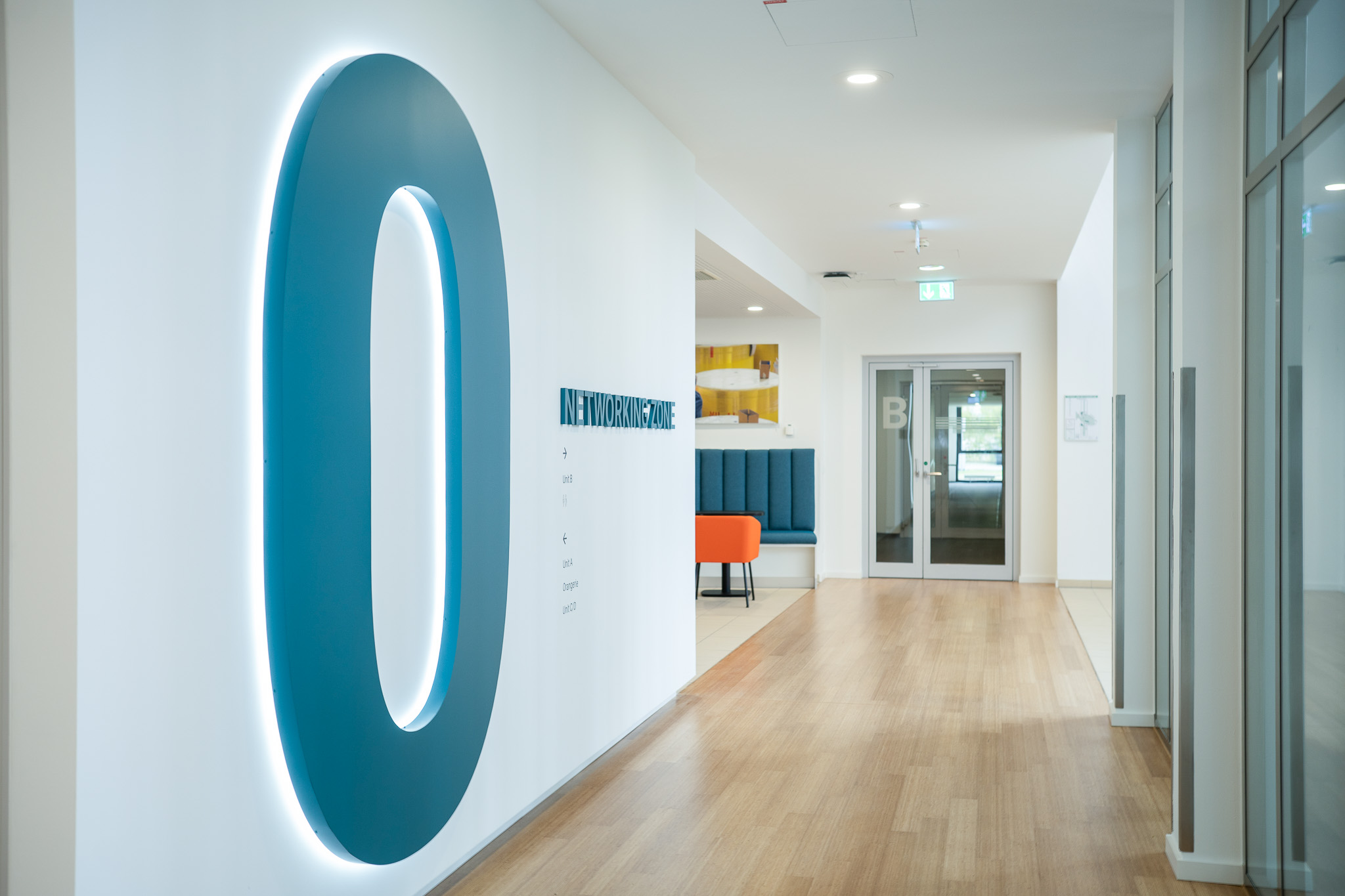
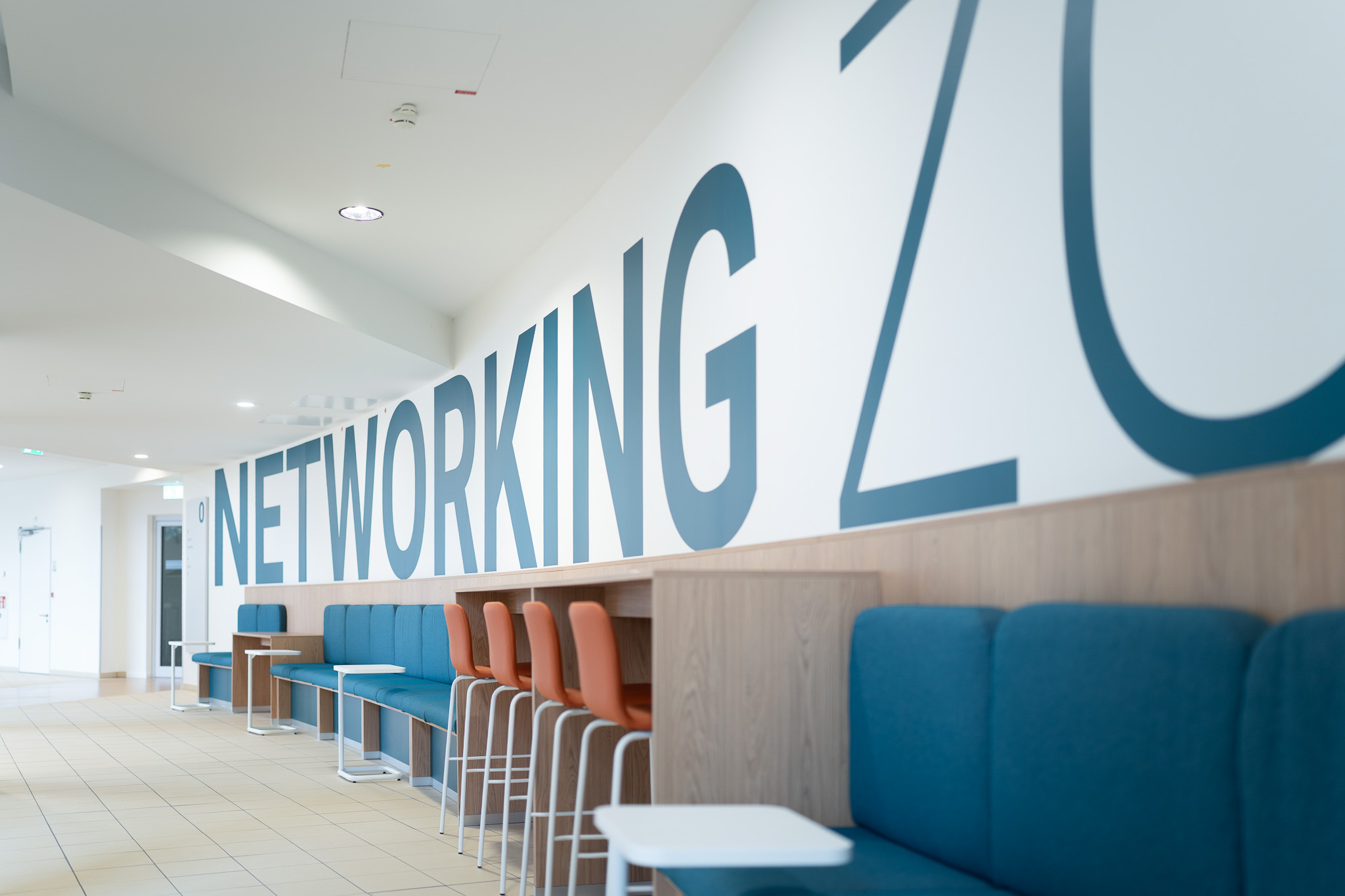
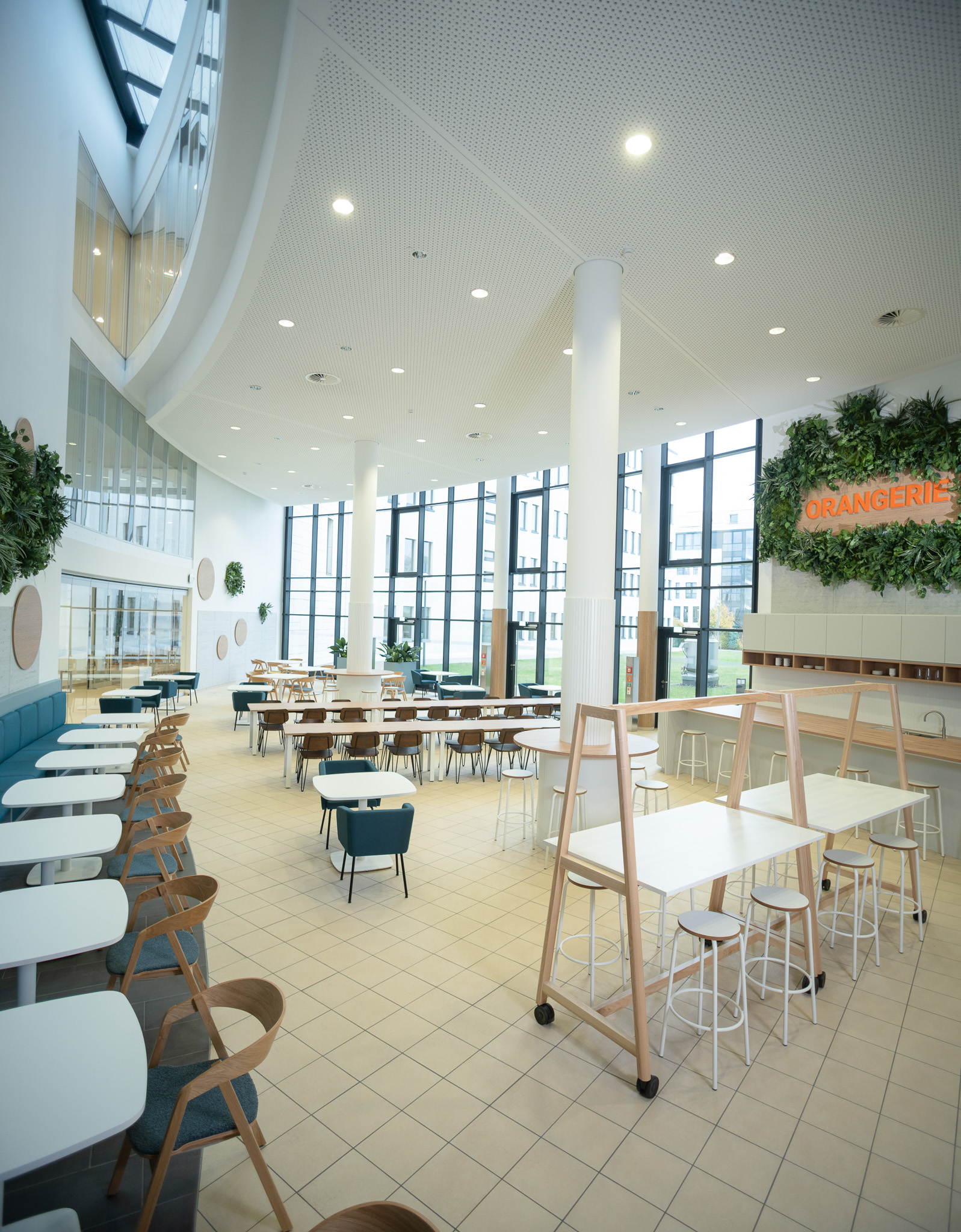
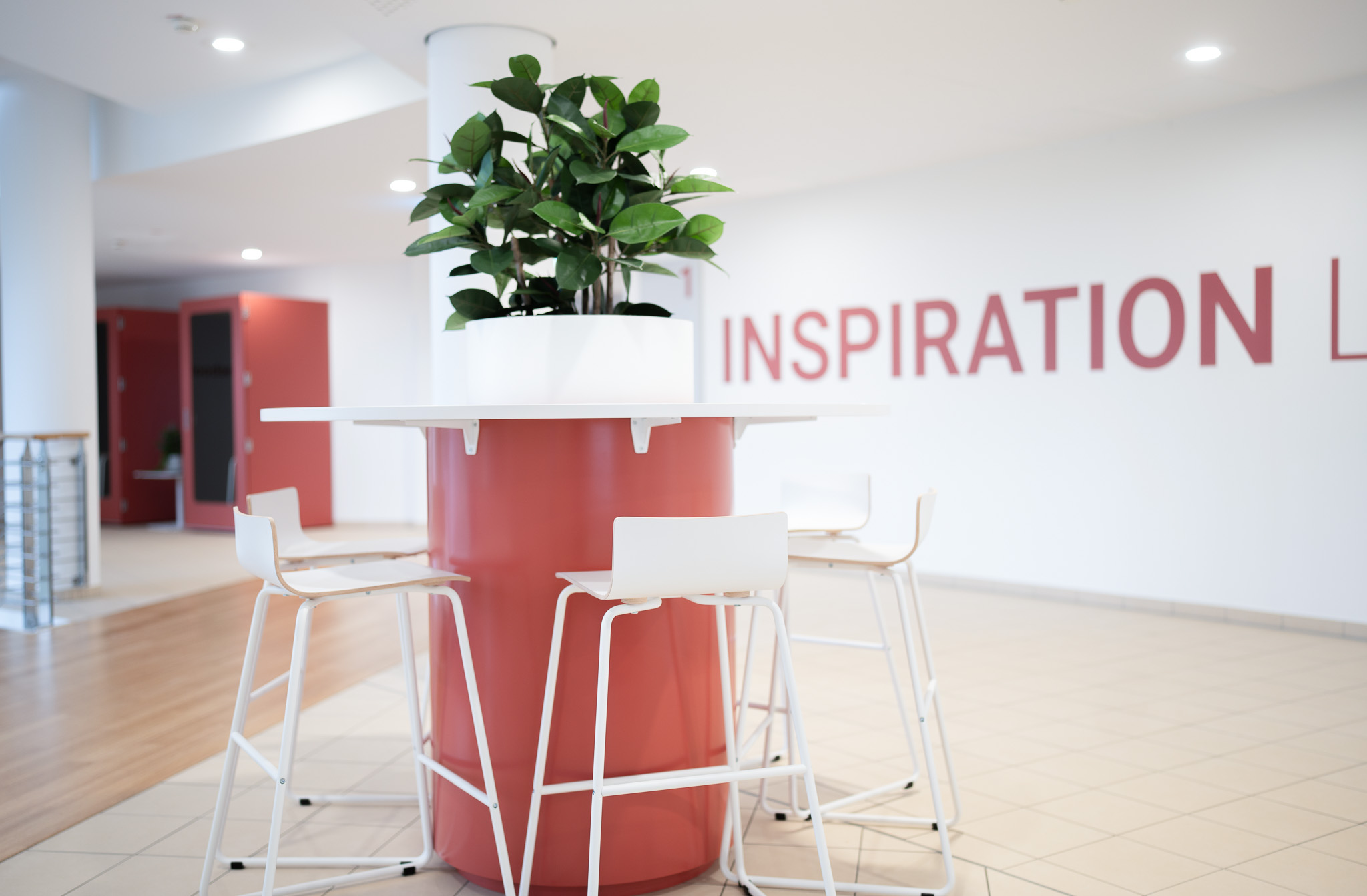
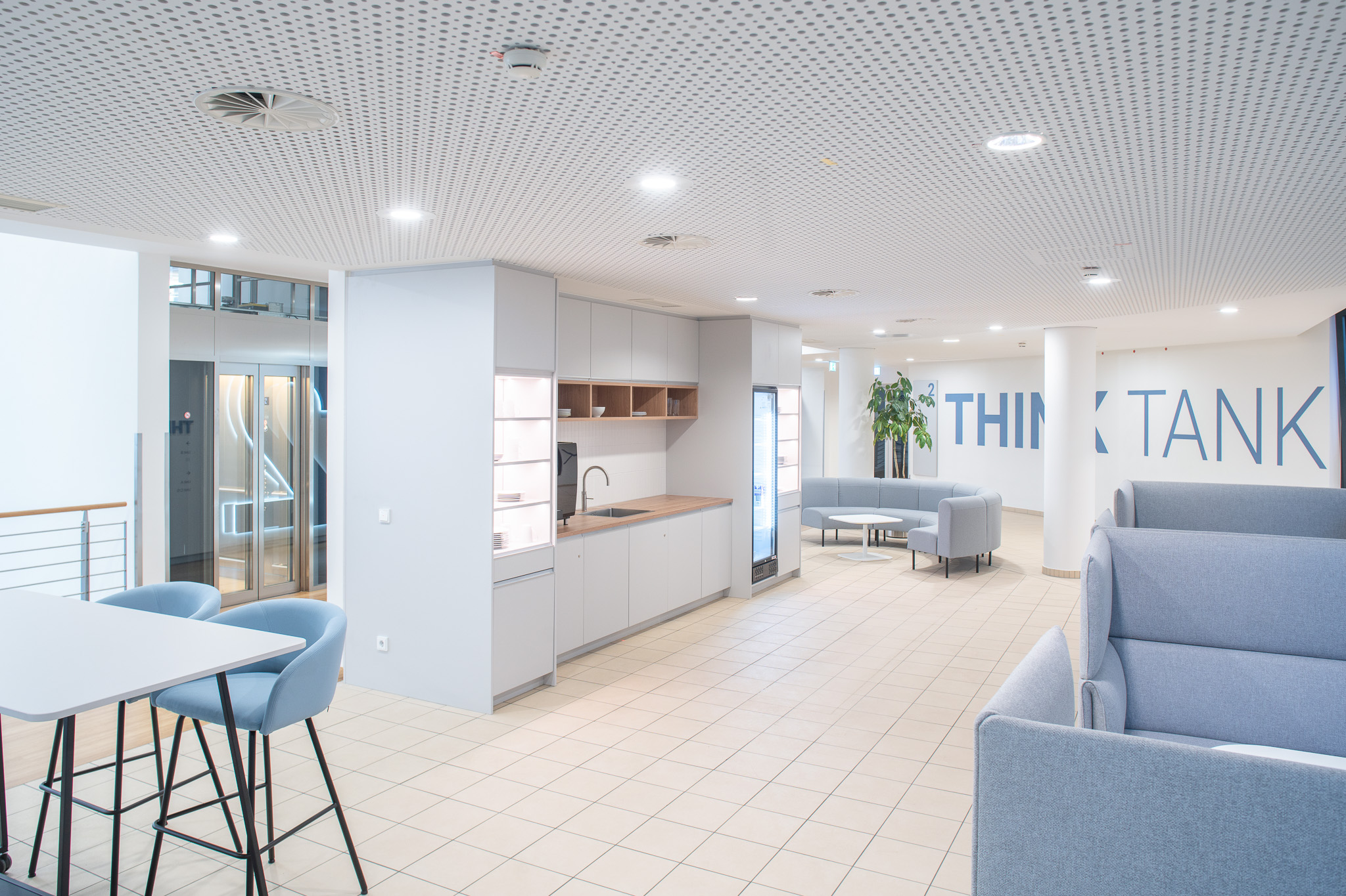
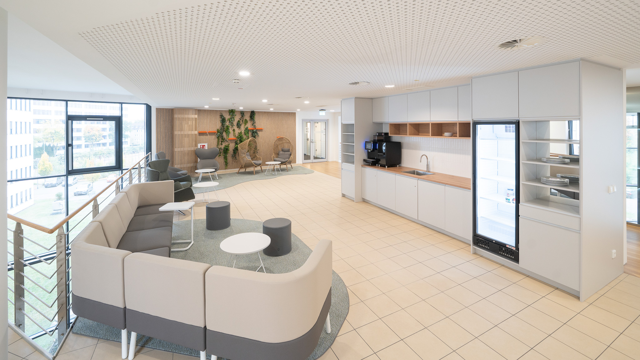
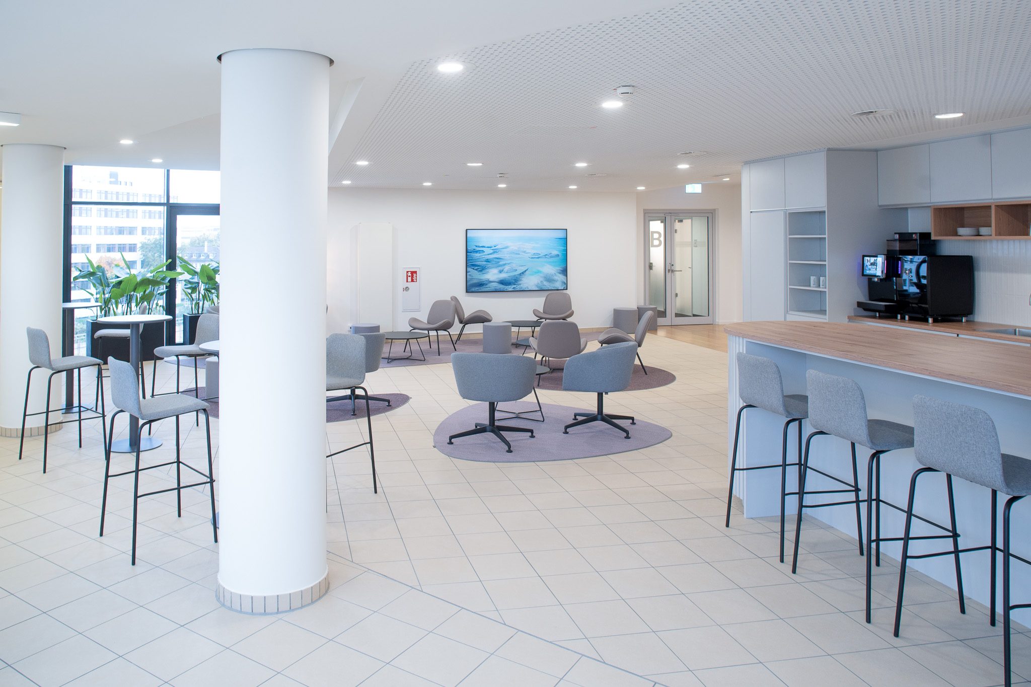
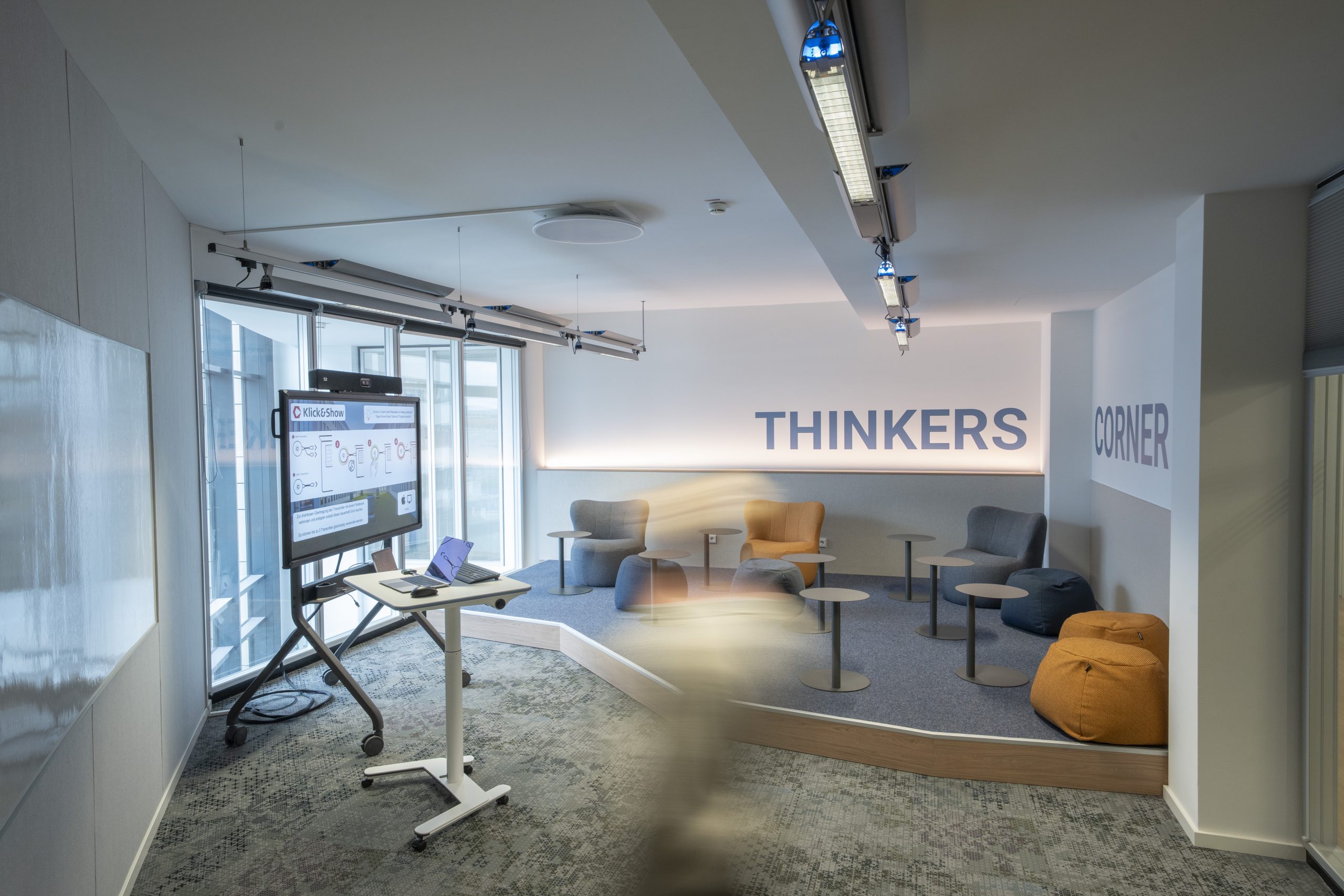
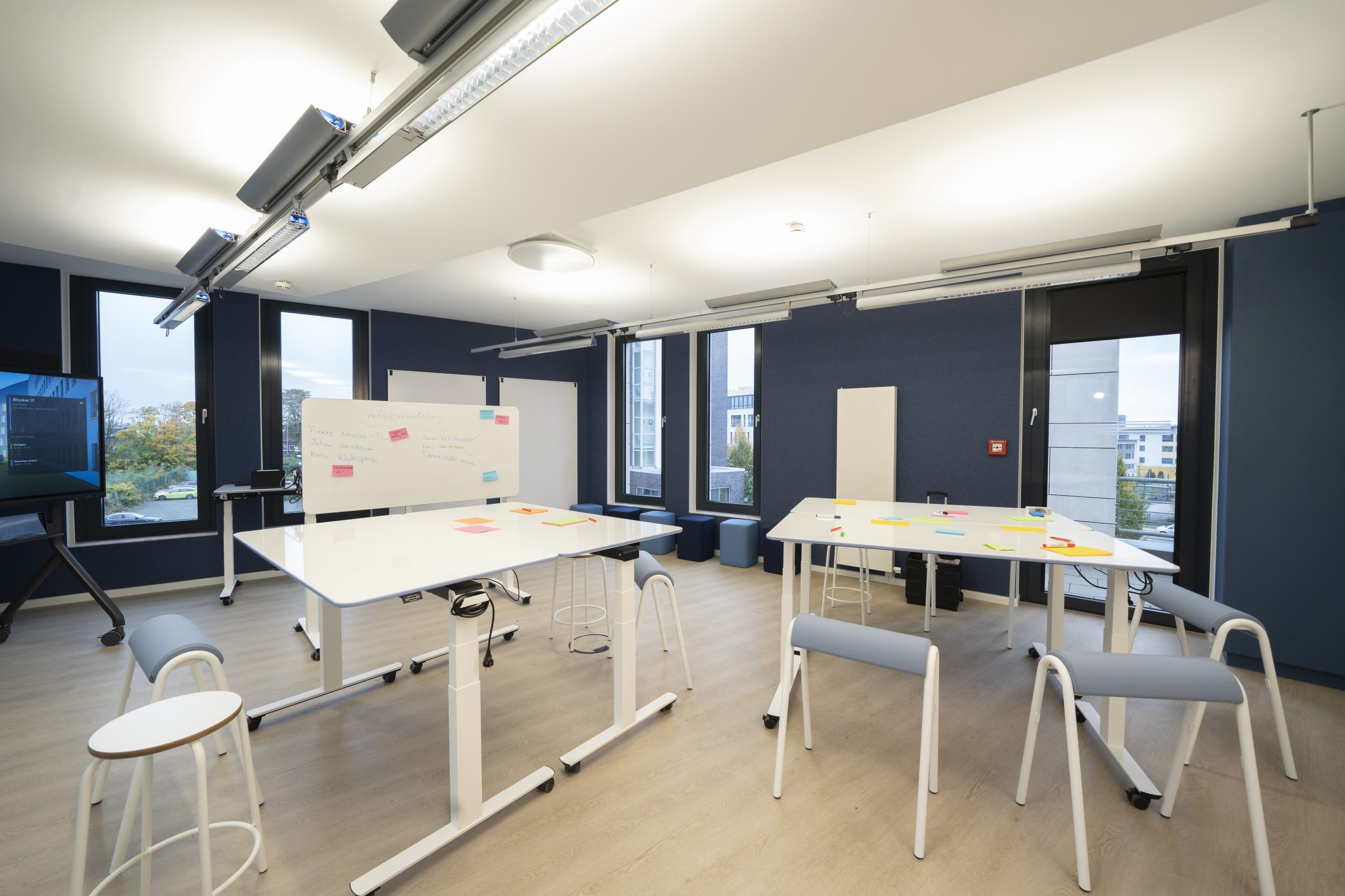
//Transforming Spaces
Kundenprofil: GNS, headquartered in Essen, is a leading company in the field of nuclear waste disposal and services. With a clear focus on quality, safety, and innovation, GNS pursues sustainable and future-oriented corporate development.
We are proud to have successfully implemented the “Transforming Spaces” project.
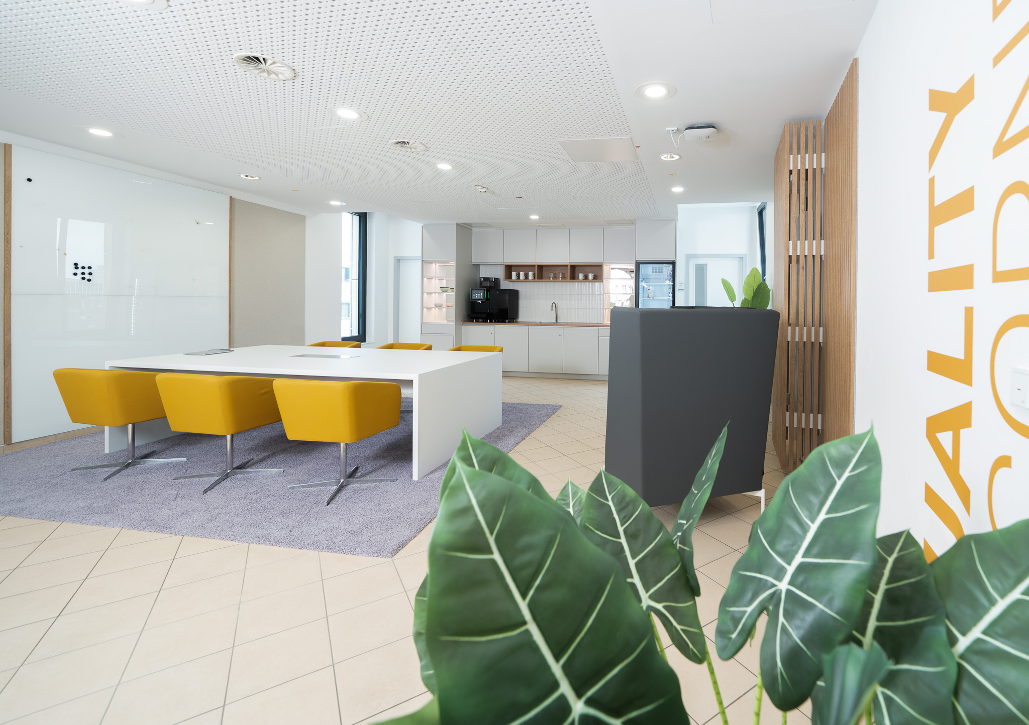
In a tight timeframe from the end of May to September, we were responsible for the complete redesign and implementation of the GNS office in Essen – from conception and planning to on-site realization.
Thanks to the smooth cooperation of all those involved – from the planning team to the implementation partners – the result was presented on time for the location celebration.
A classic and functional office environment was transformed into a place with character, identity, and a sense of community that brings GNS’s values—excellence, cooperation, and sustainability—to life in a tangible way.
Scope of work
// New corporate brand
Client: DERTOUR Group
One Brand for a Global Travel Powerhouse
Scope of work
Brand Development and Corporate Identity
Development of a secondary brand element
Catalog Concept
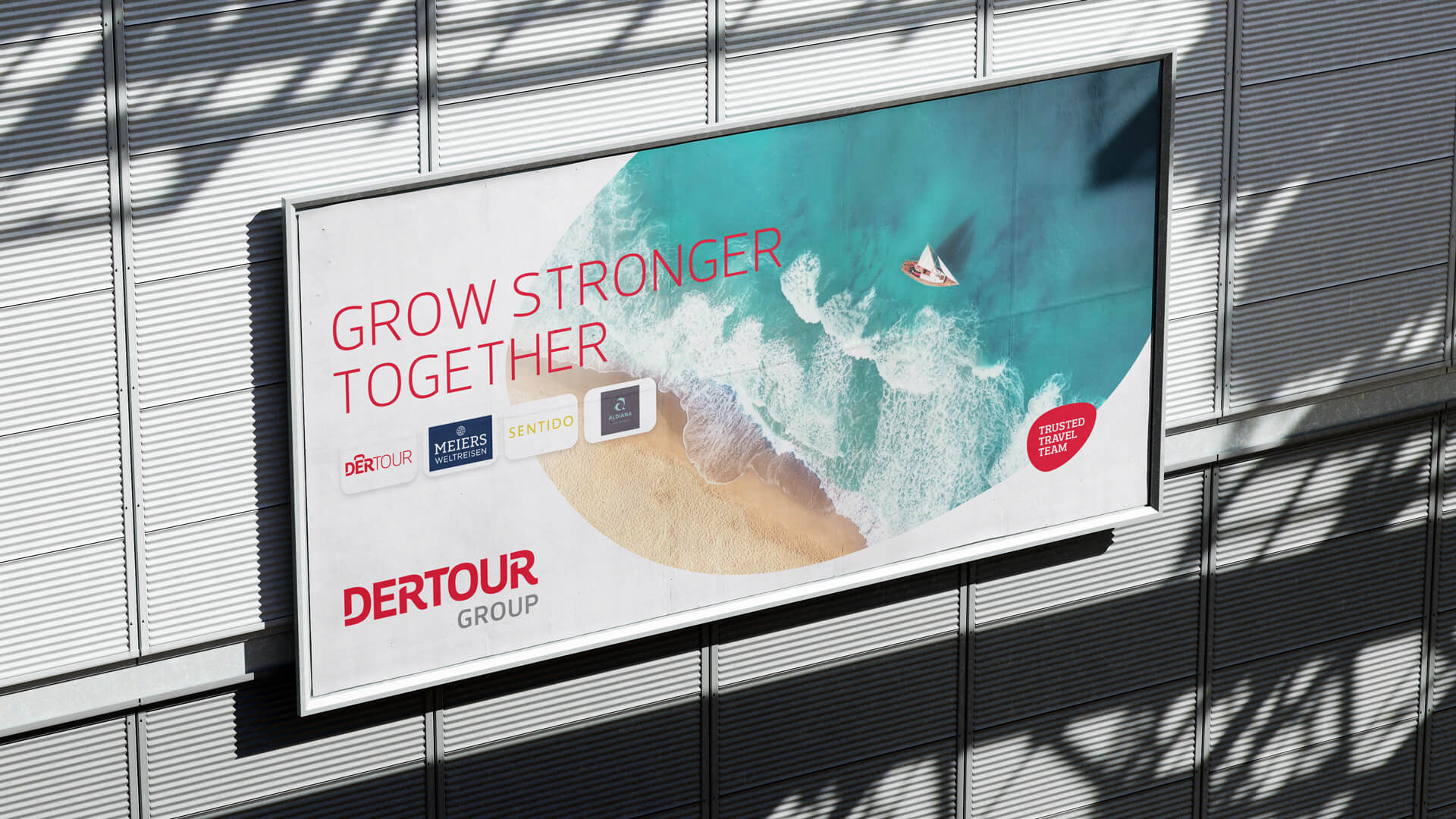
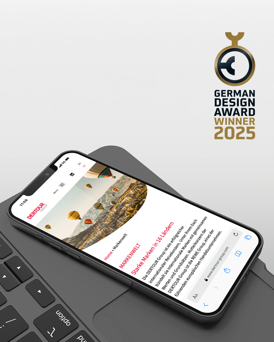
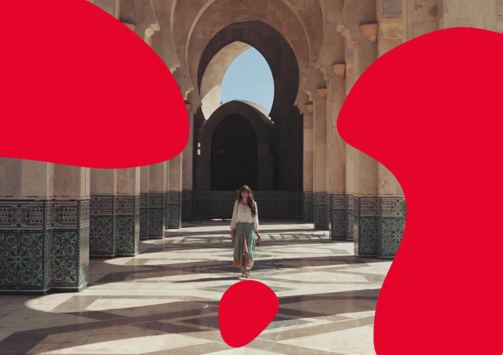
As part of this process, the main brand DERTOUR, developed by evoq, will become the new corporate brand DERTOUR Group. The brand’s fluid design brings to life the dynamic evolution of the brand—and now of the entire company—in a visually compelling way
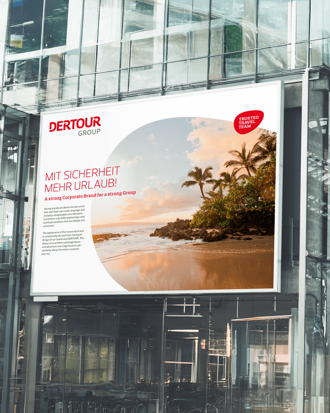
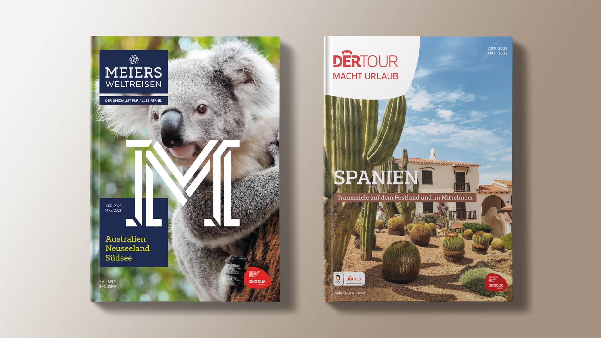
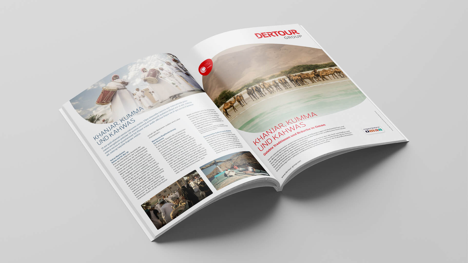

The visual elements reflect a modernized and more emotional look and feel, enabling the seamless integration of all business units under a single, strong brand.
Die Umwandlung von DER Touristik in die DERTOUR-Gruppe unterstreicht unser Bestreben, eine führende Rolle auf dem internationalen Reise- und Tourismusmarkt einzunehmen. Wir wollen als eine starke Gruppe stärker in Erscheinung treten. Das neue Designkonzept bietet ein moderneres, emotionaleres und relevanteres Markenerlebnis, das es uns ermöglichen wird, unsere Reichweite zu vergrößern.
Dr. Ingo Burmester, CEO DERTOUR Group Zentraleuropa
// Corporate Identity and Corporate Design
Client: GO!PHA
Wenn Gestaltung Bewusstsein schafft.
The mission
GO!PHA is an international alliance of scientists, brands, and innovators committed to addressing one of the planet’s most pervasive pollutants: microplastics. The challenge was to create an identity that reframes the debate and positions material innovation as a tangible path forward.
Scope of work
Brand Development and Corporate Identity
The Idea
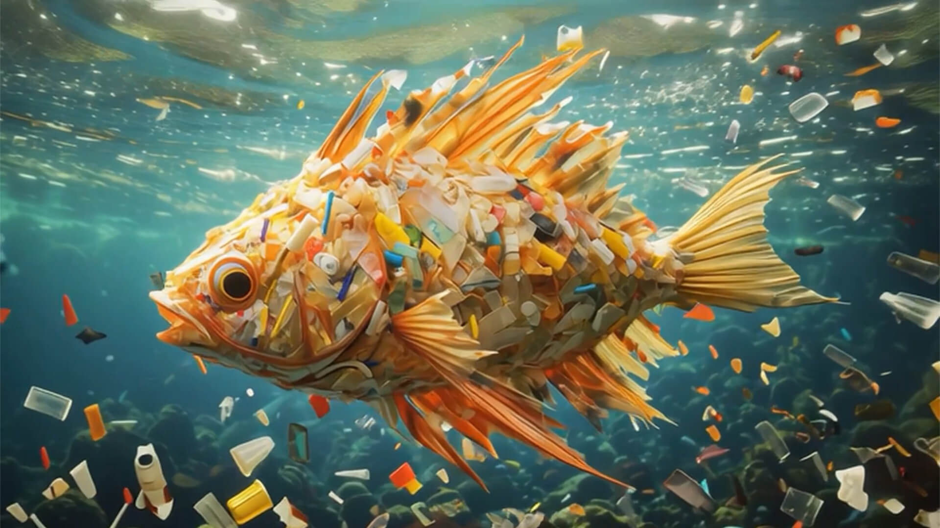
It’s not plastic that’s the enemy, but microplastics—the invisible particles that have long become part of nature, wildlife, and humanity.
This realization shapes our brand strategy and design: GO!PHA stands for a radical shift in perspective—from assigning blame to finding solutions.
The transformation begins with the material.
The implementation
The new visual identity conveys science, urgency, and optimism through a clear visual system.
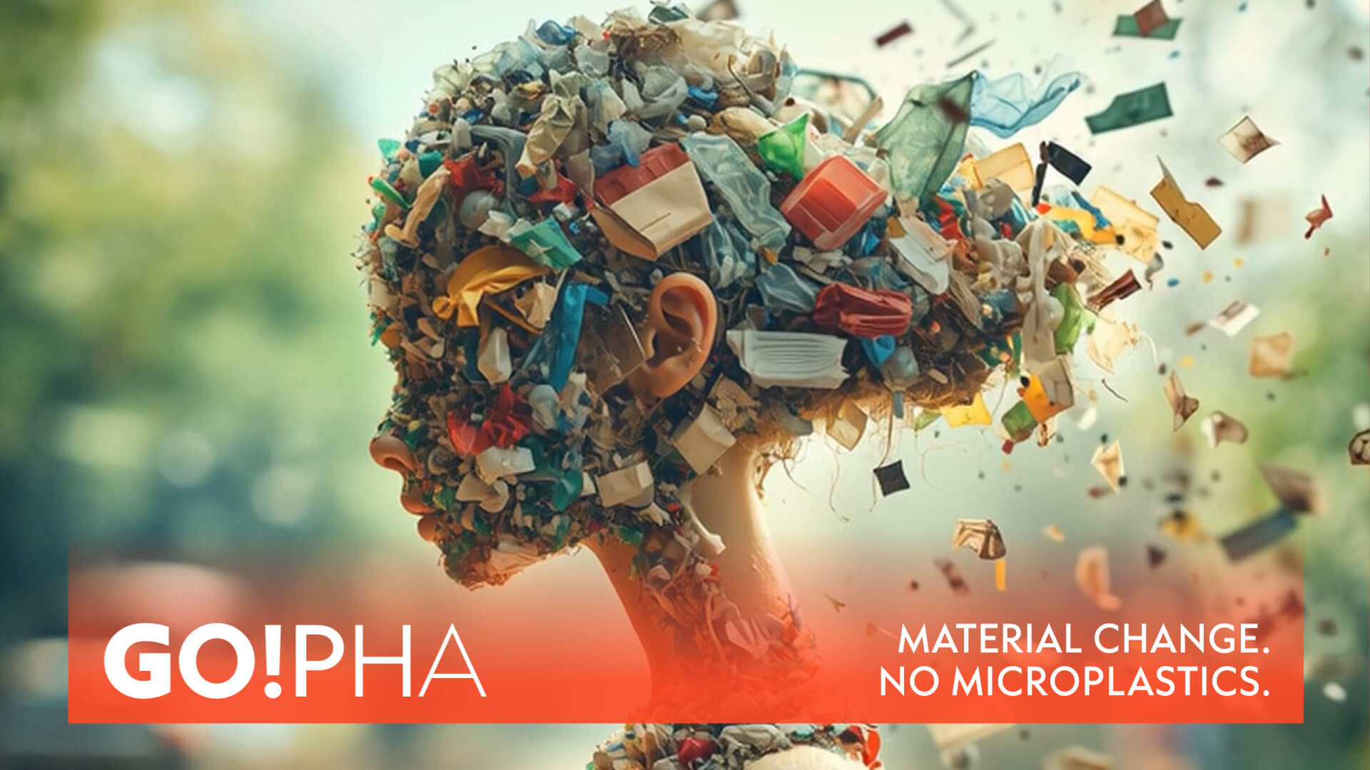
A bold orange breaks away from the familiar blue-green aesthetic of sustainability. Key visuals highlight the threat in an aesthetic—yet precisely because of this, unsettling—way: microplastics accumulating in bodies, rendered visible as an art form.
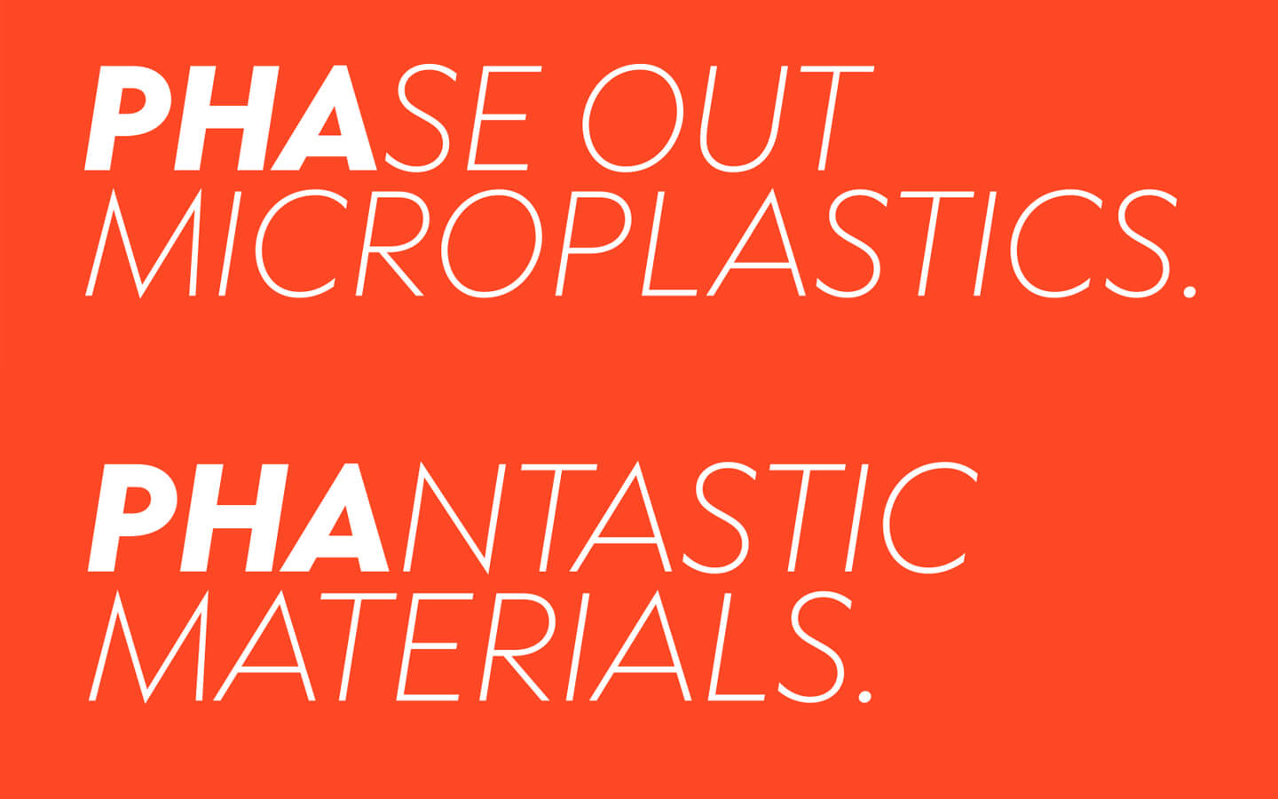
PHA headlines combine language and science into concise messages:
PHAse out microplastics.
PHA: Designed to disappear.
Change the material – change the story.
The brand communicates clarity and consistency across all touchpoints: logo, corporate design, film, campaign, summit.
The Result
GO!PHA becomes the voice of a new consciousness. A brand that combines urgency with optimism—and demonstrates that true change begins at the molecular level.
Material Change isn’t just told;
it’s experienced through exceptional communication design.
// Brand Guidelines and Cross-Media Presence
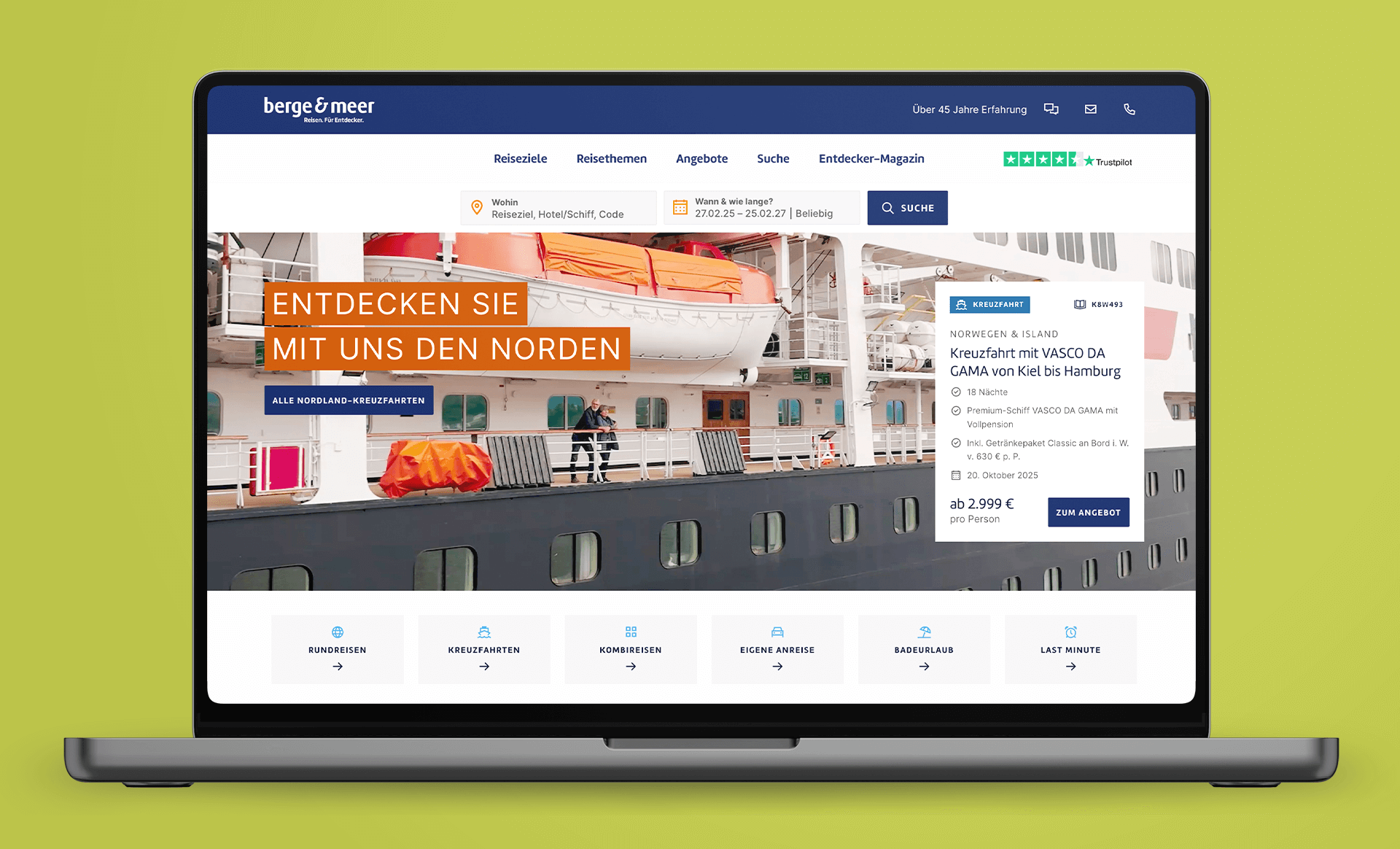
Client: Berge & Meer
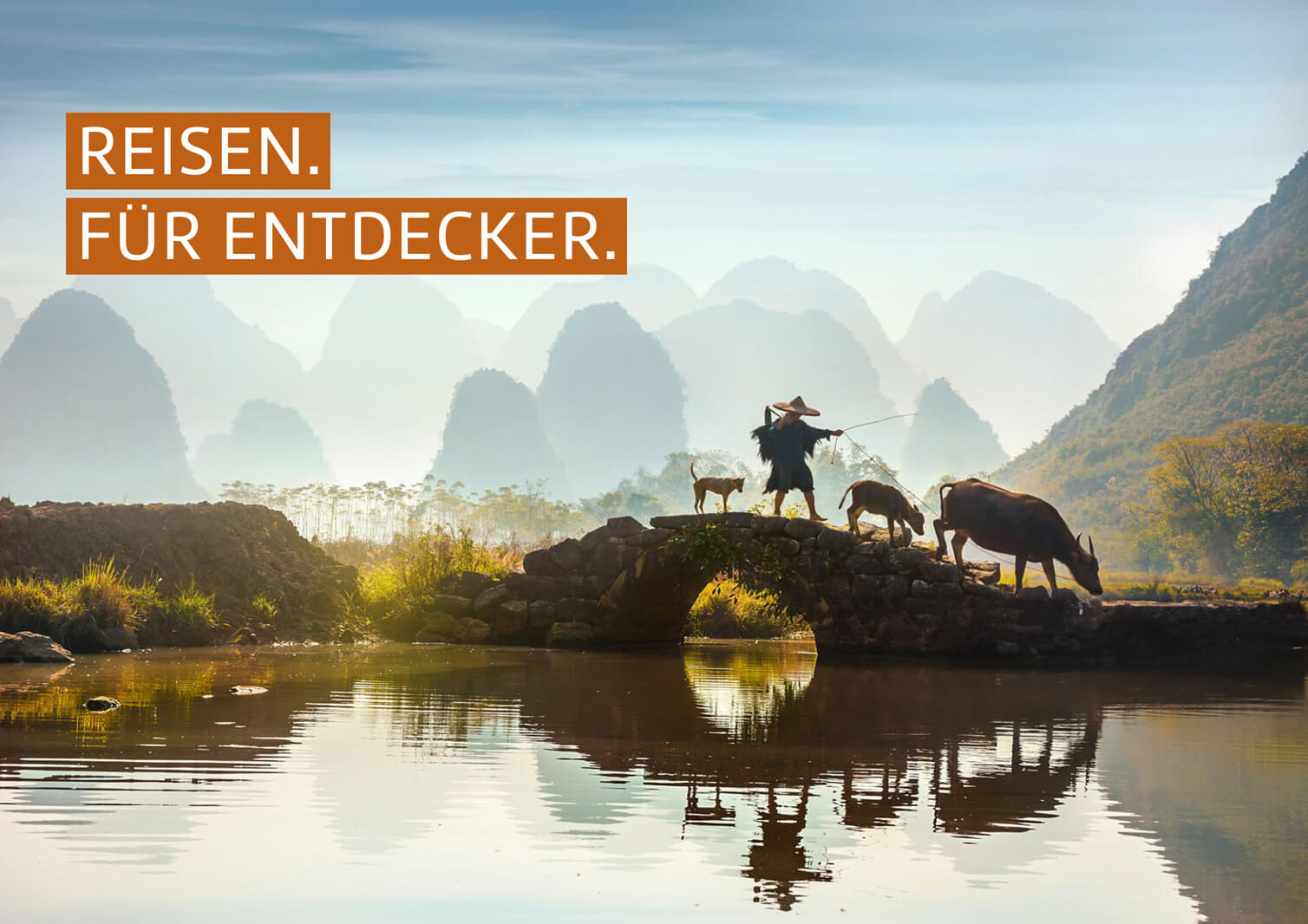
Travel. For explorers. Relaunch of a long-standing brand.
Intro
As a brand agency, our mission was to guide the Berge & Meer brand into the future with a fresh and contemporary identity—without losing sight of its core values. For decades, Berge & Meer has stood for authentic travel experiences that combine a spirit of adventure with relaxation. With the new brand identity, we have reinterpreted and further developed this identity in a modern way.
At the heart of the rebranding was the creation of a clear and inspiring brand image that awakens a longing for the world and its diverse landscapes.
The new brand experience not only sets visual accents but also creates an emotional connection—whether in print materials, the online world, or directly on-site. With this rebranding, Berge & Meer invites you to rediscover the world and clearly positions itself as a brand for people who travel with passion and want to experience the diversity of nature.
Our vision: A brand that shapes the travel dreams of tomorrow—strongly rooted in its values, yet bold enough to break new ground.
Scope of work
Logo Design
Visuals
Publications
Sales promotion
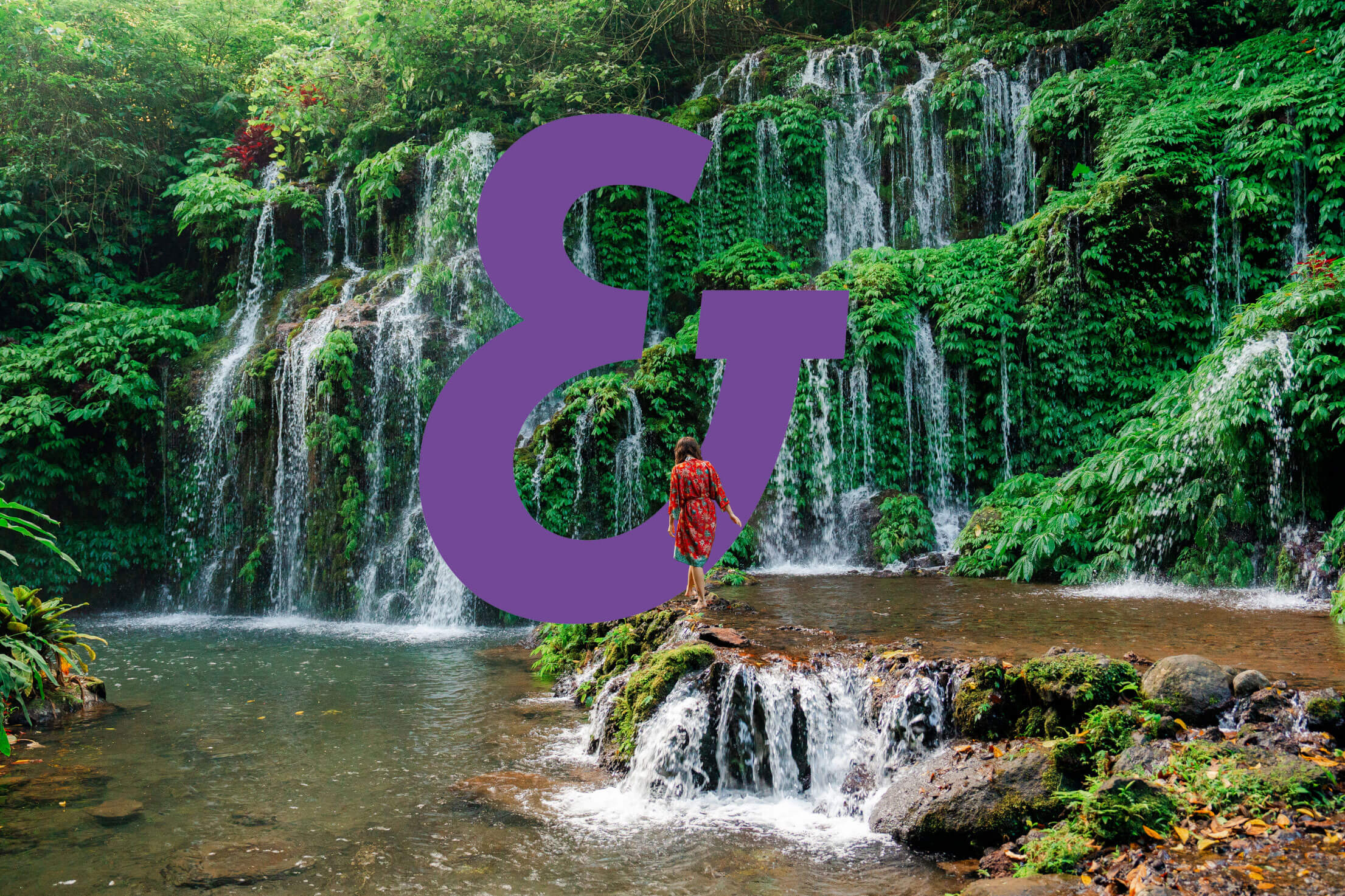
The Super Symbol
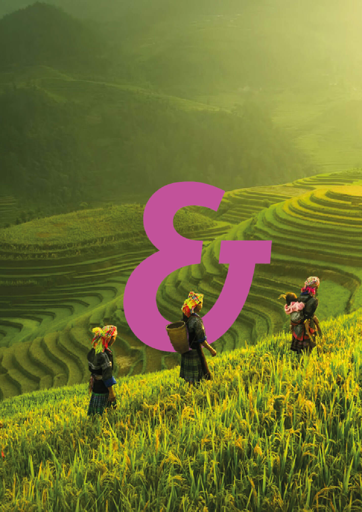
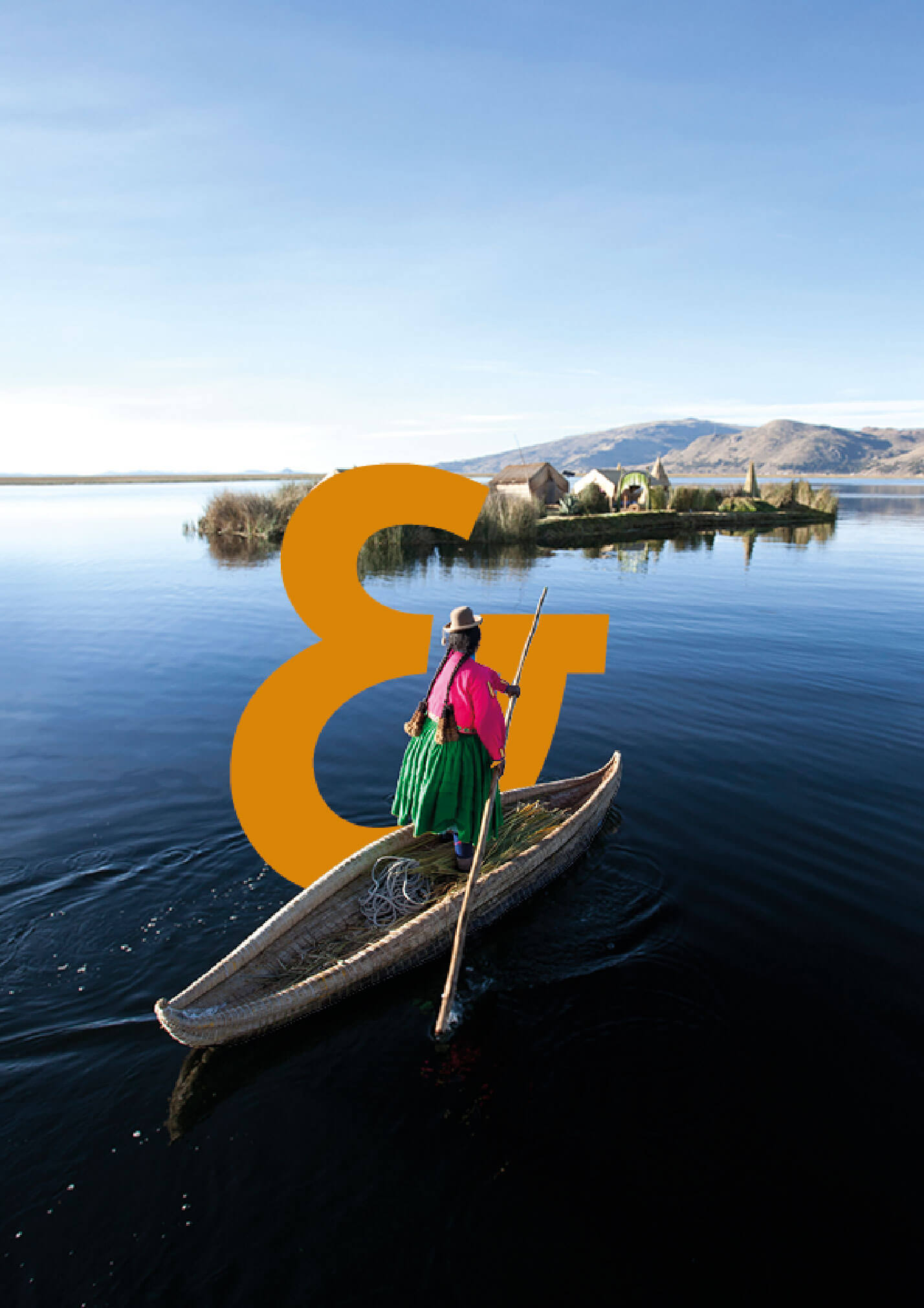
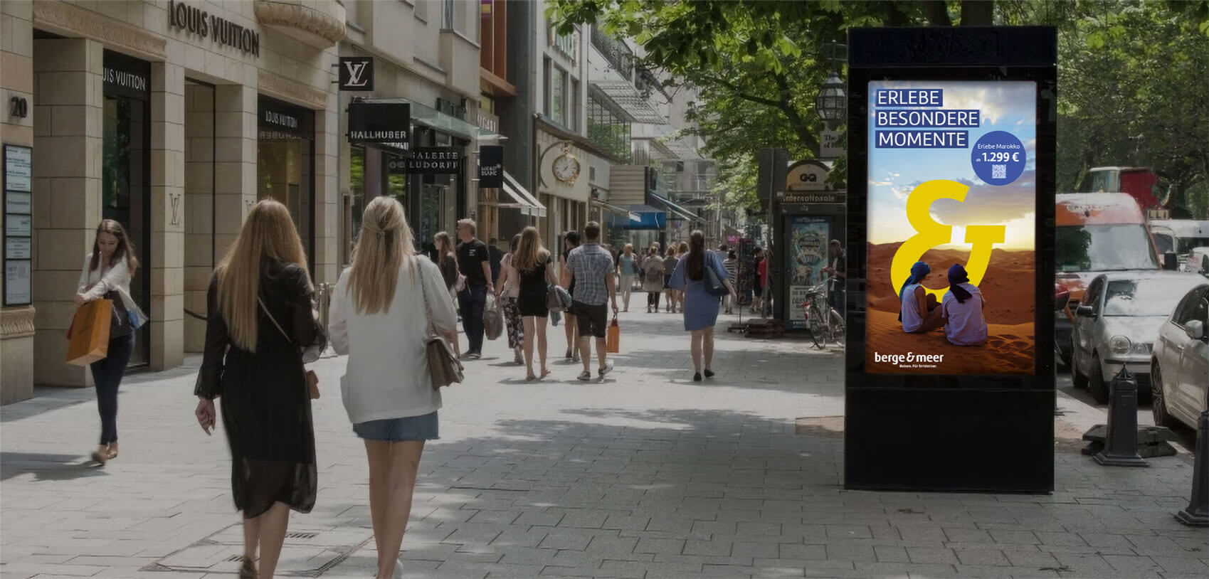
The Super Symbol draws the eye to the travel moment. It is our signature layout element and makes it immediately and unmistakably clear what matters most.
At the heart of the Super Symbol is always what matters most: the experience, the travel moment. The Super Symbol is typically used in an accent color that complements the color scheme of the image.
The Colors
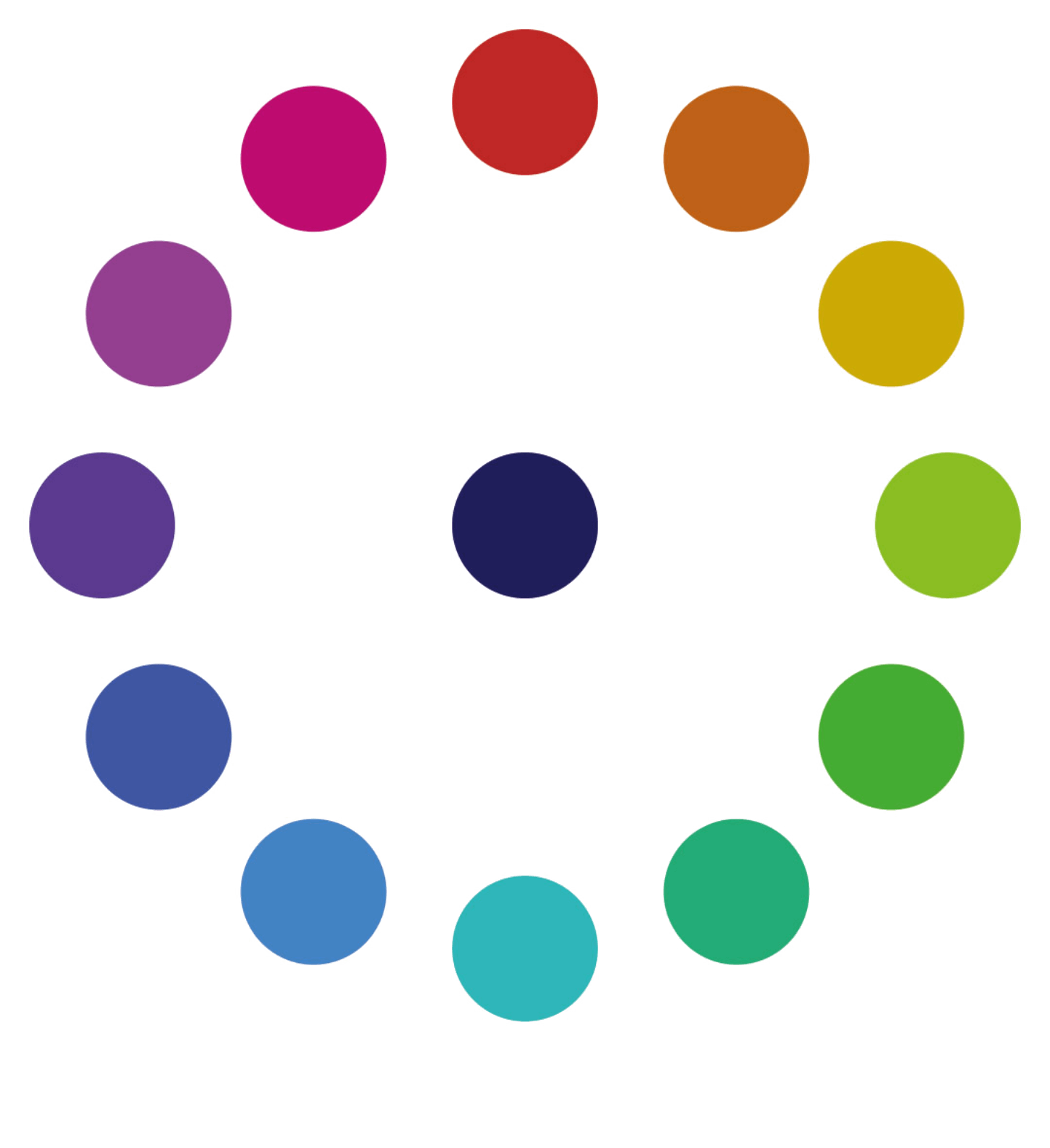
Color Wheel
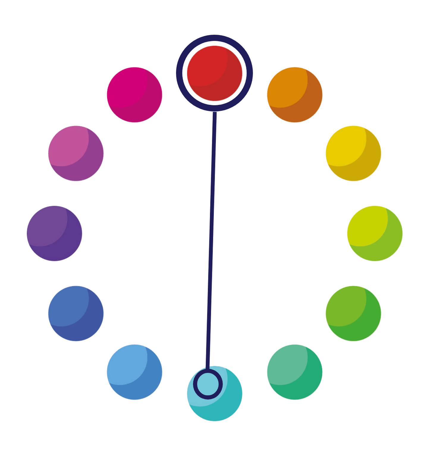
The Berge & Meer color wheel is based on the color spectrum and consists of 12 colors. Each color in this wheel can be associated with specific experiences, landscapes, or emotions we encounter on our travels, reflecting the diversity and beauty of the experiences we can gather along the way.
Accent
The accent color is available in each of the 12 color groups. It is a lighter version of a primary color and is assigned as an accent to the color directly opposite it on the color wheel. The accent color is used for the super symbol and for disruptive elements. In special cases, such as when designing a Sognature trip, the primary and accent colors may be swapped.
Print Media
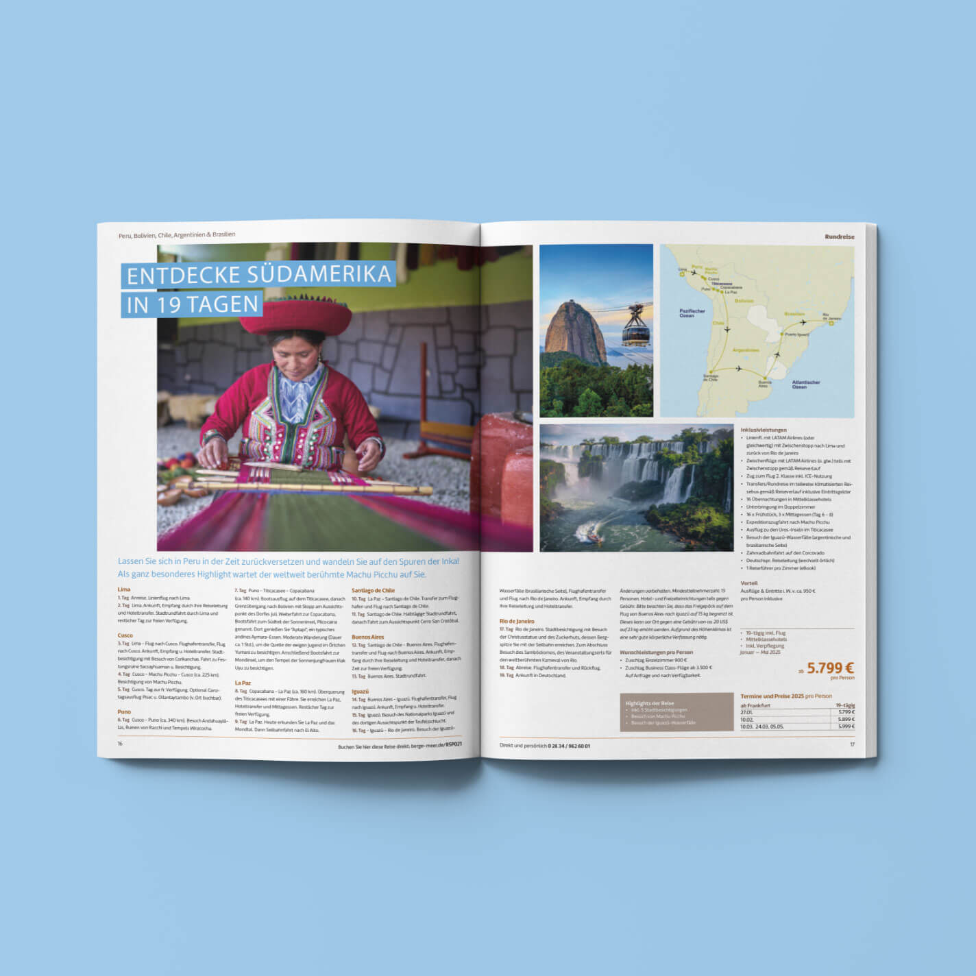
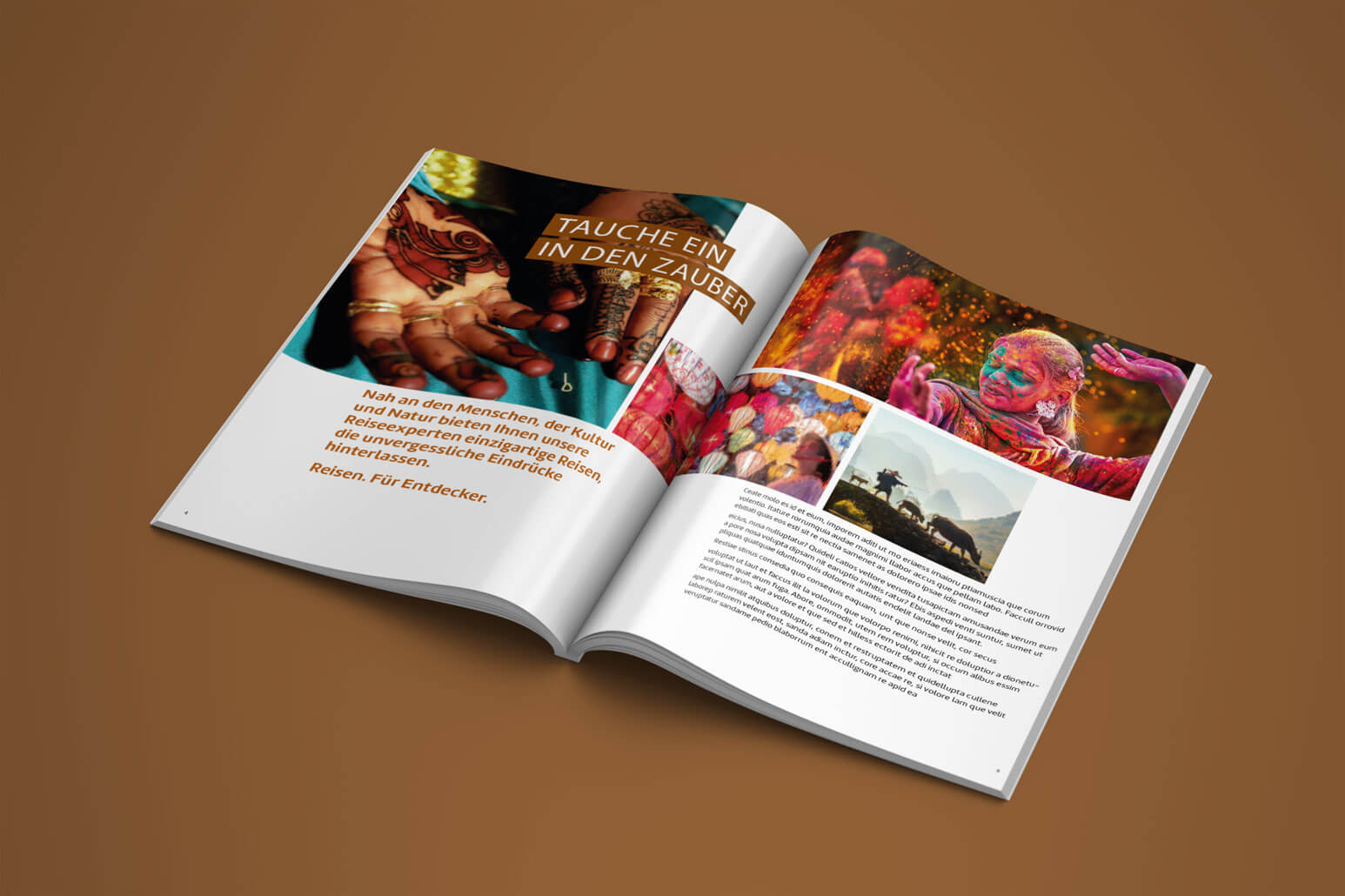
The Berge & Meer Round-Trip Catalog evokes a spirit of adventure and wanderlust, combined with a longing for relaxation in nature. The design should reflect a harmonious interplay of majestic mountain landscapes and serene seascapes. The focus is on large, evocative images of natural settings, complemented by clean, modern typography.
Natural color palettes—such as shades of blue, green, and earth tones—emphasize the theme. Clear layouts with structured content ensure user-friendly navigation, while inspiring texts and highlights invite readers to dream and explore at first glance.

Website and Social Media
Using the new brand guide, we have modernized Berge & Meer’s social media presence and website and aligned them with the brand. Clear, visually appealing layouts and a consistent color and visual language ensure that Berge & Meer’s identity is evident across all channels.
// Corporate Identity and Corporate Design
Client: TOURVITAL
Bringing the fascination of travel to life
Everyone should experience the world
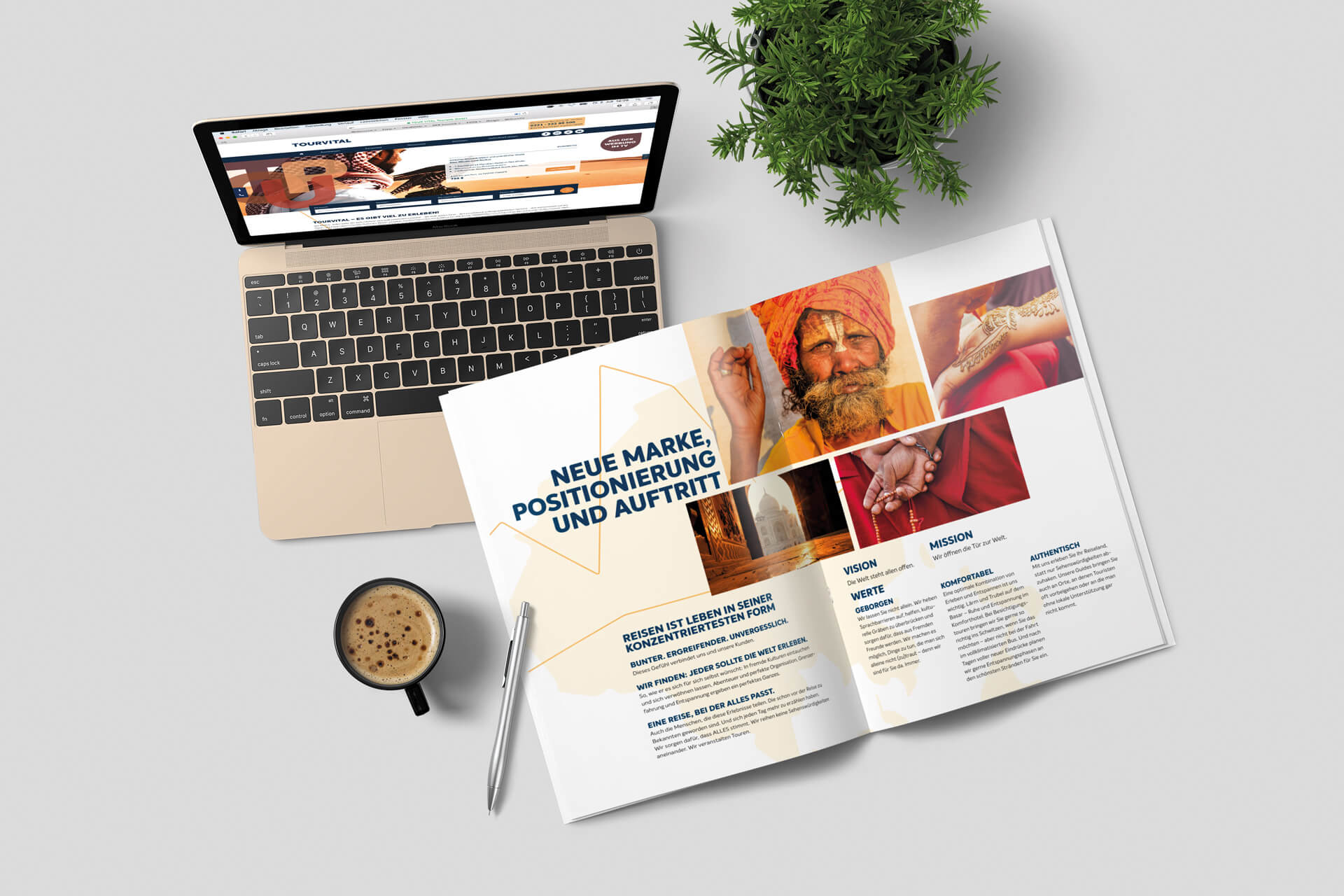
TOURVITAL, founded in 2008 as a provider of medically supervised travel and the market leader in this sector in Germany, has evolved into a specialist in adventure tours. During this time, the self-image of the core target group has also changed; “the elderly” have become active “Best Agers.” The company’s brand identity has kept pace with these developments just as little as it has with digitalization.
Scope of work
Repositioning and a new brand identity
The core idea of the brand story
“Travel is life in its purest form. We believe everyone should experience the world—in all its facets. We don’t just drive you from one photo spot to the next. We organize tours.”
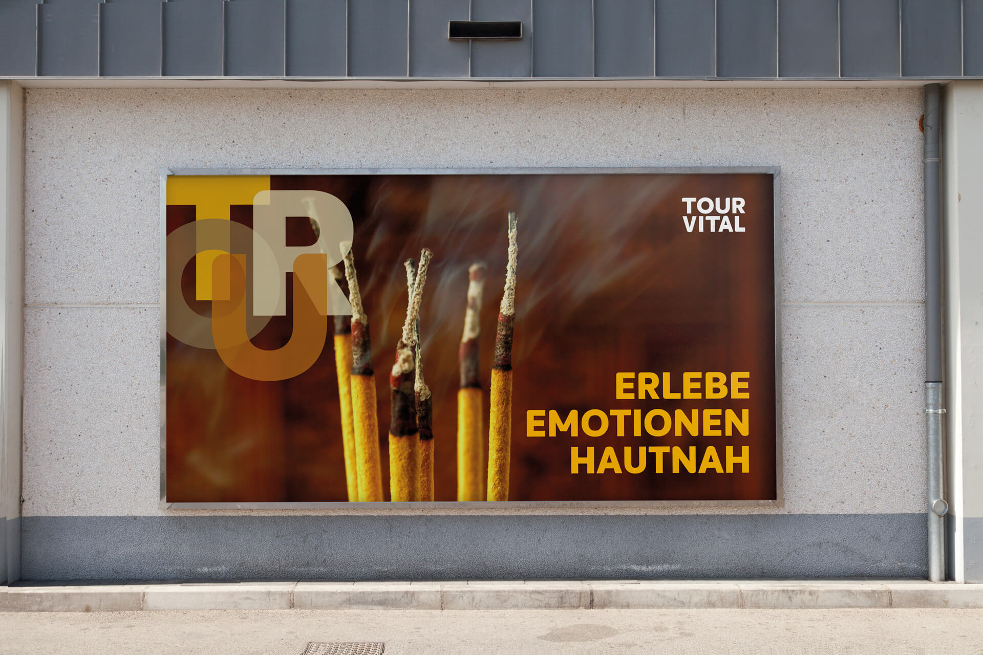
The result is a performance that puts the TOUR at the center of attention: as colorful and vibrant as the journeys it represents.
The logo visually captures the essence of the tour. Instead of a fixed color scheme, it adapts to its surroundings in five different variations.
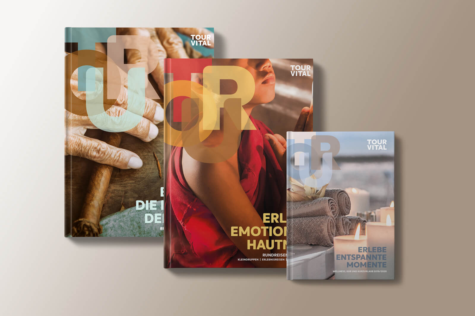
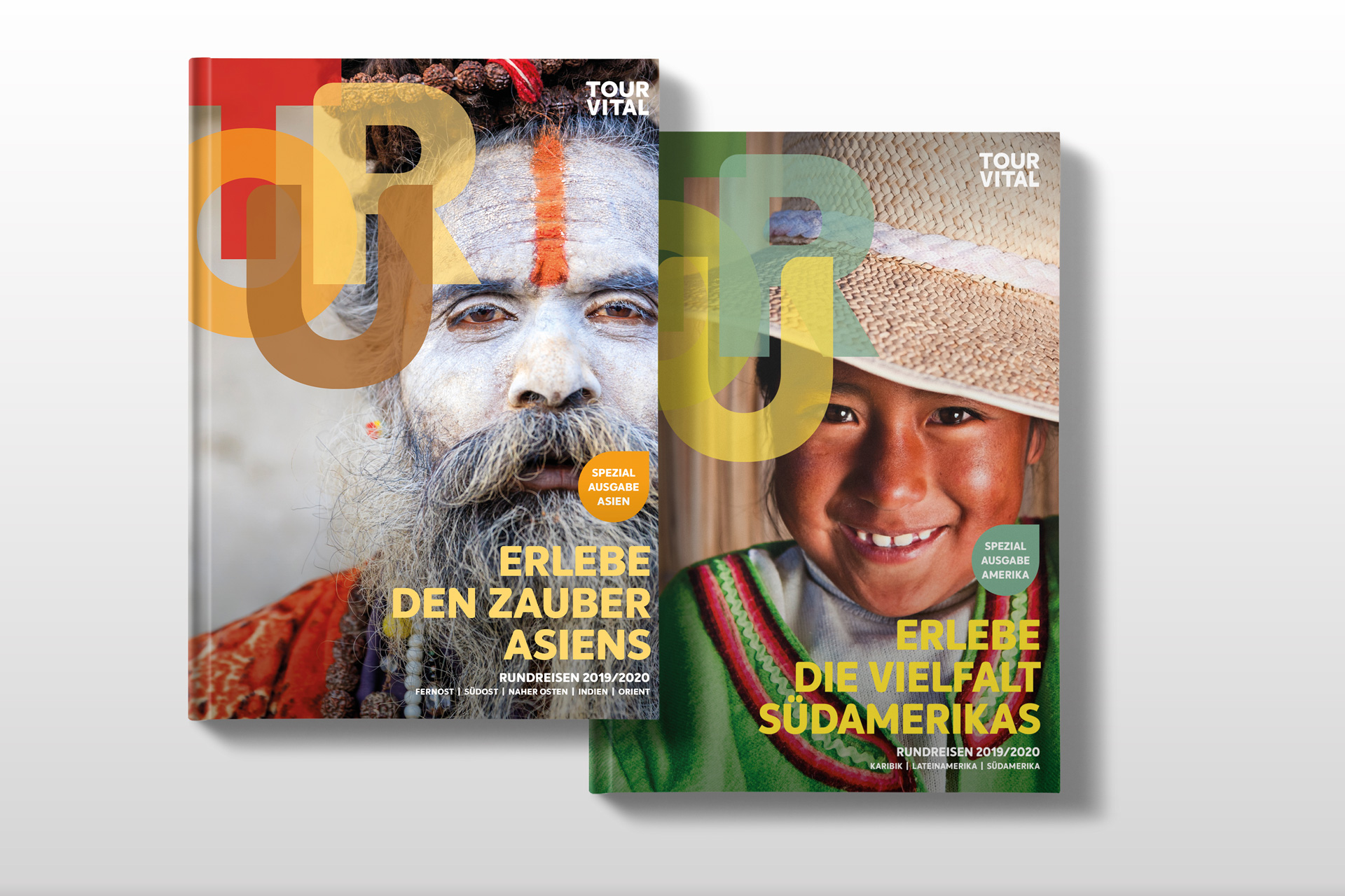
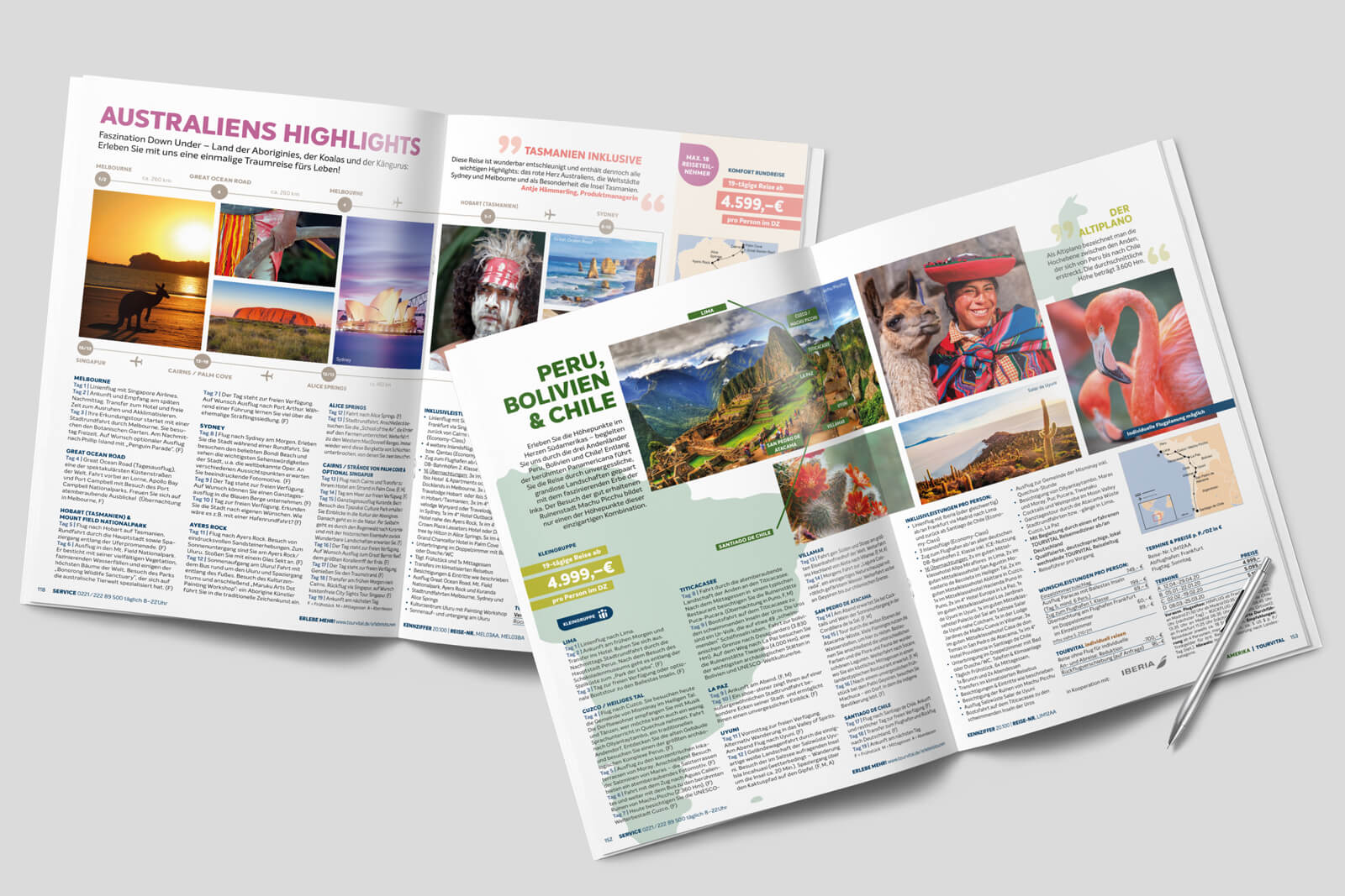
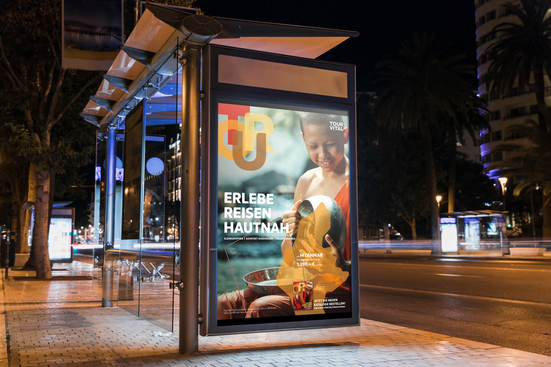
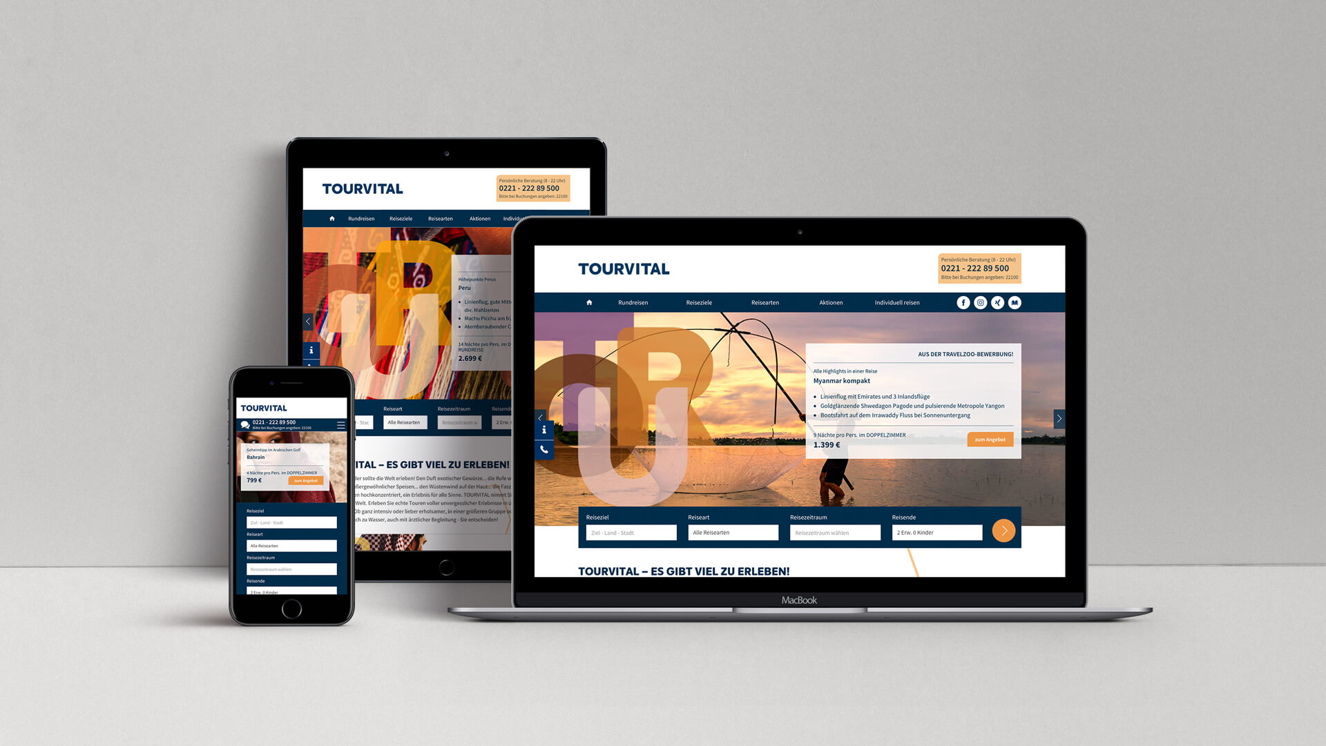
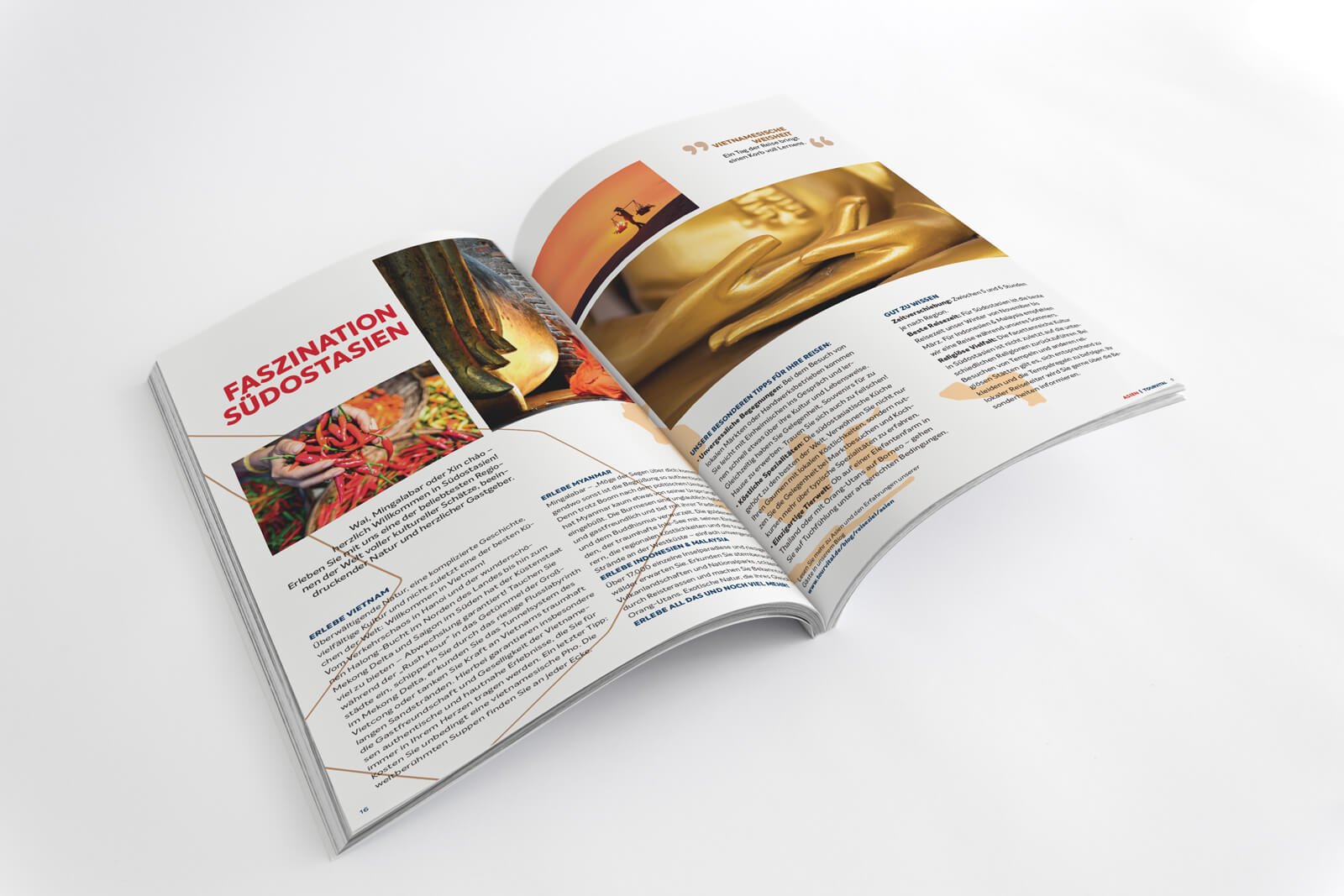
The imagery of the brand presents travel destinations very closely and from unusual perspectives—not postcard-perfect scenes, but the world as seen through the traveler’s eyes. Complemented by design elements that represent the destination and the itinerary, as well as destination symbols that appear as organic-looking silhouettes inviting travelers to fill them with their own experiences, the design
already takes prospective travelers on a journey in their imagination.
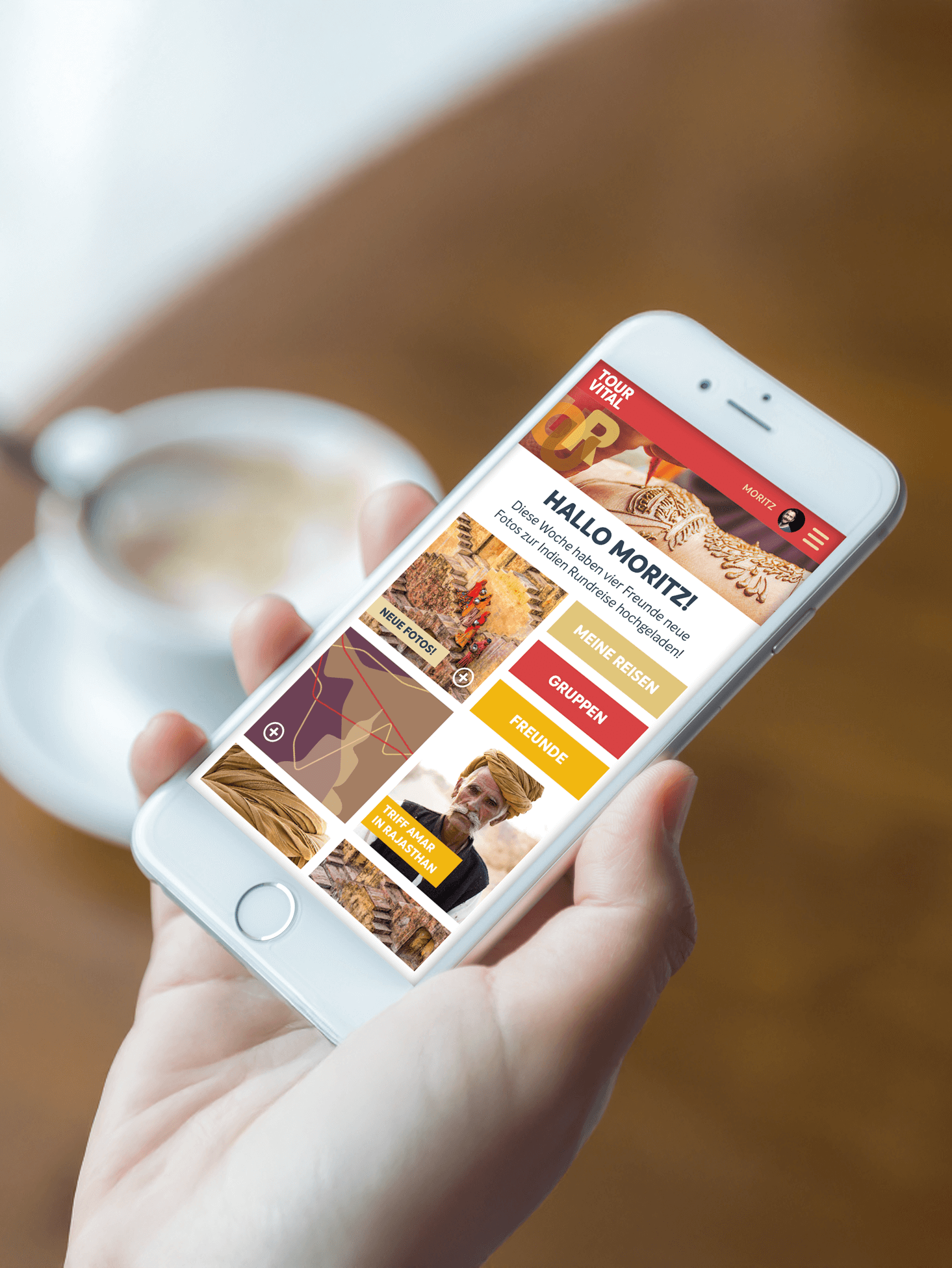
Die Marke TOURVITAL wurde in das Produkt gehoben. Marke, Produkt und Abverkauf werden eins. Das ist stimmig, neu und einzigartig.
Marcel Mayer und Beat Zingg, Geschäftsführer Tour Vital Touristik GmbH
// Leadbrand Touristik
Client: DERTOUR
DERTOUR is creating vacation. One brand for everything, one brand for everyone.
A new global flagship brand for one of the world’s largest tourism groups
Building trust in an uncertain world, providing guidance in a sea of information, ensuring brand recognition across a wide range of media and channels, and selling real-life experiences in an increasingly digital world—the demands placed on tourism brands are immense.
Scope of work
Brand Development and Corporate Identity
Development of a secondary brand element
Catalog Concept
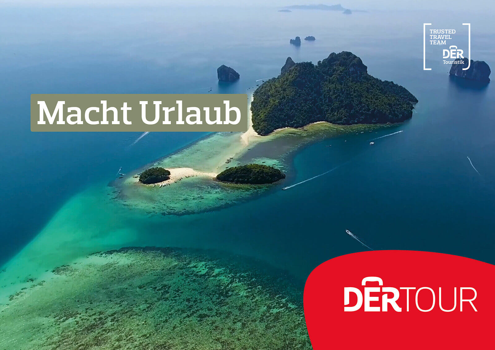
DERTOUR: DER Touristik’s New Masterbrand
One brand for everyone, one brand for everything
In an uncertain and confusing world, trust and instant recognition are more important than ever. When it comes to their travel experience, customers are looking for a strong partner who is always by their side – whether in the digital or the real world.
To better meet these needs, the world’s second-largest travel group is focusing on the brand that most clearly reflects its origins: DERTOUR.
It is being established as the main brand and will replace local consumer brands as well as DER Touristik’s retail brands. This will make the DER brand family much more recognizable as a unified entity than before – not only for customers, but also for employees and business partners. The travel experience with companies in the DER travel group will become a comprehensive customer experience—digitally and at every moment of the travel experience.
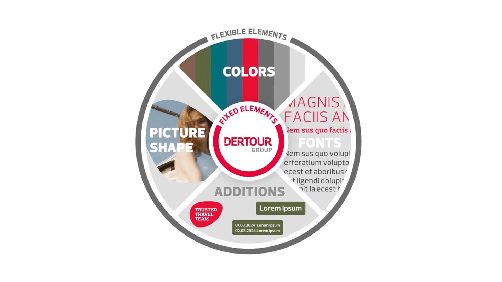
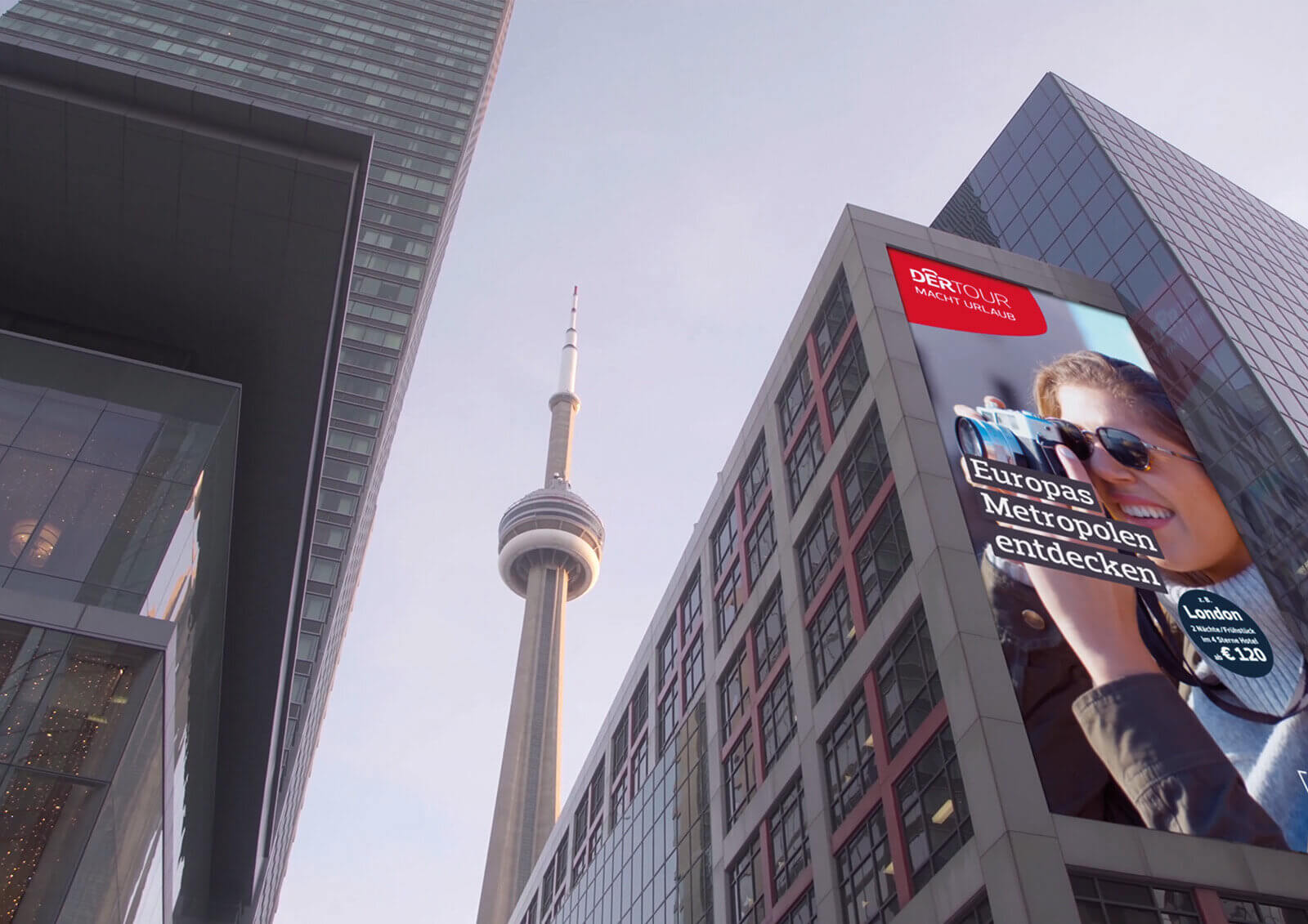
The redesigned brand is fluid and responsive, yet has become even more emotional. Flexible elements are arranged around the core brand identity in the DER brand wheel.
Instead of rigid guidelines, the CI provides only general guidelines for use, ensuring consistency while allowing for a high degree of flexibility. This allows the brand to adapt to its environment and the situation, rather than the other way around. Clear recognizability meets maximum creative freedom.
This is clearly evident in the design language, with the so-called “shapes”: the logo shape in the brand colors ensures high recognizability, while the content shape—as well as the headline bars and other supplementary elements—aligns its colors with the visual motif.
Tourismus verkauft reale Träume in einer immer digitaleren Welt. Eine extreme Herausforderung für Marken: Sie müssen sie medienübergreifend schnell und aufmerksamkeitsstark überzeugen und inspirieren. Die überarbeitete Marke DERTOUR wird diesen Anforderungen gerecht.
Rat für Formgebung
// Brand extension and technology brand architecture
Client: SENA
It’s all about connection.
Sena and ricon – Two target audiences, two related brands
As a provider of smart helmets, Sena will operate in the consumer market under its own brand. To this end, the brand will be given an emotional appeal and clearly positioned with a focus on “connectivity”: It’s not about technology or helmets; it’s about staying connected.
#rideconnected
A separate brand will be developed for the B2B sector. It will operate independently but still maintain a clear connection to Sena.
The brand name for the technology brand is derived from “ride connected”: ricon.
Scope of work
Brand Positioning
Brand development
Brand identity
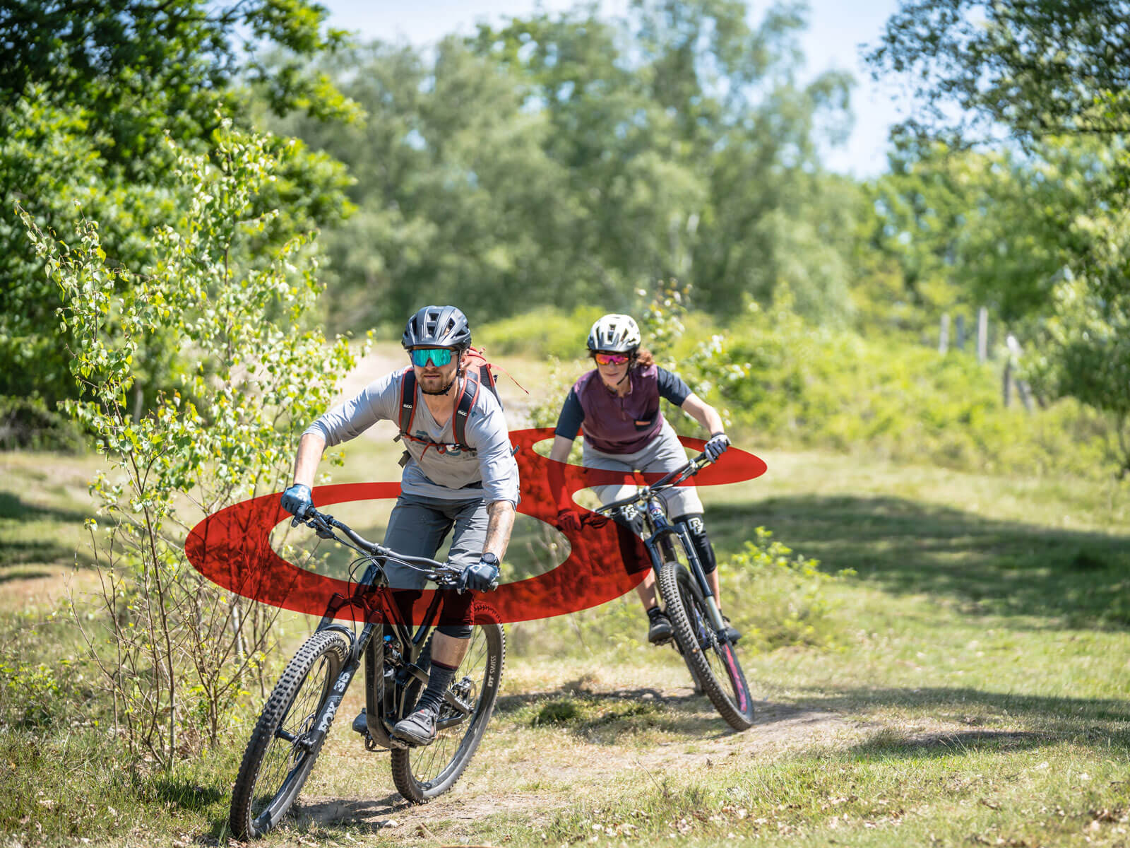
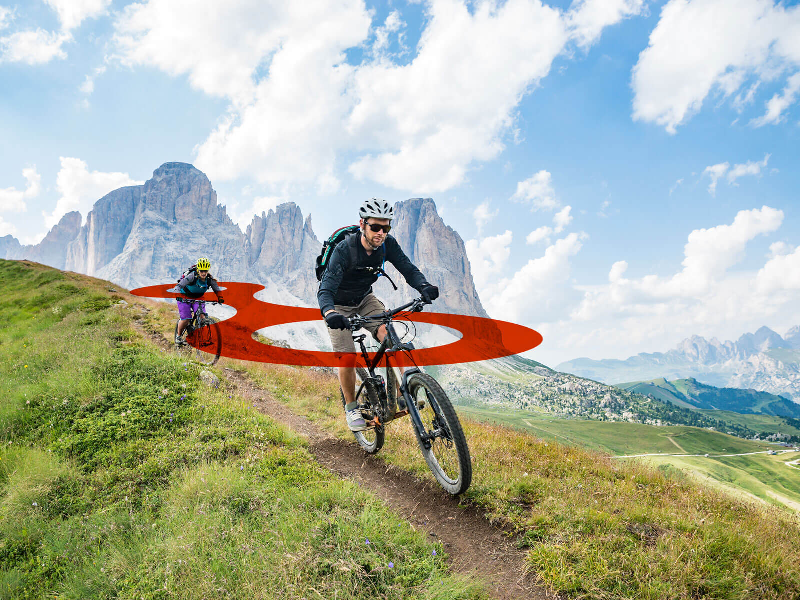
The Brand’s DNA – The New Sena Brand Story
The ability to connect has made humanity the most powerful species in evolution. We look out for one another, we share our knowledge, we’re constantly improving—and we have a lot of fun doing it. Together, we can move mountains—or ride right over them.
Take your riding experience to the next level!
More safety.
Better performance.
More fun.
#rideconnected
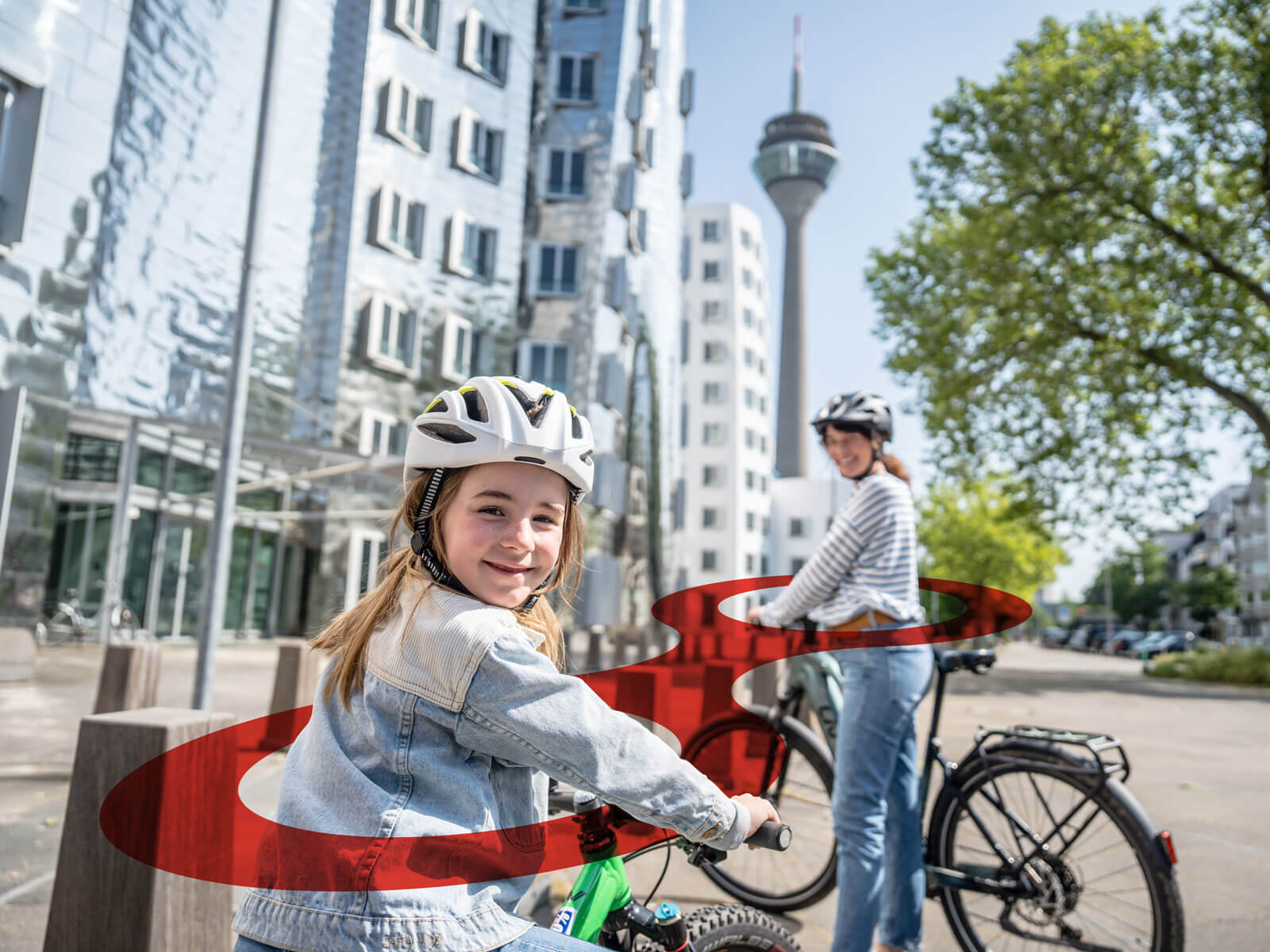
The Connector – A Super Symbol Explains What It’s All About
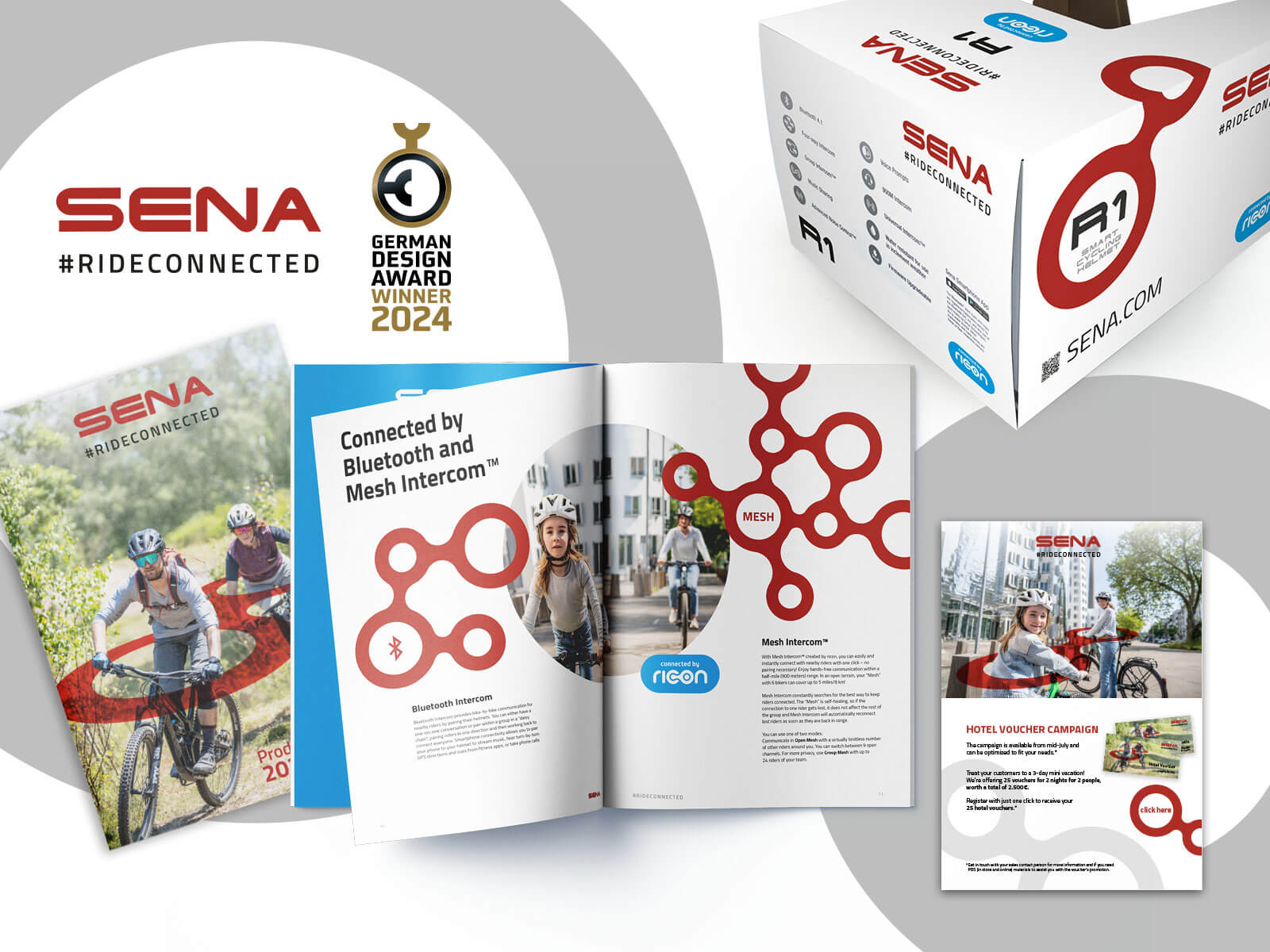
Both brands share the use of a connector as a key visual element. However, this element differs visually enough to emphasize ricon’s distinct identity. In the case of ricon, the connector is also part of the logo, giving it a distinctive look and strong visual impact.
In Sena’s visual motifs, it clearly highlights the product’s benefits and makes the target audience immediately apparent.
Furthermore, the connectors also serve as a distinguishing feature for the two connection technologies offered: Mesh and Bluetooth.
Mesh and Bluetooth – Explained by the Super Symbol
While Bluetooth connections are established in a so-called daisy chain—meaning the connected devices are linked in a row and communication always flows from front to back and back again—the mesh network developed by Sena creates a network between the receivers. This makes the connection significantly more stable and self-healing: If a rider loses the connection, the others remain connected to each other, and the connection is automatically reestablished as soon as the rider is back within range.
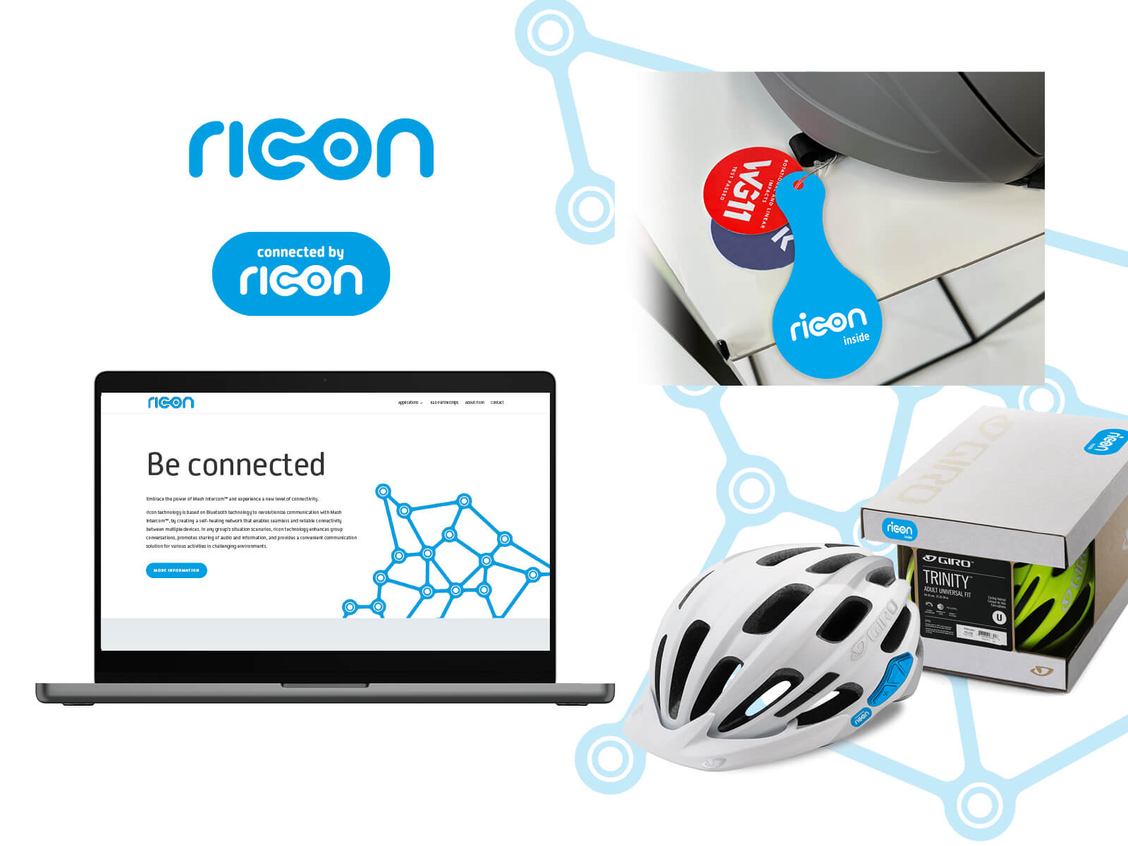
Connected by ricon
The eye-catching blue emblem on helmets and packaging serves as a clear indicator to consumers: this helmet is a smart helmet that enables communication while cycling. This feature is not monopolized by a single helmet brand but becomes a functionality offered by various providers. This benefits all providers, but above all it helps build the market—connectivity is particularly attractive when many potential communication partners are available.
However, it differs visually enough to emphasize ricon’s distinctiveness. At ricon, the connector is also part of the logo, giving it a distinctive look and strong visual impact. In Sena’s imagery, it clearly highlights the product’s benefits and makes the target audience immediately apparent. Furthermore, the connectors also serve as a distinguishing feature for the two connection technologies offered: Mesh and Bluetooth.
What’s next?
The Sena brand will continue to grow—new areas of application are already being implemented, as are new communication technologies. The flexible and versatile new brand identity will support this growth.
// Brand
Client: stekkbar
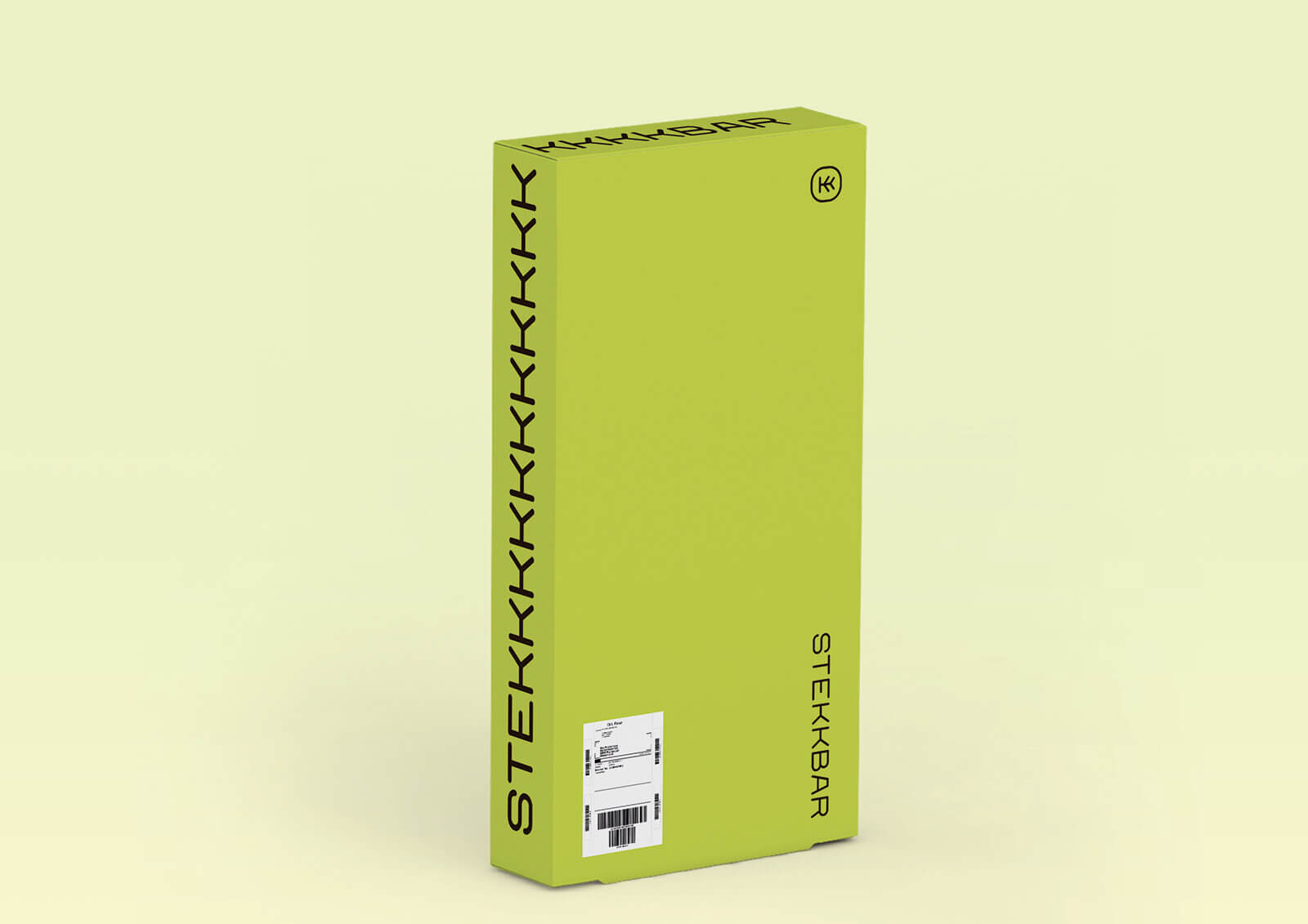
STEKKBAR – sustainable, flexible, scalable
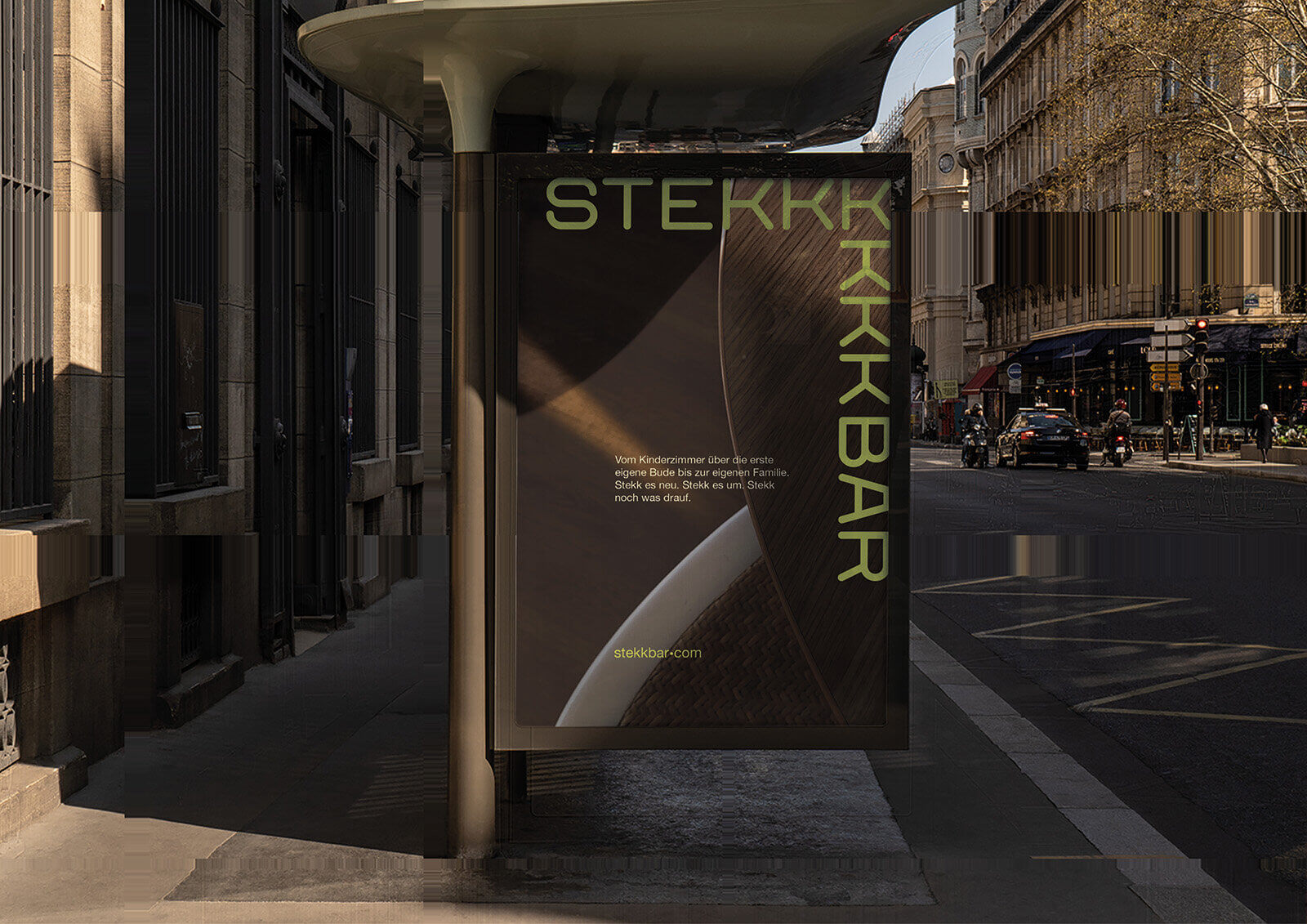
The concept behind STEKKBAR is as simple as it is genius: furniture that can be easily adapted to suit your needs. We developed the perfect brand – one that explains this brilliant idea in all its facets.
The overall result speaks for itself: the German Design Award for product and brand!
Scope of work
Brand Development and Positioning
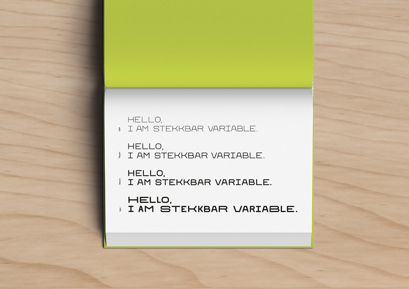
Typeface Development
Appearance
The STEKKBAR Story
Our lives are constantly changing.
WE are constantly changing.
How smart would it be to have furniture that simply adapts to these changes?
That grows with us.
That perfectly fulfills the role we need it to play at any given moment.
That we can adapt to suit our needs. Whenever we need it.
Your STEKKBAR furniture grows with you and stays with you, if you want, for a lifetime: from the nursery to your first apartment to starting your own family.
Plug it in a new way. Rearrange it. Add something else.
Always new, always tailored to you, always 100% wood.
Flexible and sustainable.
From the name to the typeface: A brand identity tailor-made for the product
The brand name says it all: stekkbar. With two “k”s to take advantage of the letter’s furniture-like appearance, for better recognition, and also to secure the corresponding URL.
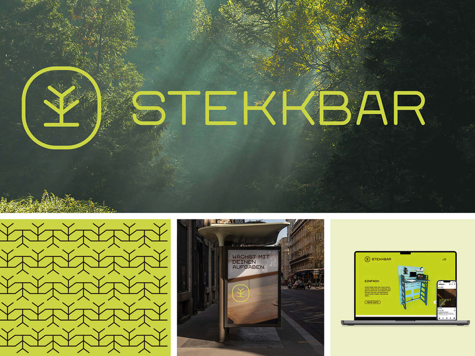
The logo symbolizes what STEKKBAR stands for: sustainability, adaptability, and growing with the user. The stylized tree is composed of the letter K from the “STEKKBAR Variable” typeface, developed specifically for the brand and inspired by the furniture. It, too, can be “stekked” and then forms a secondary design element that is as eye-catching as it is harmonious.
A striking color scheme rounds out the impression: green, of course, for sustainability, but in a fresh, eye-catching shade, accompanied by just two other colors.
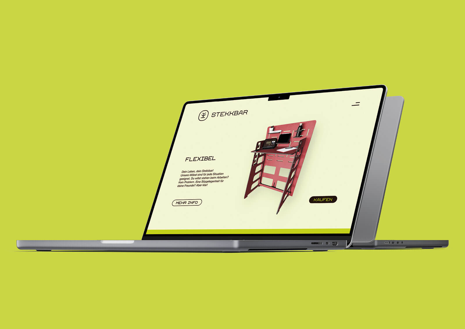
The brand also stands out online for its simplicity; the product and its benefits take center stage as the hero.
Ich freue mich ganz besonders über die großartige Marke und die beiden German Design Awards für STEKKBAR, weil STEKKBAR ein Projekt unserer Azubis ist, für die auch die Zusammenarbeit mit der Agentur eine tolle Erfahrung war.
Martin Tischer, Geschäftsführer
// heimat.verbunden
Client: Goetel
Fiber optics with a home-field advantage. A brand identity that gets right to the heart of the matter.
A corporate vision becomes a brand
Goetel has a vision: “Having been based in Lower Saxony and Hesse for over 20 years, we want to act as a driver of innovation and contribute to digital equality so that everyone can continue to live and work in their home region in the future.”
However, this vision has not yet been reflected in the brand’s communications.
We were given the opportunity to take on this challenge.
Scope of work
Brand development
Brand identity
Brandstory
Home. It sounds a bit old-fashioned. Yet it’s the place where life happens and the future takes shape. We feel a deep connection to our home. To the people, their hopes and dreams, goals, and ideas. They’re all deeply rooted here. Whether they’ve stayed or moved here, they’ve chosen to live and work right here. Just the way they want to. That’s exactly what drives us. We enable people to live the way they want. Where they want, and how they want. We create a strong connection. Between people. To the world out there with all its knowledge, education, and entertainment. To the future.
Those who aren’t connected get left behind very quickly. We provide that connection. For the people and what drives them.
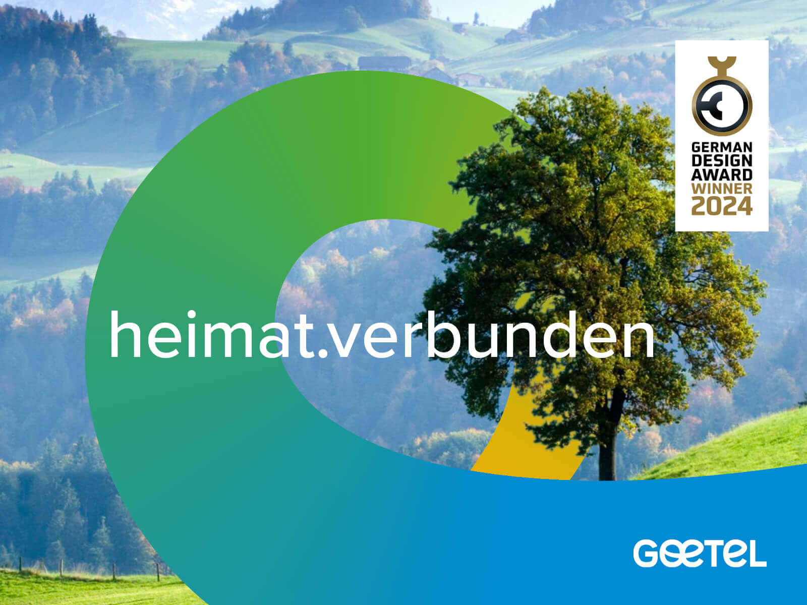
heimat.verbunden
That’s goetel
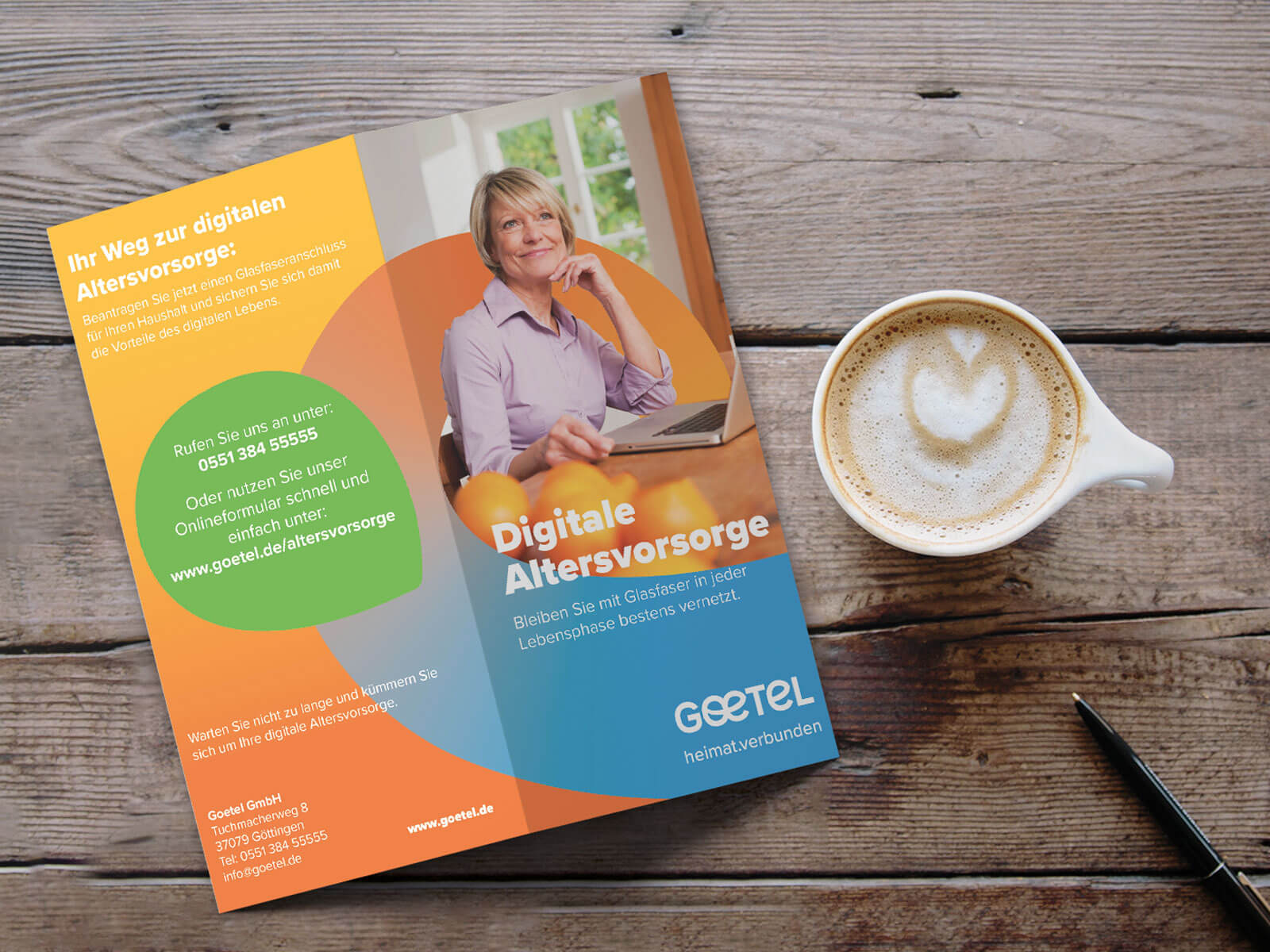
It all began with the brand story, which translated the vision into concrete images and emotions and directly inspired the new tagline, the super symbol, and the new logo.
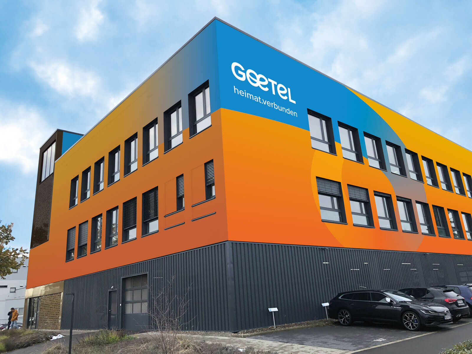
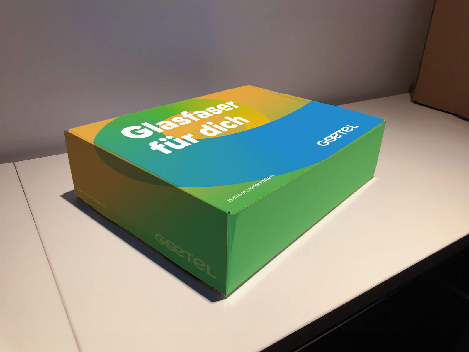
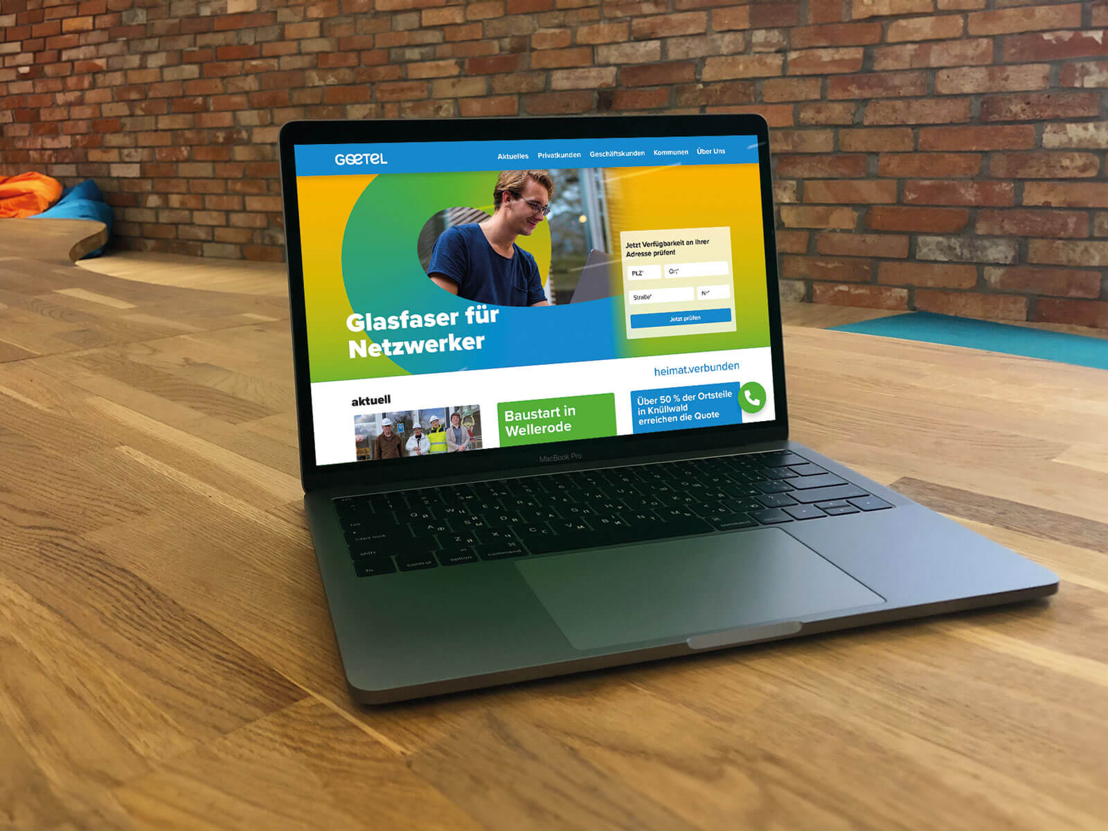
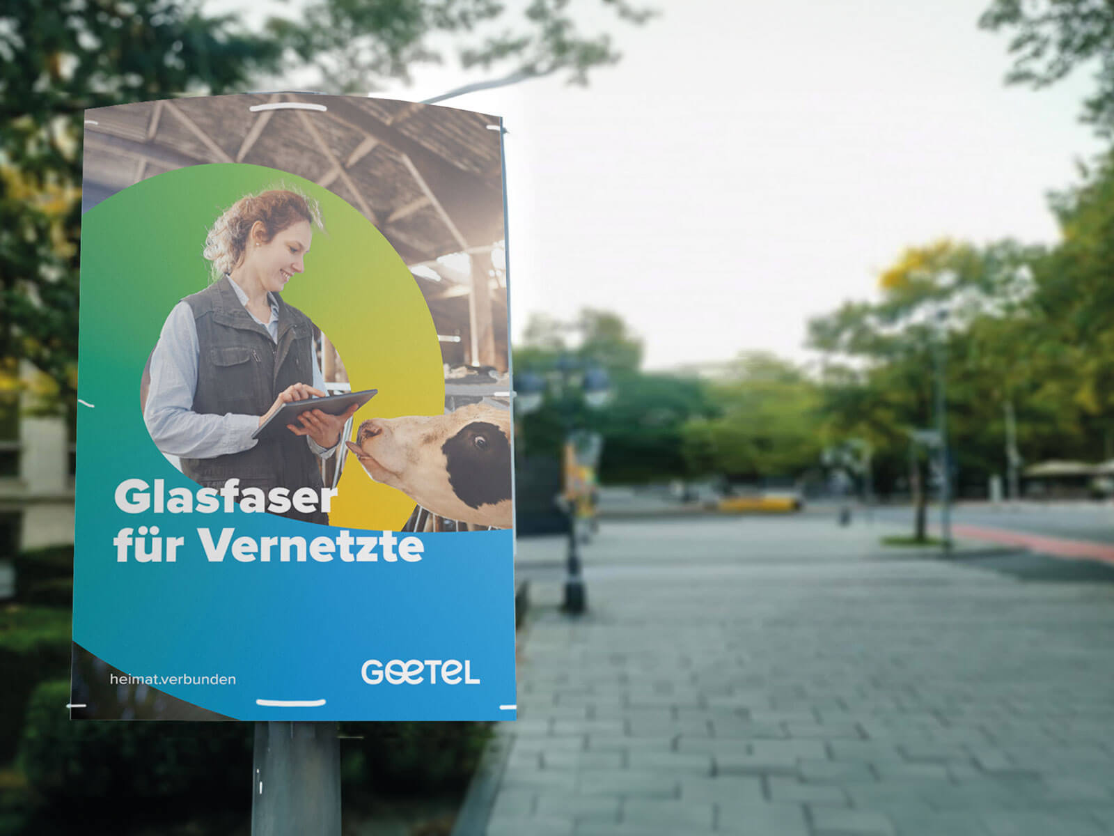
The size of the loop adapts flexibly to the image motif and format. It always ends in the lower right corner and forms the background for the logo. Its gradient consists of two colors and always begins with yellow. The headline explains who fiber optics is important for and will soon be available to. Bring on the future!
The Loop
The super symbol places the people of the region—the very focus of the campaign—at the center. It shows what it’s all about: connection. And it reveals who is speaking, as it is derived from the new logo typeface.
The Logo
Here, too, connection is the central theme: The previously separate vowels “o” and “e” come together, thereby stripping the brand name of much of its technical austerity and conveying emotionality and approachability with their friendly “wink.”
The Tagline
Connected. To home. At home. Fiber optics is the technology of the future. And yet, especially in rural areas, connectivity remains sluggish. It’s not just about faster internet. It’s about equal opportunity. About economic growth. About better education. About preserving the value of one’s property. It’s about living where you want to live. Because you’re connected to home. And still being able to do everything you want. Because home is perfectly connected. Goetel specializes in connecting rural areas with future-proof fiber optics. This turns even small villages into gigabit hubs. Future-oriented infrastructure creates future opportunities, not just in major cities.
The Colors
The traditional Goetel blue, which conveys reliability and tradition—both key factors in choosing a fiber-optic partner—remains a staple and is complemented by bright, cheerful colors with gradients. Movement, passion, endless possibilities—always fresh and personalized.
The Image Motifs
People from the region staying connected—always natural and optimistic, always rooted in their home region, and always connected via fiber optics. But these don’t have to be the classic sofa-and-desk motifs; after all, the internet accompanies us to many places and many workplaces, including some unusual ones.
The size of the loop is flexible, depending on the image motif and format. It always ends in the lower right corner and forms the background for the logo. Its gradient consists of two colors and always starts with yellow. The headline explains who fiber optics is important for and will soon be available to. Bring on the future!
// Brand Development and Communication
Client: helloFiber
Fiber optics at last! Brand development at the speed of light.
From Zero to Local Hero
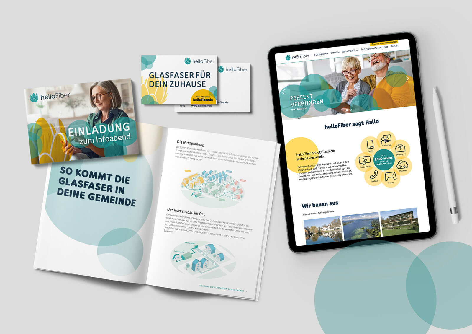
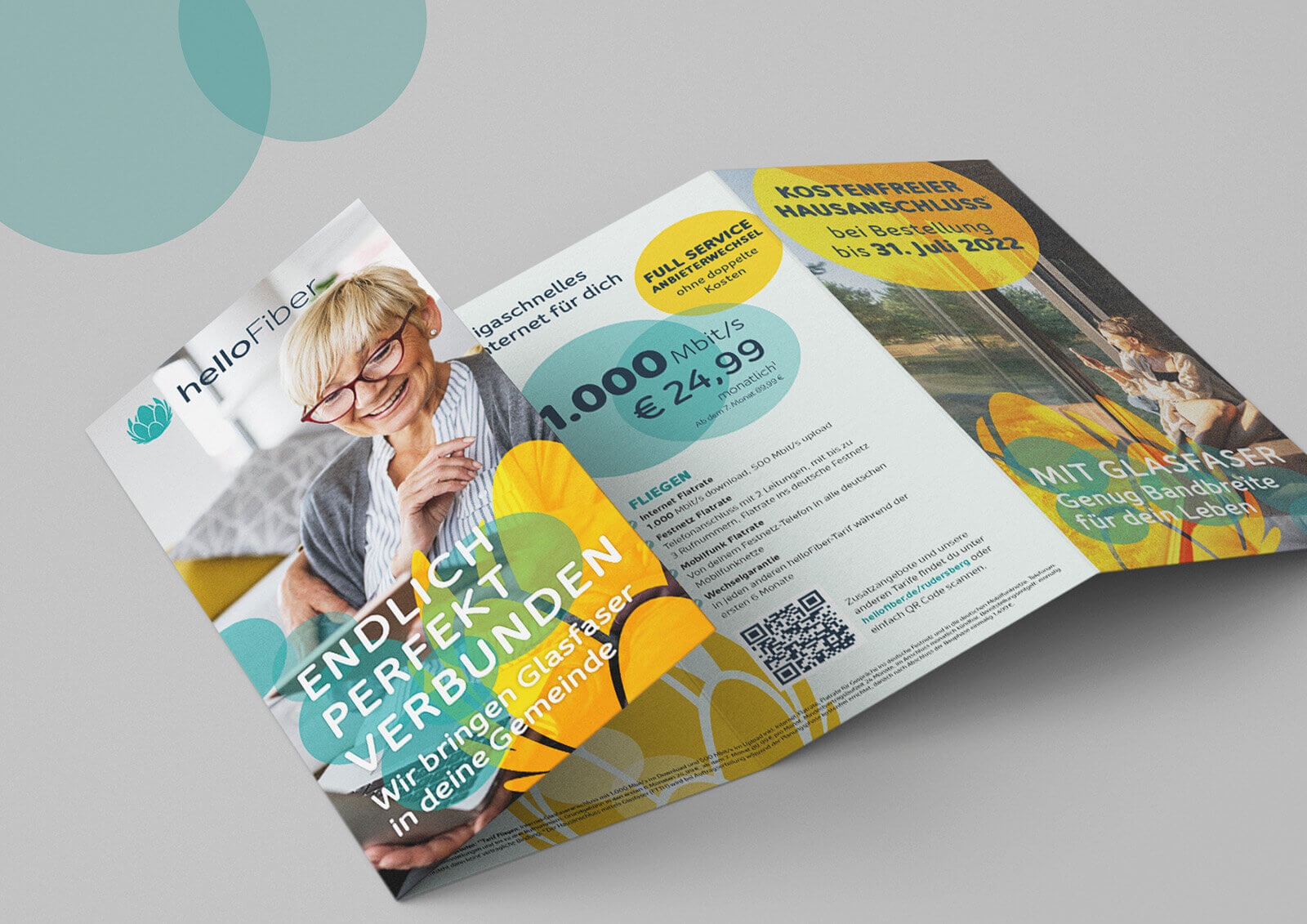
helloFiber is building fiber-optic networks in rural communities that have not yet been connected to high-speed internet. This business model only works if approximately one-third of households opt for a connection and choose one of the internet and phone service packages offered—and they must do so within a very limited timeframe. The challenge, therefore, was to quickly explain the benefits of the new technology and generate demand, while also building trust in the previously unknown brand.
Scope of Work
Brand identity
Communication Strategy
Posters
Website
Brochures, mailings, customer communications
Promotional materials and giveaways
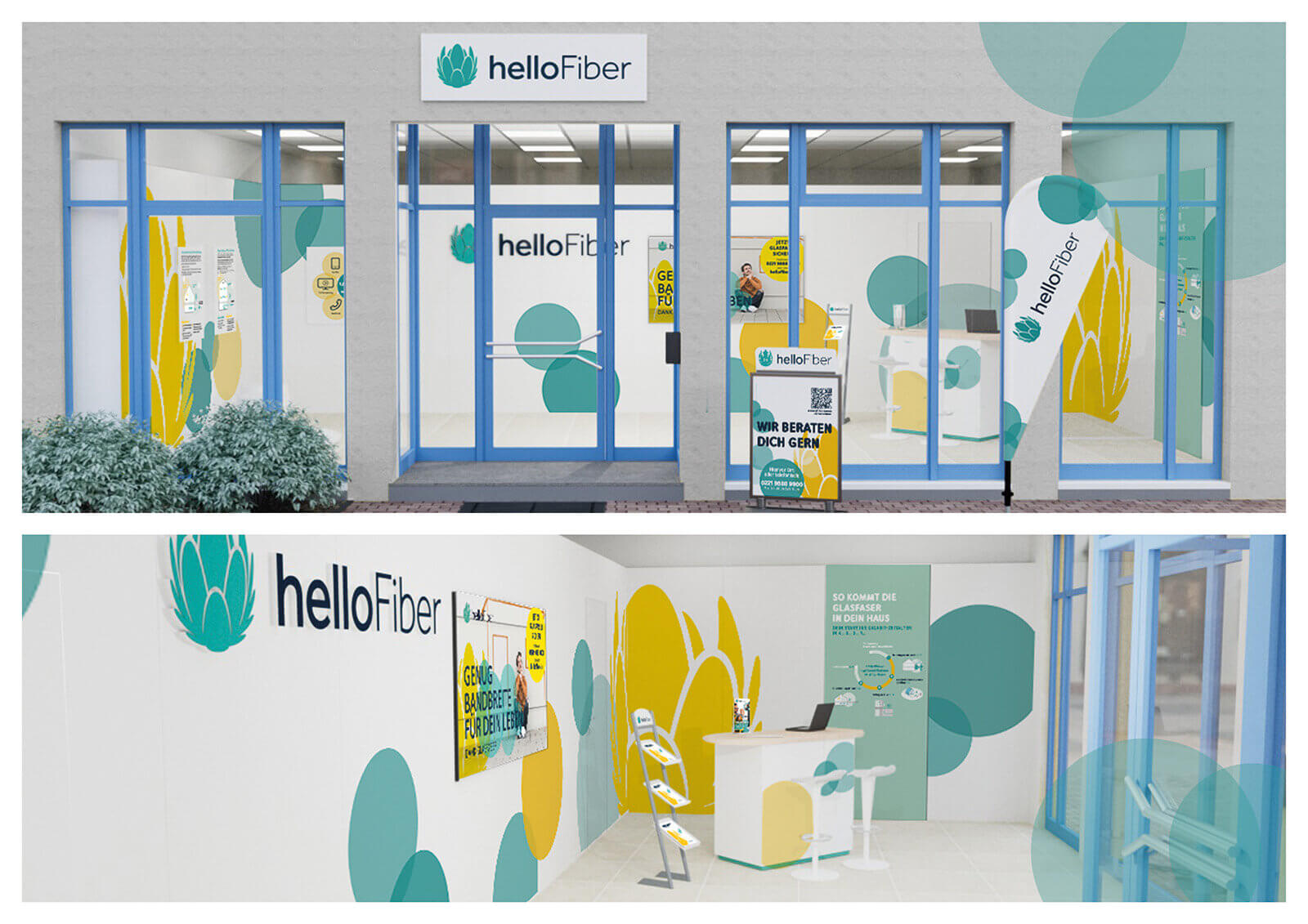
Construction Site Communication
Color concept
Catalog Concept
The Task
A new brand, a challenging market, a unique challenge: helloFiber provides fiber-optic internet connections to rural communities that have not yet been served by high-speed internet. This requires massive investments in building out the fiber-optic network. To make this feasible, approximately one-third of households must be convinced to sign a contract within a specific timeframe.
The brand must therefore build trust in just a few months, explain the technology, and generate demand for a product that customers won’t receive for several months or even years.
Light as the central theme
The focus is on the core benefit: internet at (almost) the speed of light.
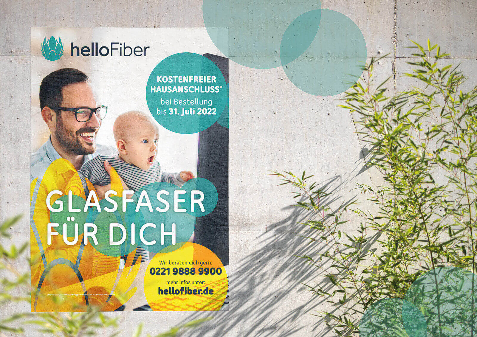
The light points in the design and the semi-transparent super symbol pick up on this theme. But it’s not primarily about technical aspects; rather, it’s about light, joy, and connection, which bring the perfect connection into people’s lives. Cheerful pastel colors, a design with plenty of white space, and imagery that conveys joy and surprise clearly convey the positive mood.
Perfectly Connected
From explaining the technical advantages to highlighting the immediate benefits of lightning-fast browsing and gaming, all the way to the emotional benefits—the perfect connection with other people—the campaign brings the advantages of the new internet to life on every level.
helloFiber Says Hello
The brand always comes across as friendly and approachable. From the bright colors and light-filled design to the informal “you” address, helloFiber presents itself as an approachable ally for a perfectly connected life.
The brand name helloFiber underscores the communicative aspects of fiber-optic technology and the friendly, open attitude of the brand personality. The Bloom, as part of the logo, demonstrates the company’s telecommunications expertise.
Bloom as a mark of origin
The “Bloom,” used on its own as a distinctive design element, is the established brand of a global market leader in telecommunications products—one of helloFiber’s parent companies—and thus serves as a mark of origin and proof of expertise. The bright yellow of the Bloom creates warmth—fitting for a product that connects people with their friends and family.
Seal of Trust
The “100% Fiber Optic” seal reaffirms the commitment to quality: it signifies true fiber optic connectivity across the entire route—Fiber to the Home.
Light speed even on the so-called “last mile.”
heimat.verbunden
Communication in Three Phases
Communication in the target regions takes place in three phases.
Phase 1 focuses on building brand awareness and establishing trust.
Fiber optics is presented as a technology that creates seamless connections between people. The tone is relaxed and cheerful—it just works.
In Phase 2, the benefits of fiber-optic technology are demonstrated through use cases that show how fiber optics makes life easier, more pleasant, more exciting, more entertaining… simply better. Brand-specific illustrations explain the product and the technology without overwhelming the reader.
Phase 3 is about convincing those who are still undecided. Emotional imagery is deliberately avoided; the focus is on facts and the urgency of signing up now to secure future-proof internet not only for oneself but for the entire community.
// Brand development, positioning, interior design
A trip around the world in one place
A fresh start for an old container ship: It’s set to become a trendy city hotel in the harbor.
Scope of work
Naming
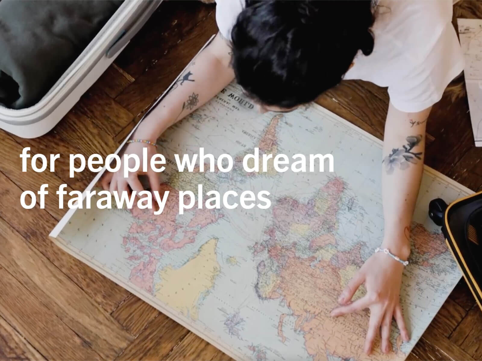
A hotel for global citizens
The result was a truly unique hotel concept designed for truly unique people: Global Citizens. People who feel at home all over the world and draw inspiration from cultures, architecture, and landscapes. People who enjoy daydreaming about faraway destinations even on a short trip and are always on the lookout for something special.
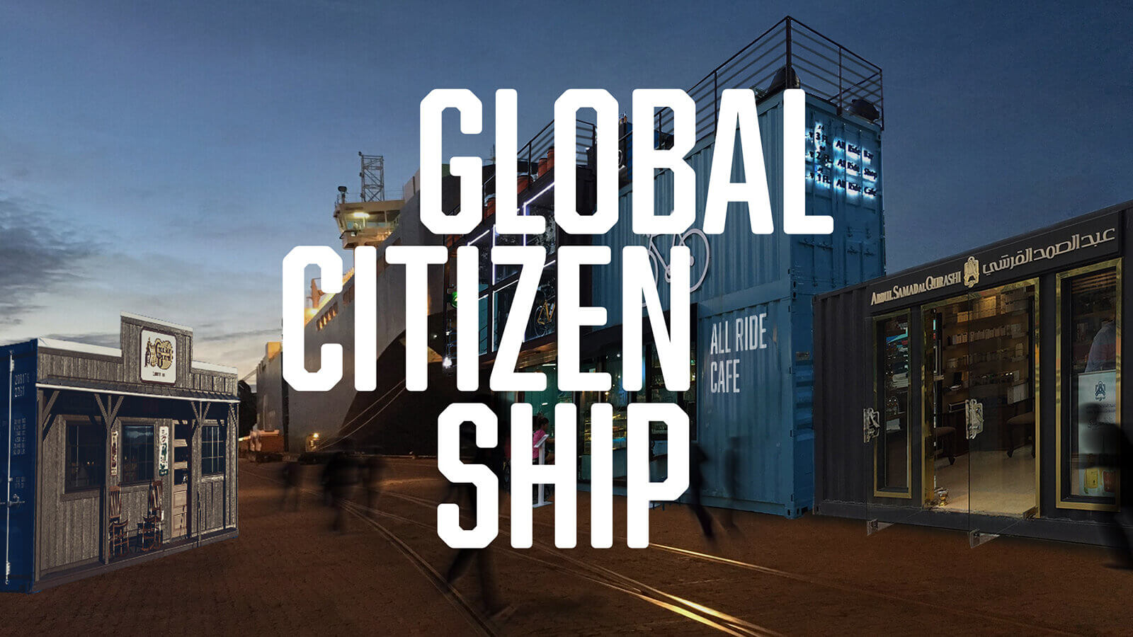
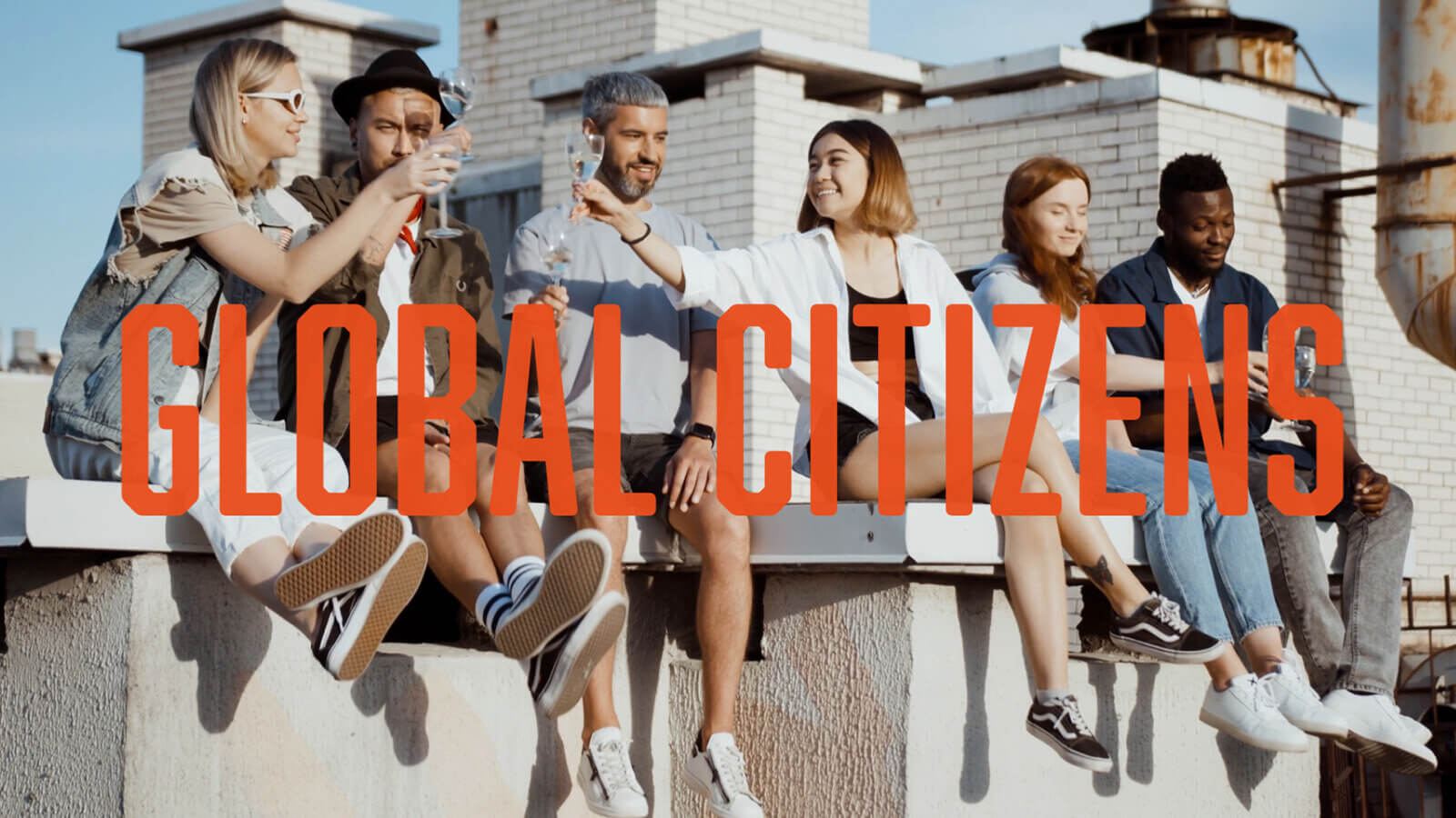
The Allure of Seafaring
When you step aboard a ship, you leave everyday life behind and begin to dream of faraway places. This is especially true when that dream world has an authentic setting—the ship and the containers are real, and the feeling that every corner is brimming with adventure is no illusion.
Containers are global citizens made of steel
A ship that has sailed the world’s oceans has come home—and like any old sea dog, it has plenty of stories to tell. Retired shipping containers are transformed into spaces that continue to carry within them the world they have traveled. They are filled with trendy venues from every continent. Colors, patterns, and interior styles transport guests to foreign lands—with authentic flair.
Diversity over uniformity
In a world where globalization often means that when you wake up in a hotel room that meets “international standards,” you can’t tell whether you’re in Sydney, Singapore, or Stuttgart, we’re taking the opposite approach. We pack the world into containers and bring it to our guests.
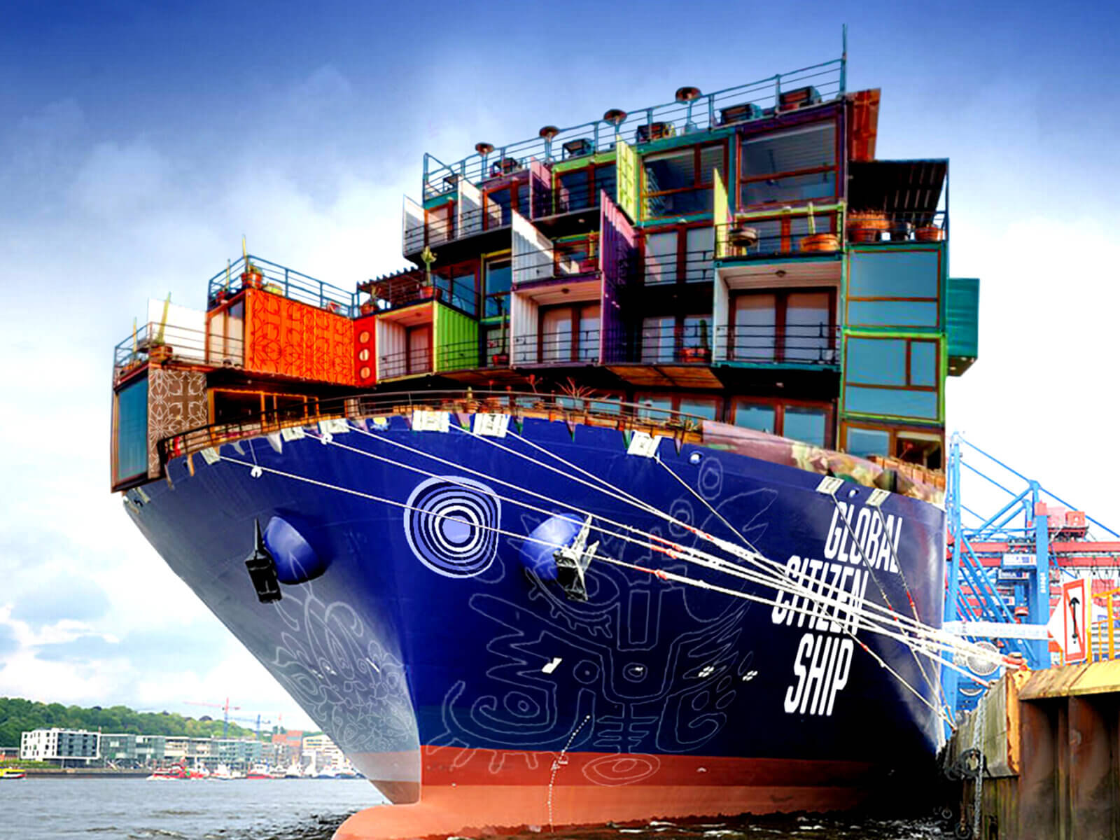
Just a quick trip around the world
With Global Citizenship, you can take a quick trip to your favorite faraway destination or go on a weekend-long trip around the world—all without jet lag, whenever you feel like it, and with a small carbon footprint.
With Global Citizenship, a city break becomes a long-distance trip, the hotel becomes an attraction in its own right, and the stay becomes a cruise with no environmental impact.
// Brand development
Client: njju
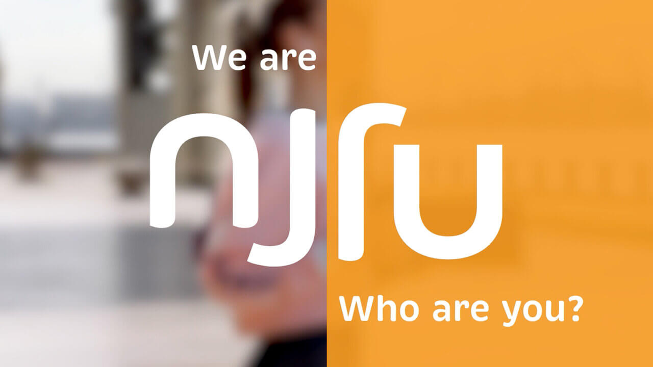
We are njju – who are you?
Our current lifestyle is depriving future generations of the resources they need to survive. Young people around the world are speaking out against this. This young generation is looking for trustworthy brands and products.
njju stands for upcycling and fair working conditions. In workshops, “waste” generated by the fashion industry in India is transformed into something new. Something new. The new new. njju, in other words.
Scope of work
Logo
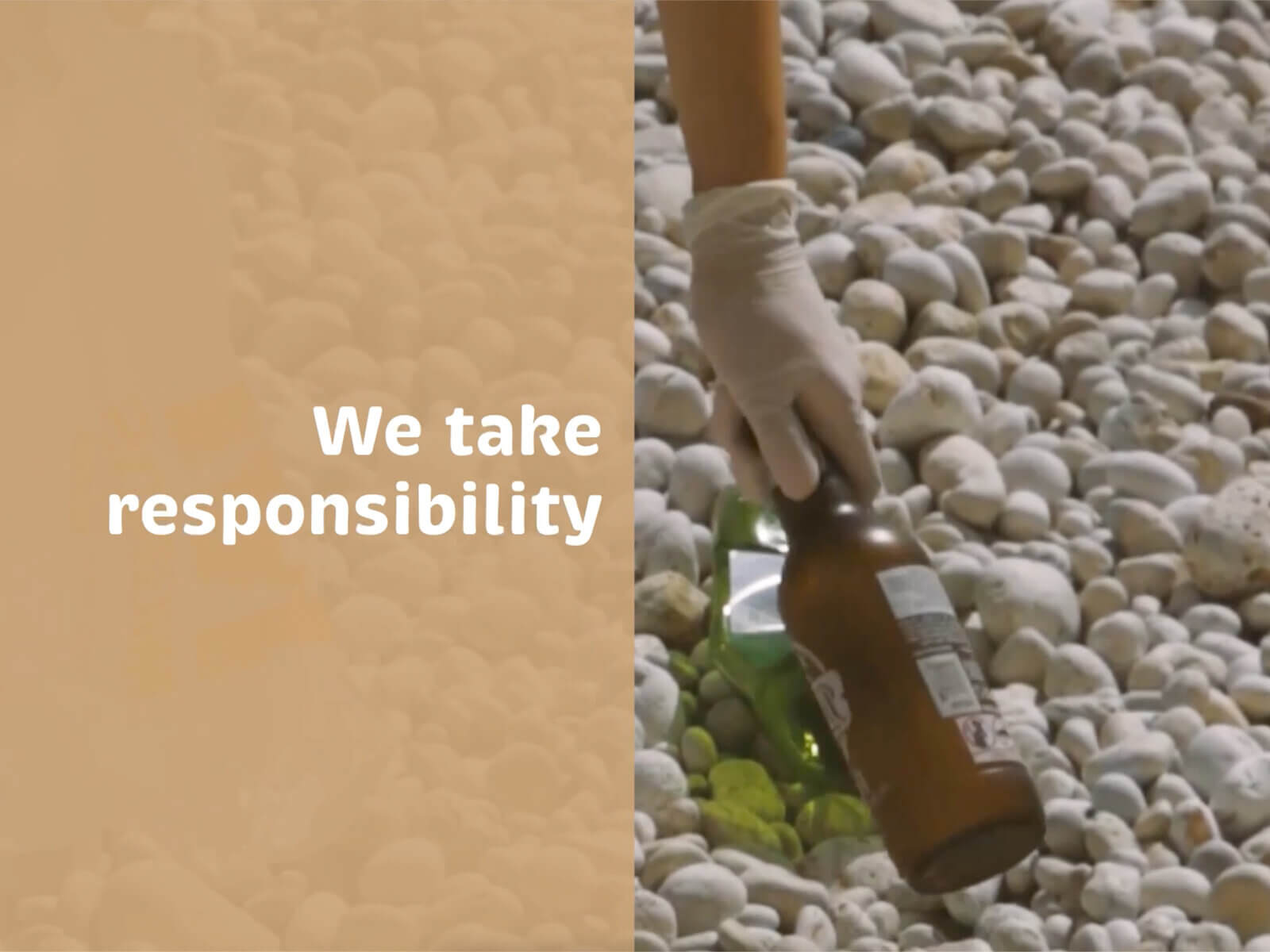
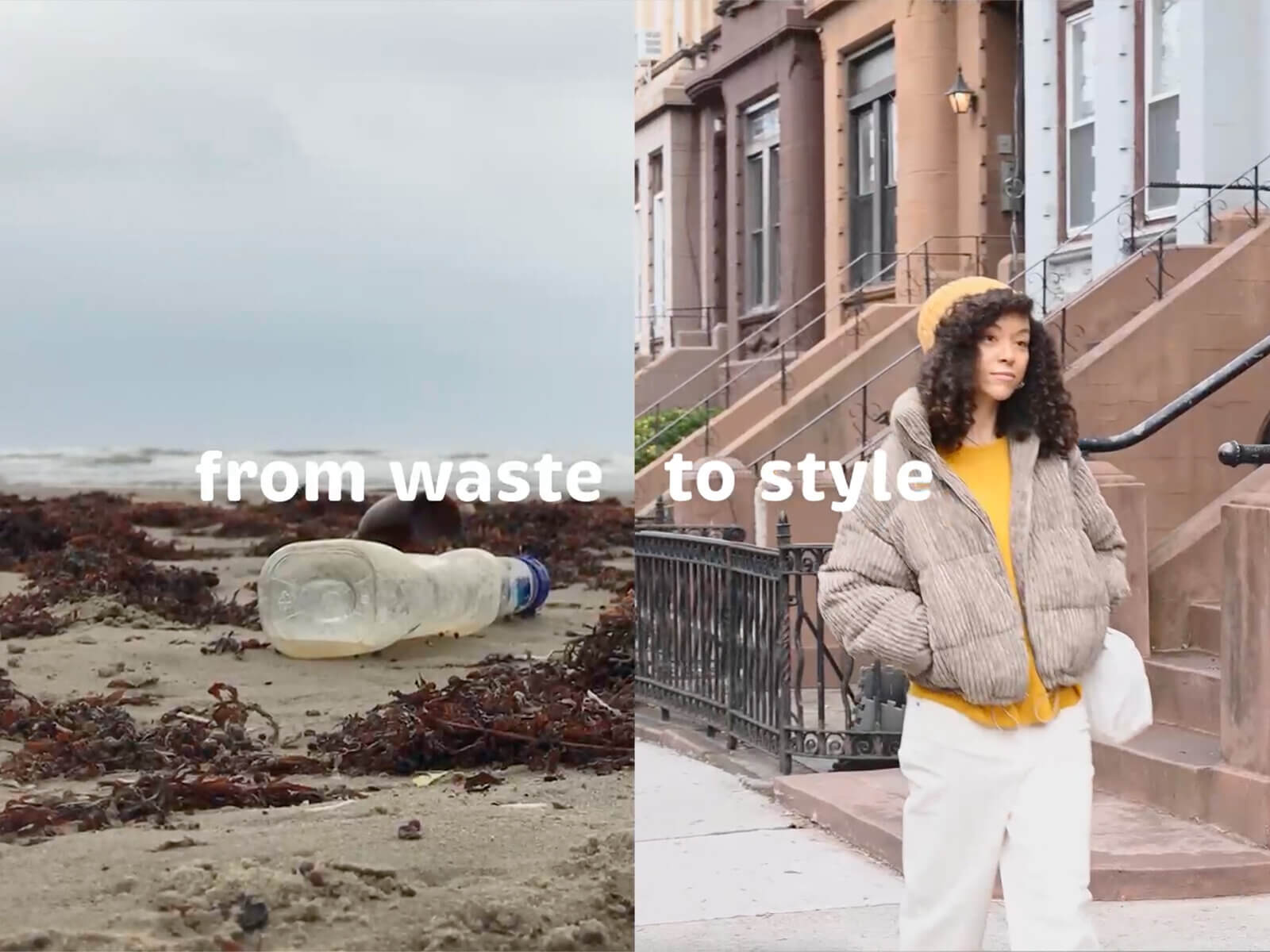
njju
A new lease on life for valuable raw materials.
A new lease on life for women in India and their families.
A new label for conscious consumers.
njju, that is.
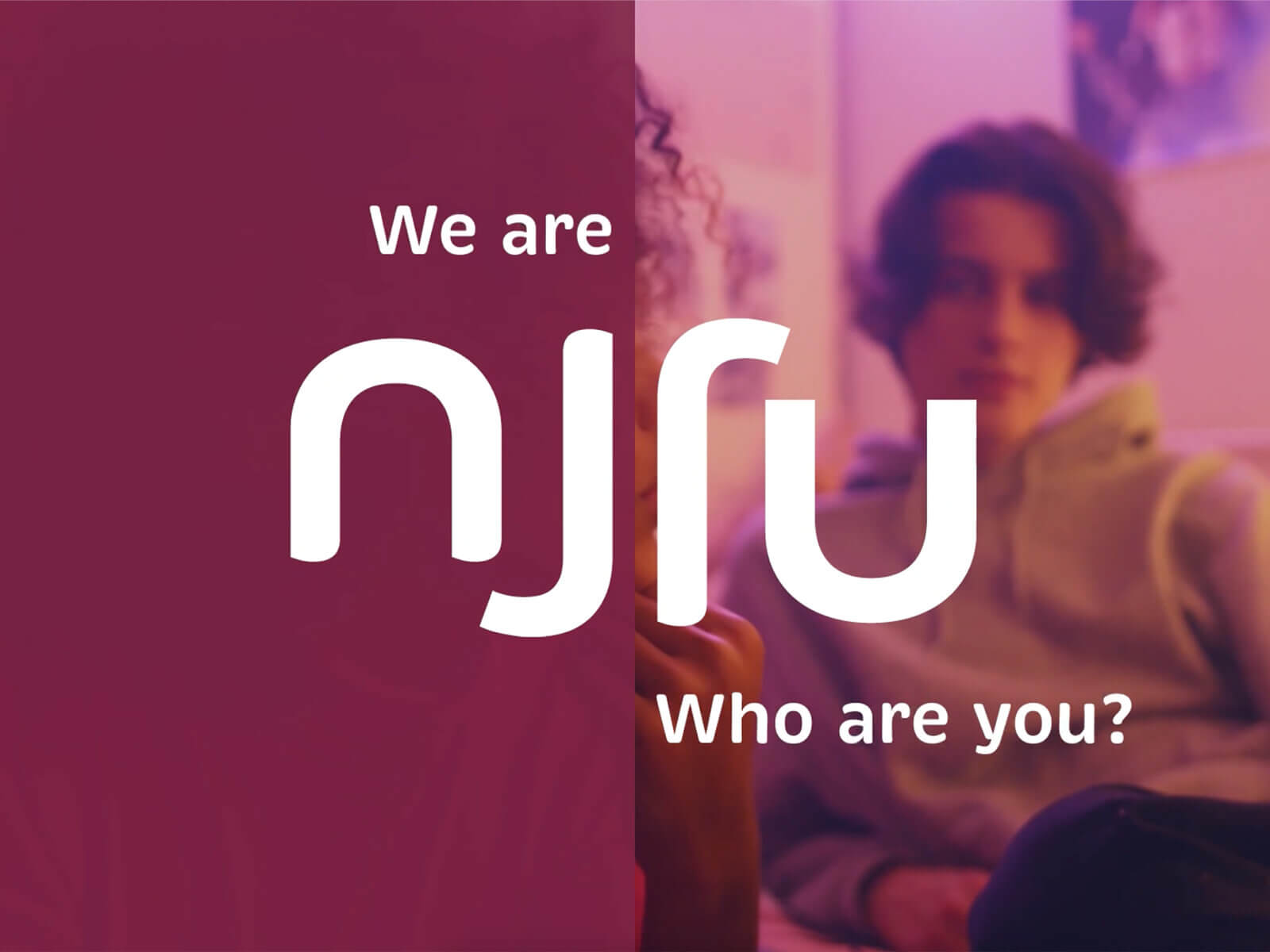
Circular economy
Recycling in the sense of downcycling isn’t enough; the goal is a true circular economy—raw materials aren’t wasted, but are reused again and again in new ways. That’s njju.
We are njju, who are you?
Solving big problems requires a community, a global movement. People all over the world who share the same goals and adjust their consumption habits accordingly. Without having to give up fashion. That’s njju.
Vegan leather made from car tires
The first product: a bag made from vegan leather crafted from old car tires. A problematic waste product is transformed into a new raw material, and trash becomes fashion. Manufactured in Indian workshops under fair working conditions.
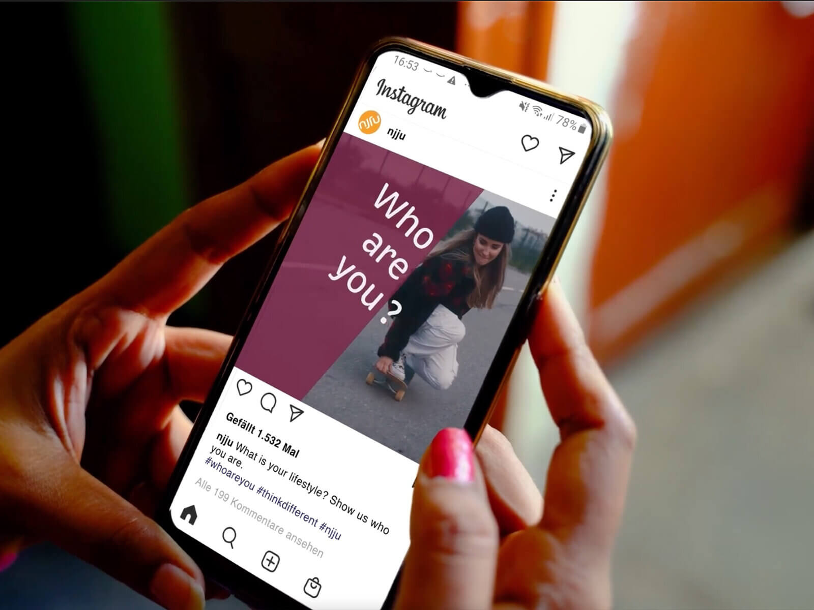
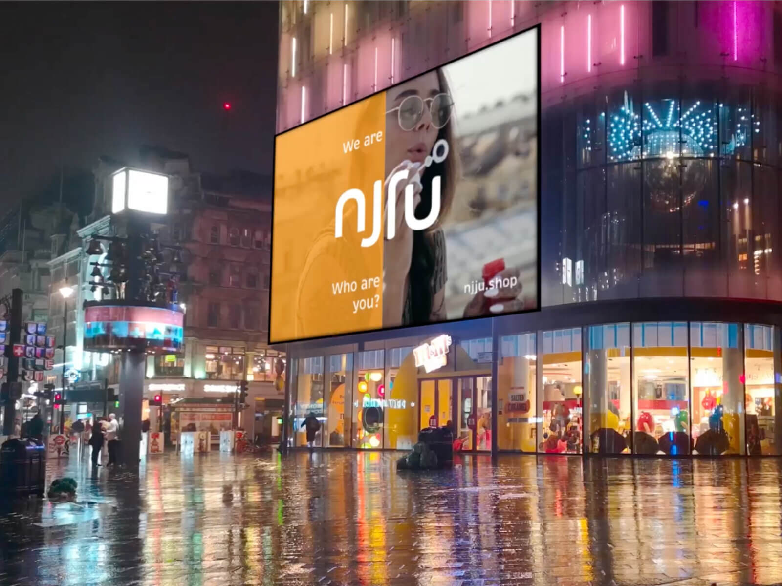
„We are njju, who are you?“ Logo, Markenname und Claim treffen perfekt: Es geht um mehr als Recycling, es geht um echte Kreislaufwirtschaft. Es geht um mehr als um Konsum, es geht um eine globale Bewegung.
Shailaja Rangarajan, Founder njju
// Repositioning and Branding
Client: PrimaSol
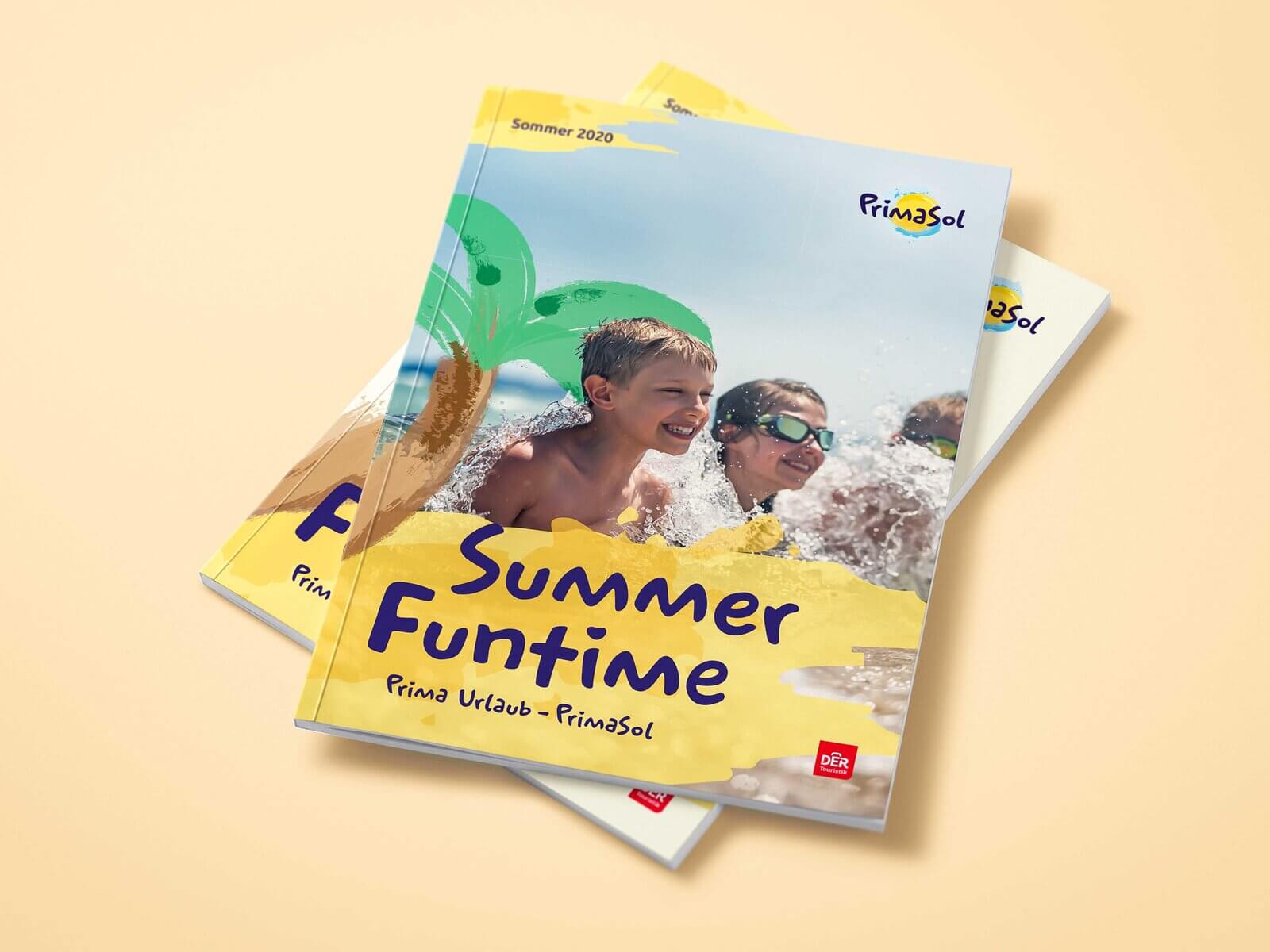
The recipe for a perfect family vacation
The PrimaSol Hotels offer everything you need for a wonderful family vacation. The hotels have now been given a fresh new look and a communication strategy that brings that vacation feeling to life with every customer interaction.
Scope of Work
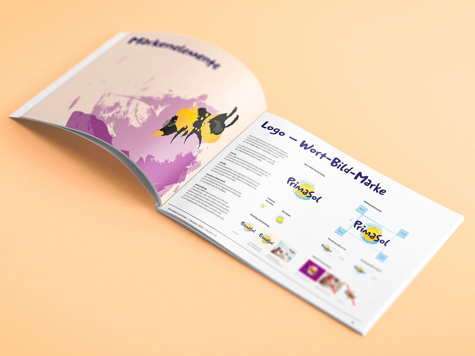
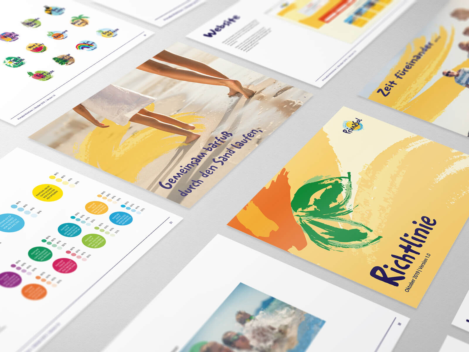
Since no existing typeface conveyed the desired sense of joie de vivre and lightheartedness, a PrimaSol typeface was developed. To enhance the typeface’s liveliness, the glyphs for frequently used characters are varied in the body text.
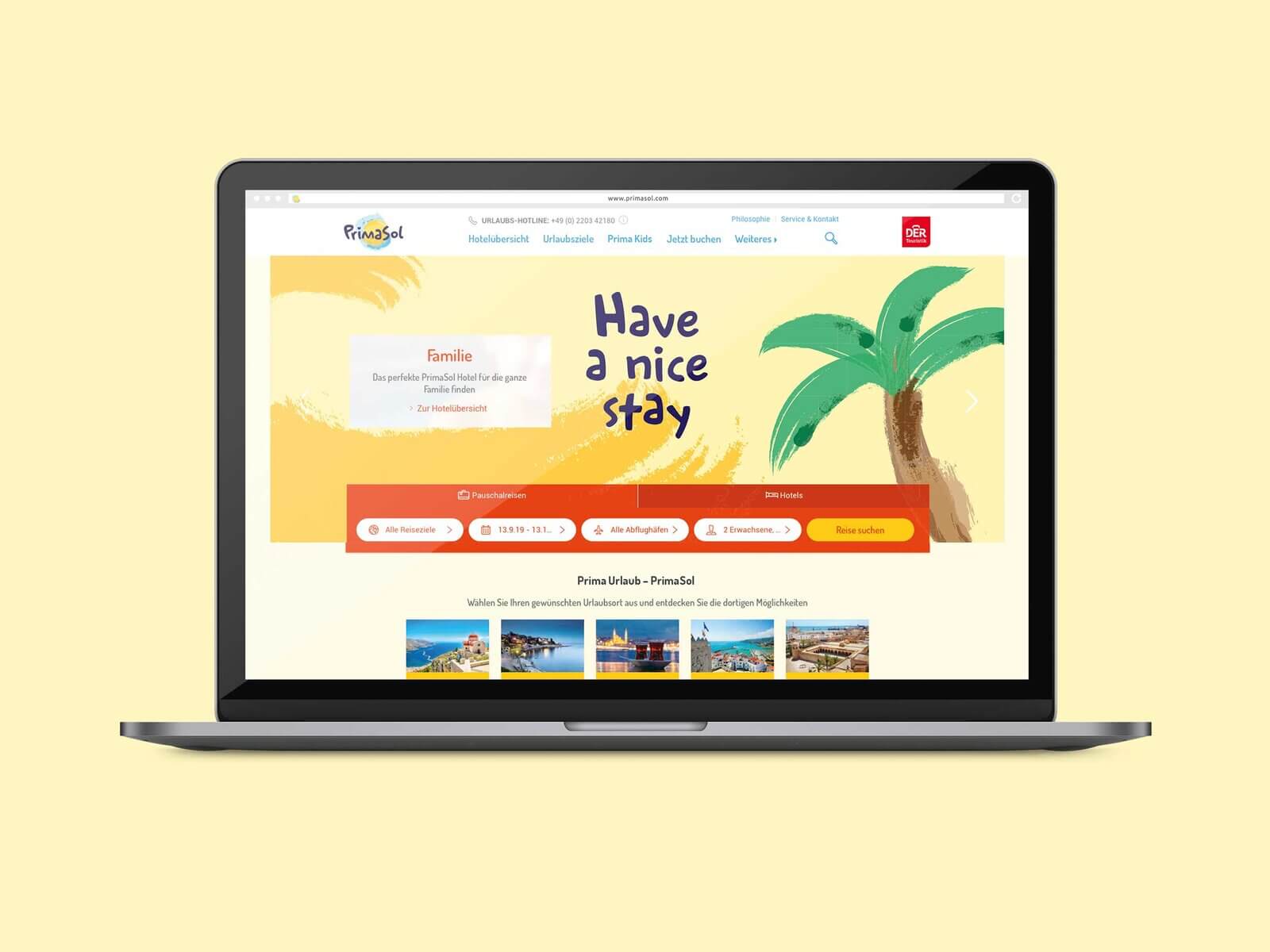
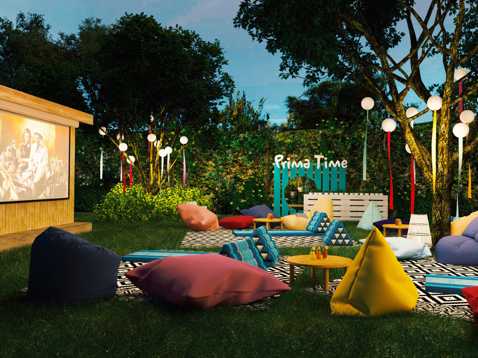
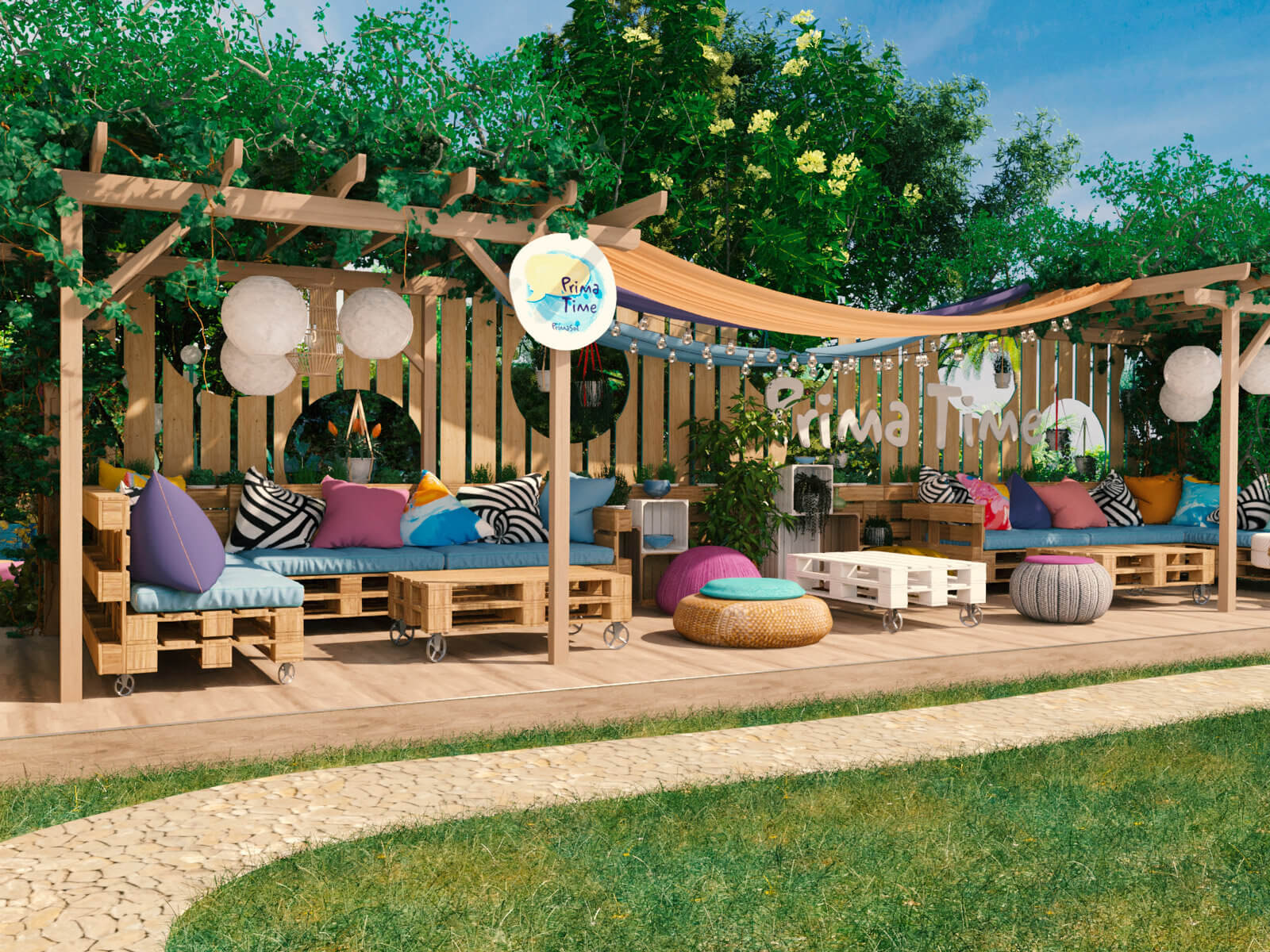
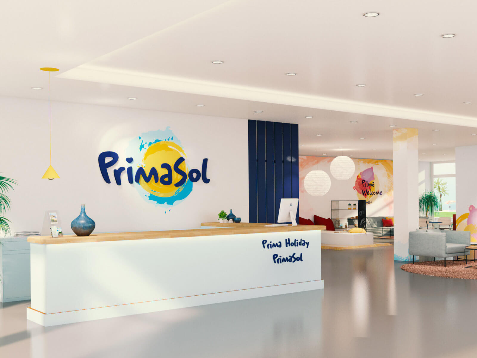
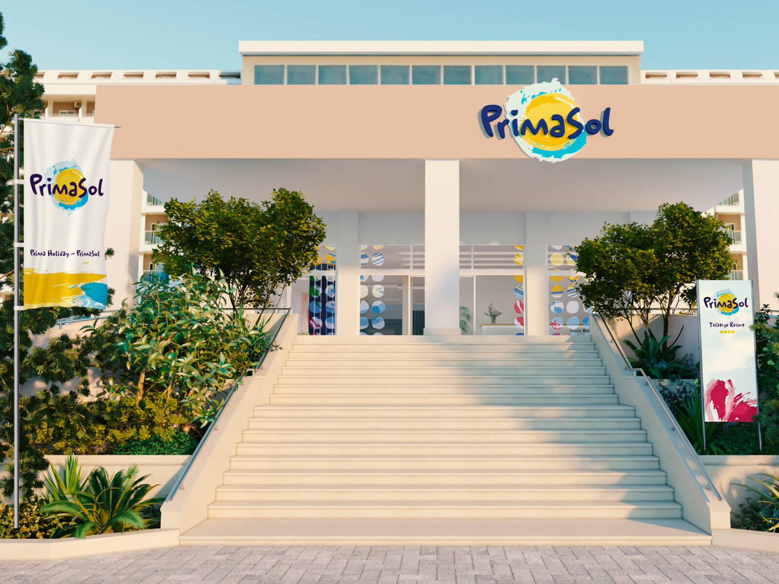
Prima Auftritt der PrimaSol-Familienhotels in frohen Farben, eigenständiger Hausschrift und bunten Bereichs-Icons für ein prima Urlaubsgefühl vom Katalog bis zum Check-out. Variable Markenidentität als sonniger Begleiter durch denTag und durchs Hotel mit Gute – Laune – Garantie.
Rat für Formgebung
// Brand positioning and corporate design
A valuable brand had become outdated, and its appearance no longer matched the product. We modernized and emotionalized the brand – now the anticipation of long-distance travel begins with the very first contact.
MEIERS WELTREISEN is “The specialist for everything far away.”
Scope of Work
Redesign Logo
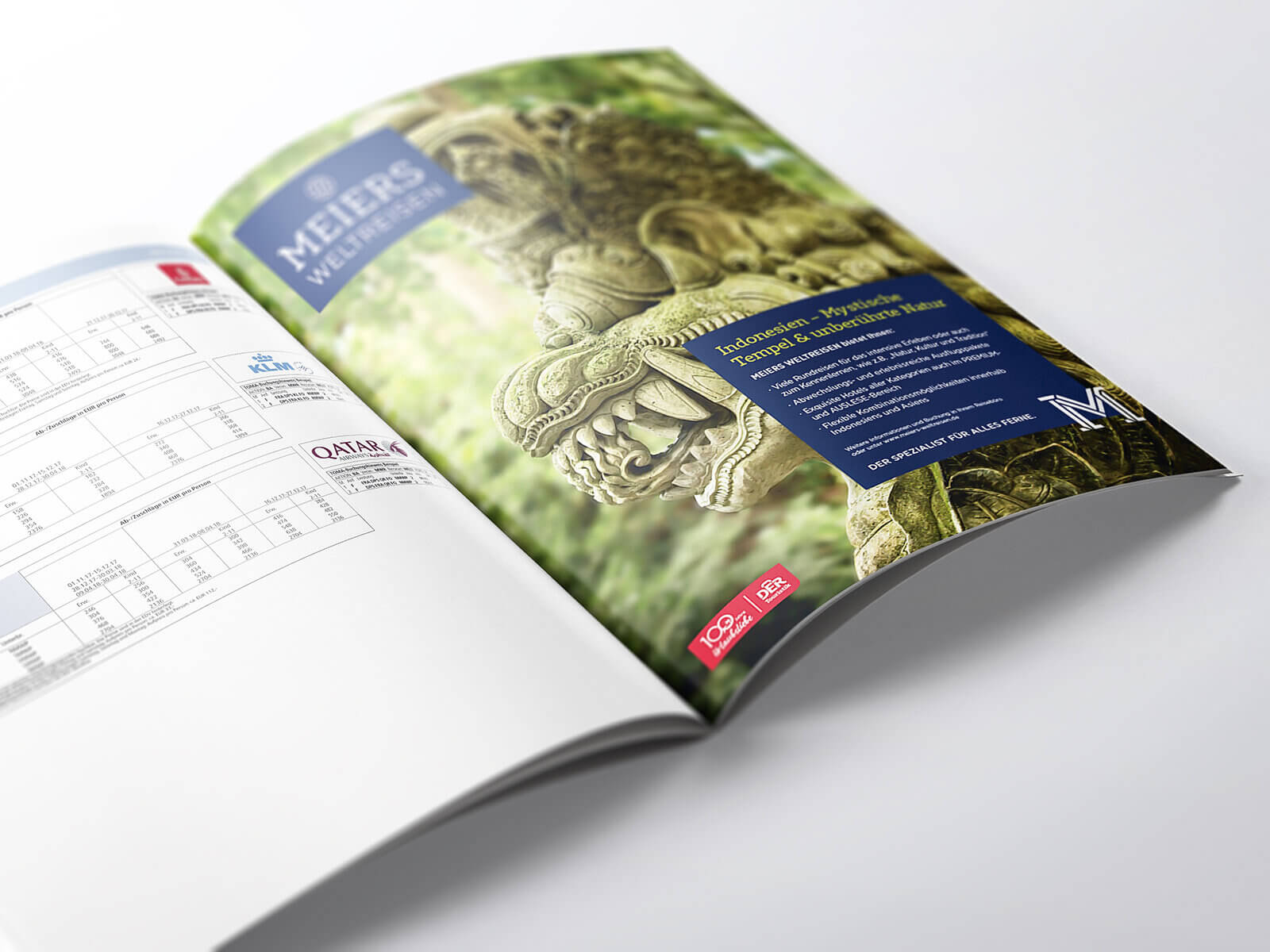
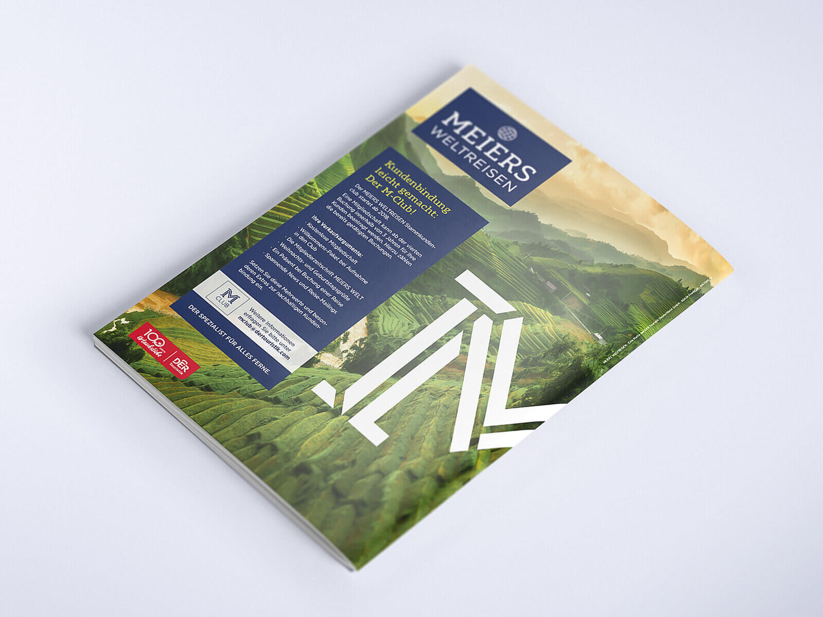
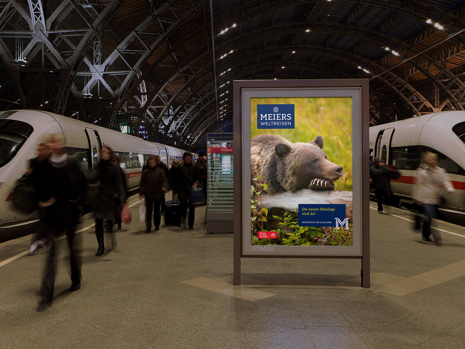
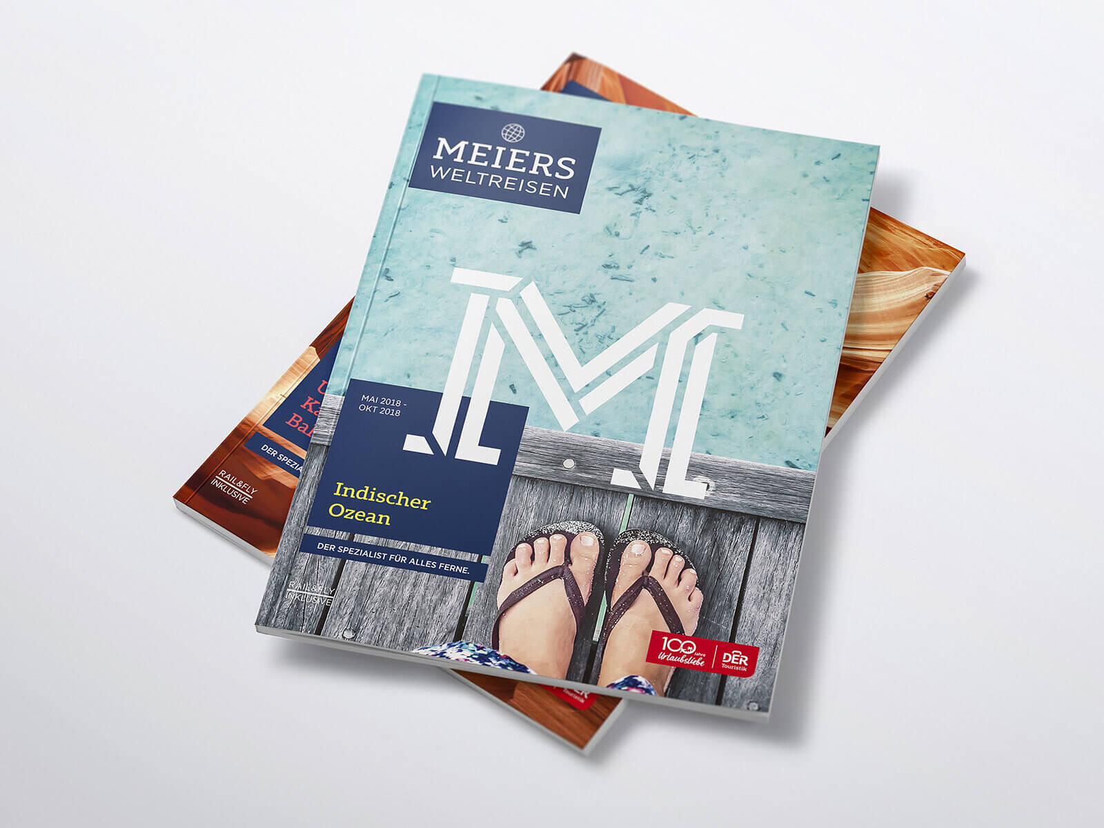
The logo underwent a subtle refresh and now appears significantly fresher without losing its recognizability. Alongside the logo, a large “M” was introduced as a monogram and secondary design element. It ensures quick brand recognition across all communication materials and makes the visual identity unmistakable.
The traditional Meiers blue was retained and complemented by six modern secondary colors. The visual language was completely reimagined. Detail imagery is used on catalog covers and in advertisements—views that you only see when you are there yourself. The viewer experiences the world from the perspective of an attentive traveler. The visual language is further enhanced by unusual environmental motifs beyond typical postcard imagery. In contrast, the imagery becomes very specific in the context of concrete sales offers.
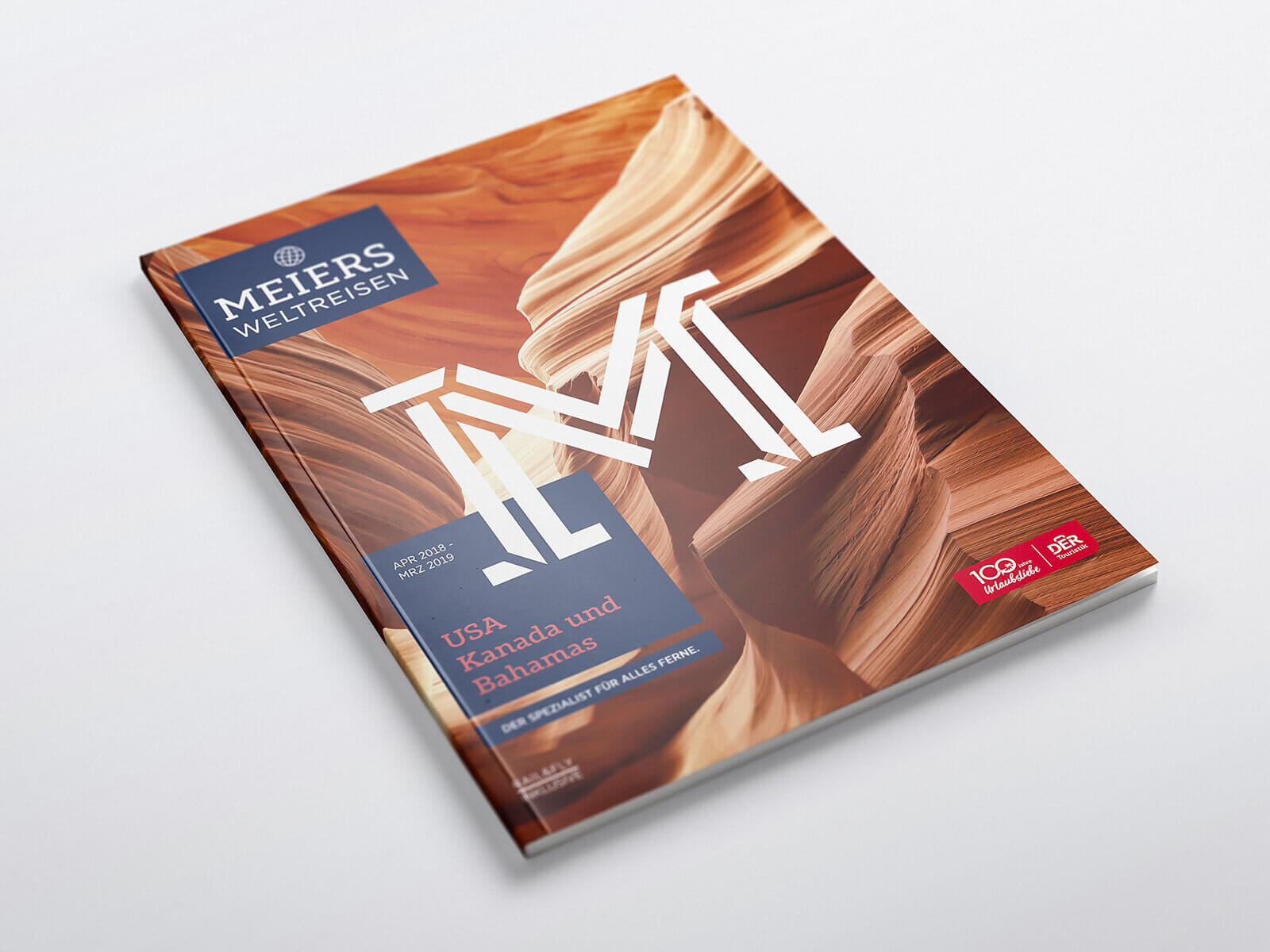
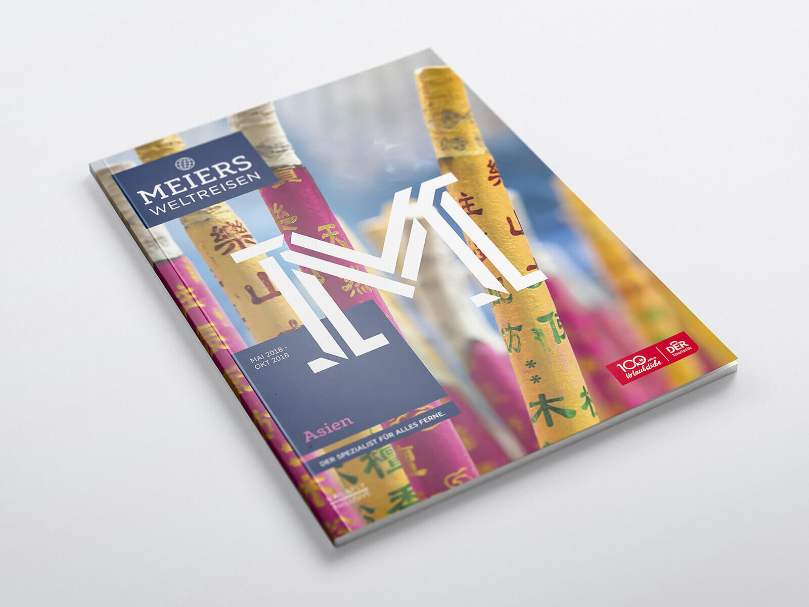
The new brand appearance clearly stands out from the competition and impressed us with its emotional appeal – it inspires a desire to explore distant destinations.
Lars Bolle, Vice President Group Brandmanagement & Strategic marketing for DER Touristik GmbH
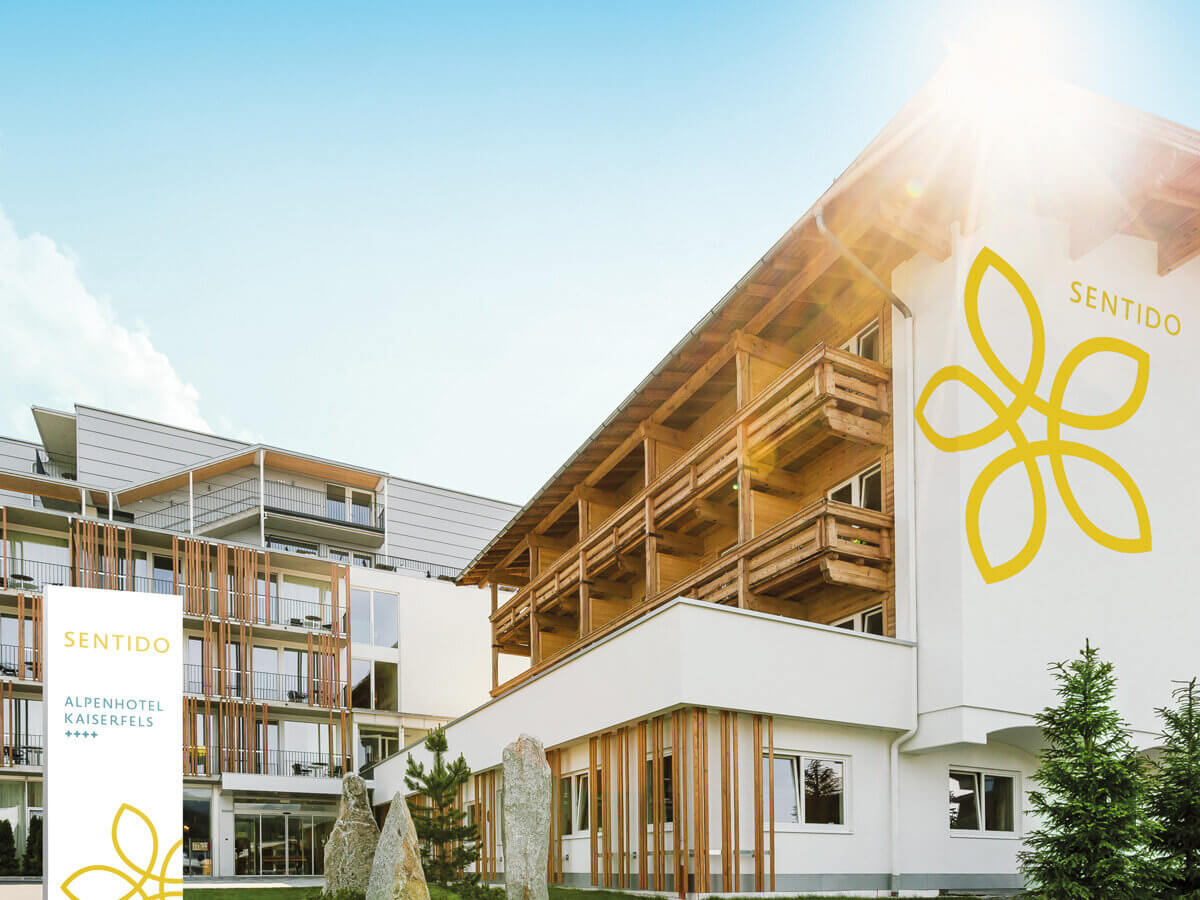
// Brand migration
Two hotel brands were to become one. Since the hotel chain lti of DER Touristik and the newly acquired chain Sentido were very similar in their philosophy and positioning and also targeted the same audience, this was a logical step.
Based on the shared brand core of the Sentido and lti hotels (enjoying a vacation with all five senses), a new brand appearance was developed that incorporates and refines characteristic elements of both existing brands.
Scope of Work
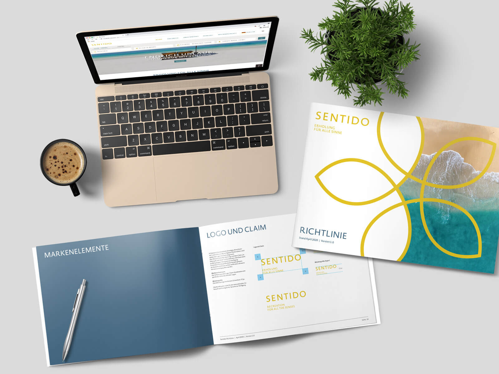
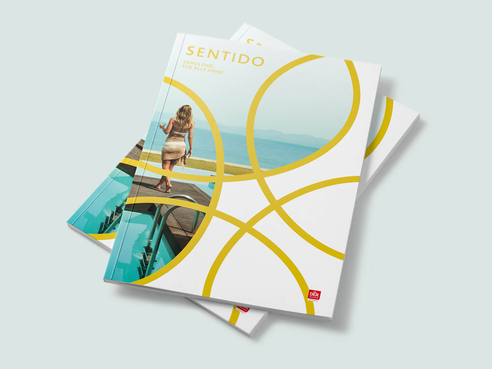
To create the logo, the brand name Sentido was connected with the lti font and the lti color gold. Also typical design elements of both brands were combined into a new, harmonious appearance, which additionally has received an expanded color palette.
Through this, an appearance emerged that can flexibly adapt to the respective hotel environment. Every Sentido hotel is therewith unique and yet unmistakably a Sentido. The brand appearance adapts to the country- and building-specific framework conditions, so that the individuality of the houses is preserved. The guest experiences ‘their’ Sentido always familiar, but everywhere new
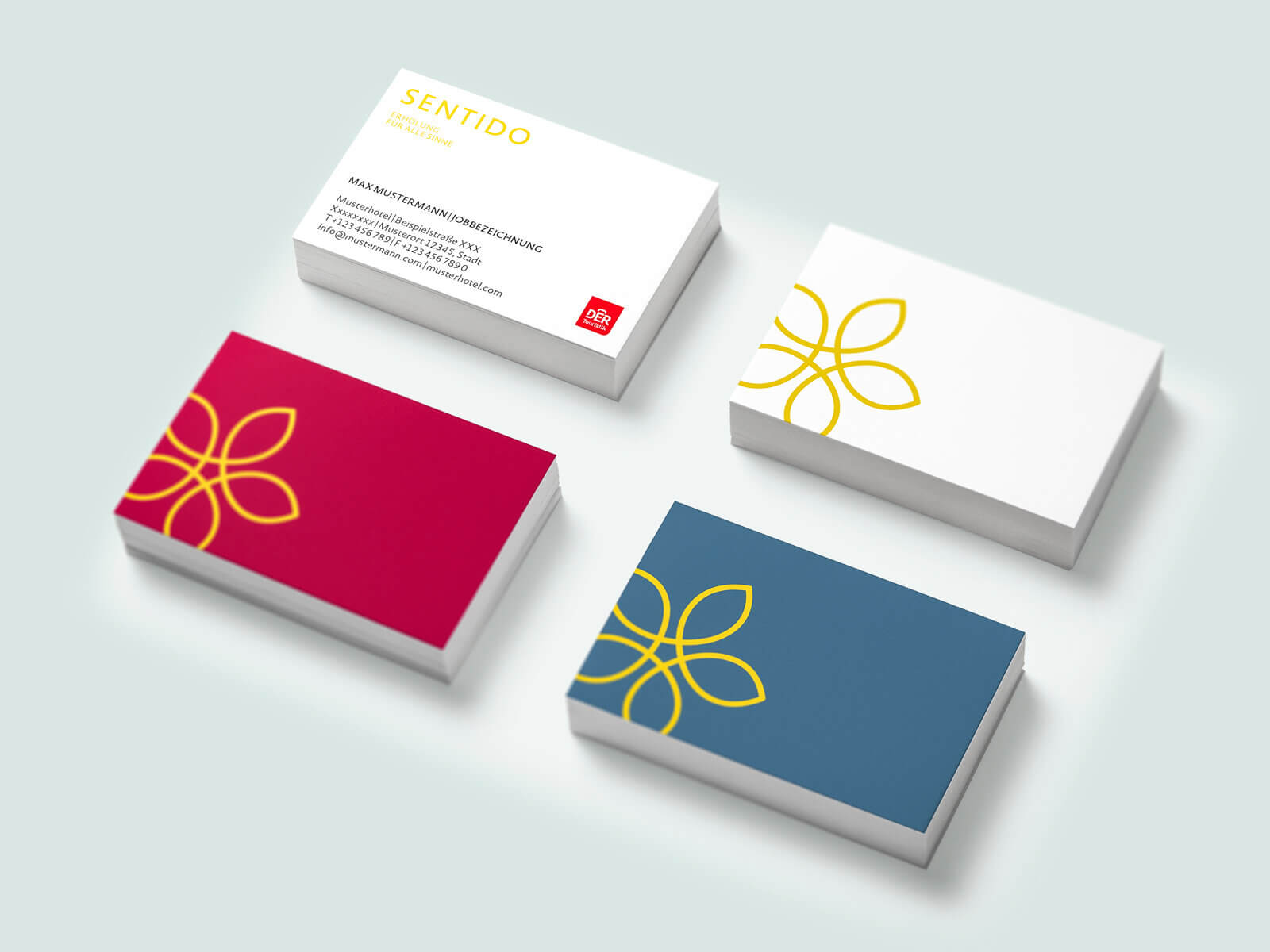
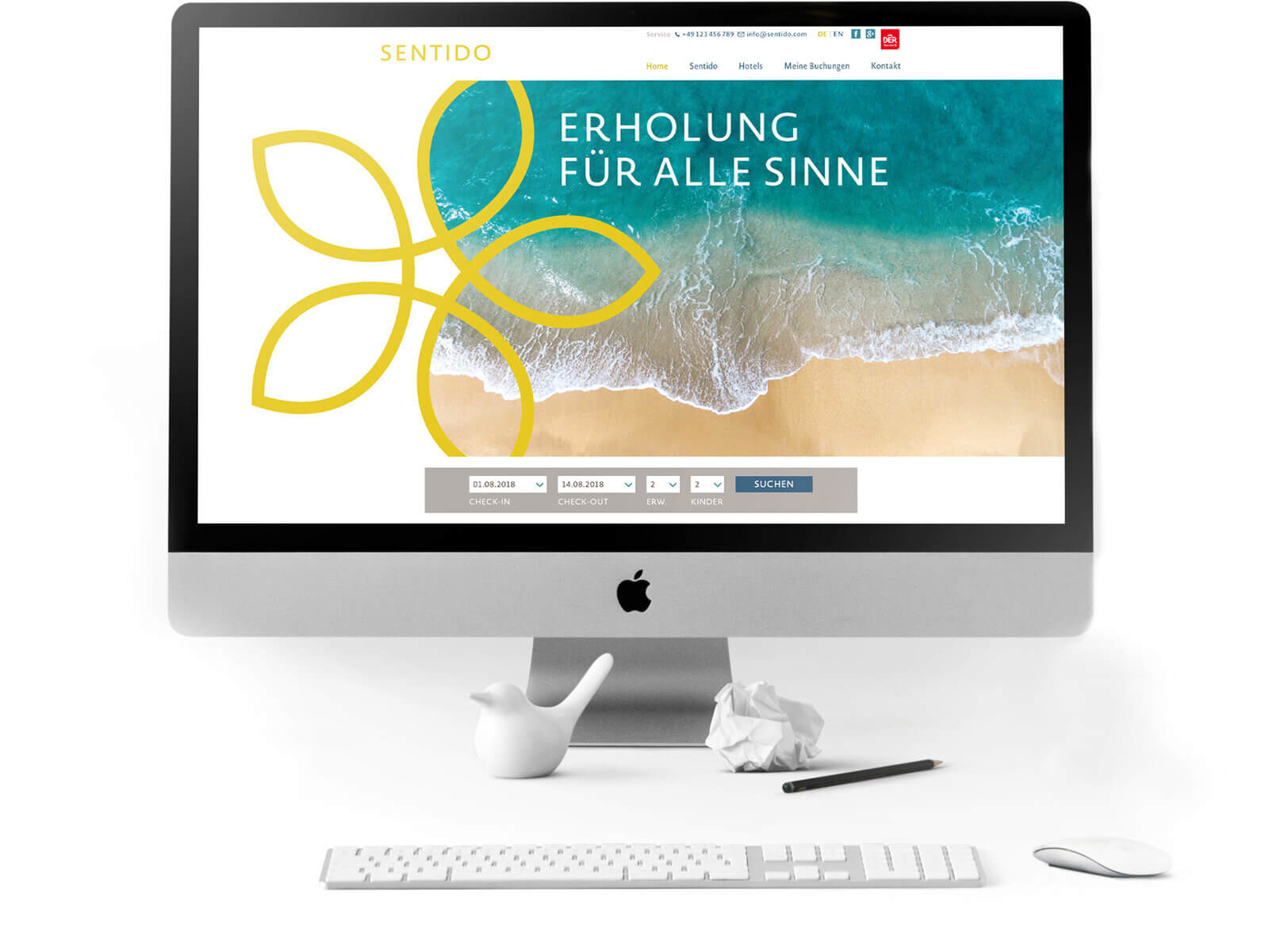
The hints of the traditions of the host country and the creative freedom that the brand appearance leaves for the personality of each individual house make every hotel a completely individual experience for all senses.
Brandbook as an acquisition tool
The flexibility of the appearance allows not only, next to the beach hotels, to gather also other destinations, e.g. Alpine hotels, under the umbrella Sentido, but also makes the brand interesting for previously independent hotels. Thus, the brandbook for hoteliers, which ensures that the brand is lived consistently everywhere, is at the same time an ideal acquisition tool.
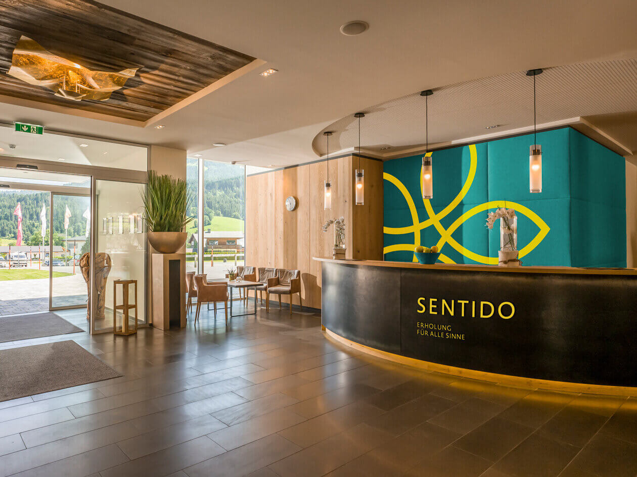
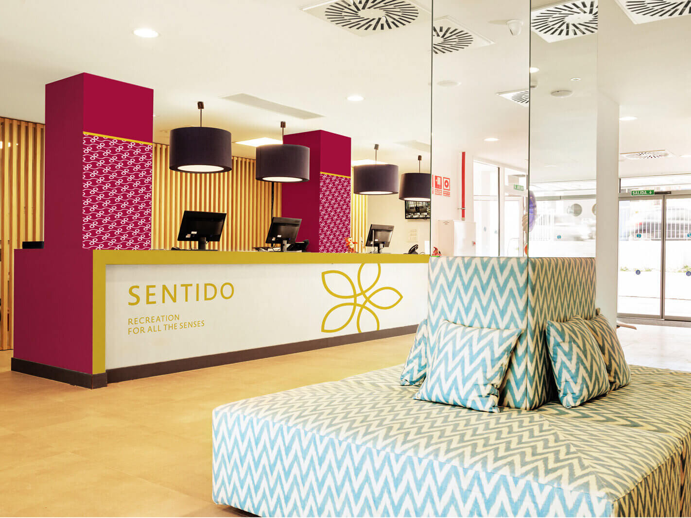
Sensuous appearance that conveys the individuality and authentic flair of the houses and destinations of Sentido in an unmistakable way. In the center a blossom as the embodiment of the five senses. Sensitively it conveys the message: Sentido celebrates vacation as an experience and relaxation for all senses.
German Design Council
// Communication concept and internet marketing
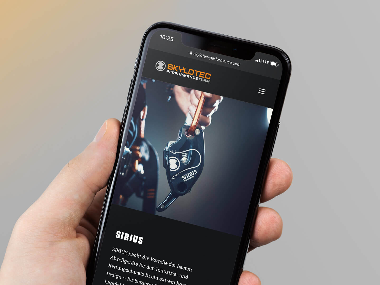
Skylotec GmbH is among the leading manufacturers of personal protective equipment against falls (PPE) and rescue systems in the fields of sports and industry. However, the positive image of the brand was previously very rational. An emotional bond was to be built and strengthened with professional climbers, especially the ‘stars’ of the industry, the RBA climbers (Rope Based Access). In addition to a stronger and more emotional brand image, brand awareness was also to be further increased. Skylotec was no longer to be perceived as a manufacturer, but rather as an expert in the field of fall protection.
Scope of Work
Videos
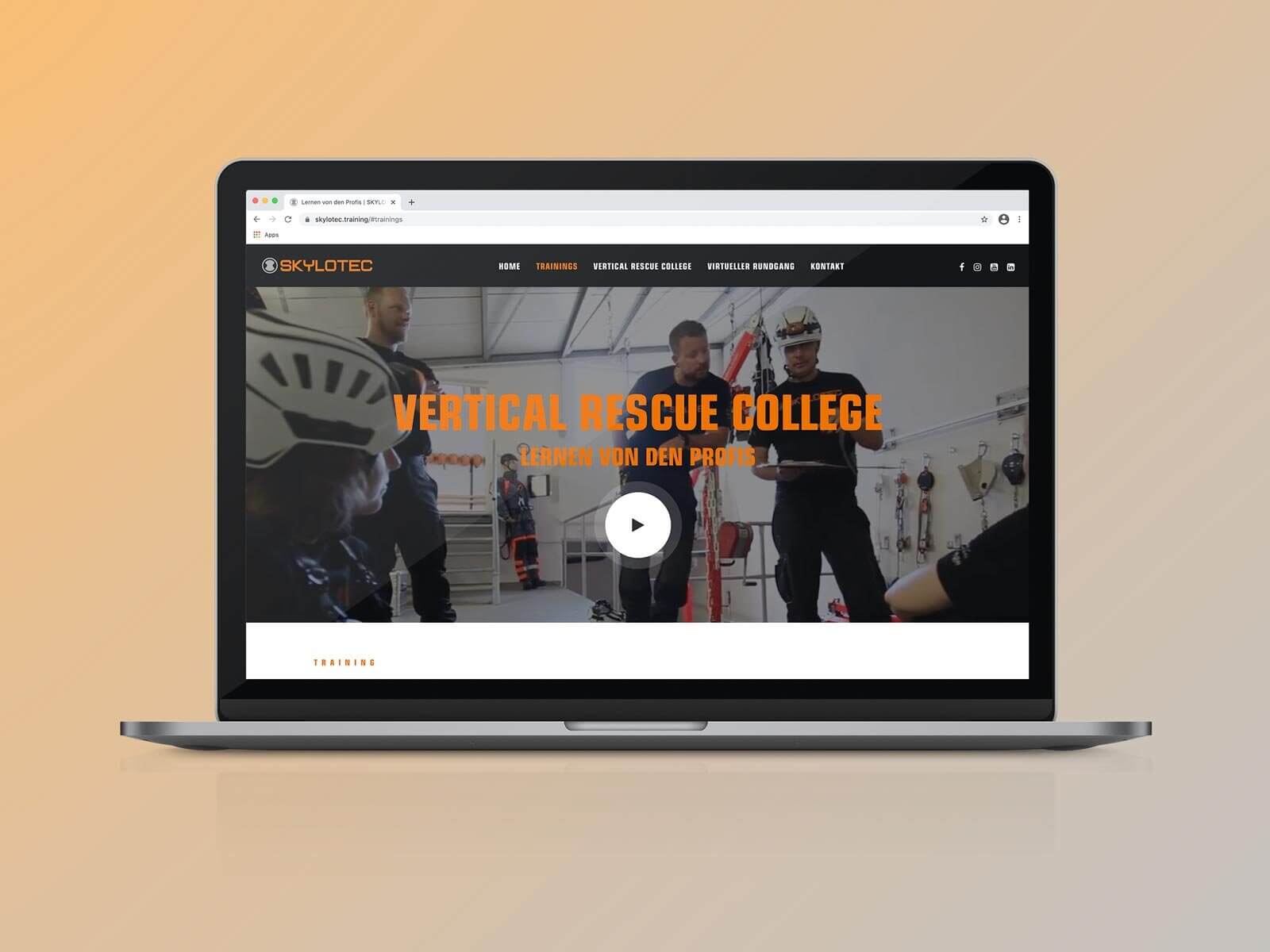
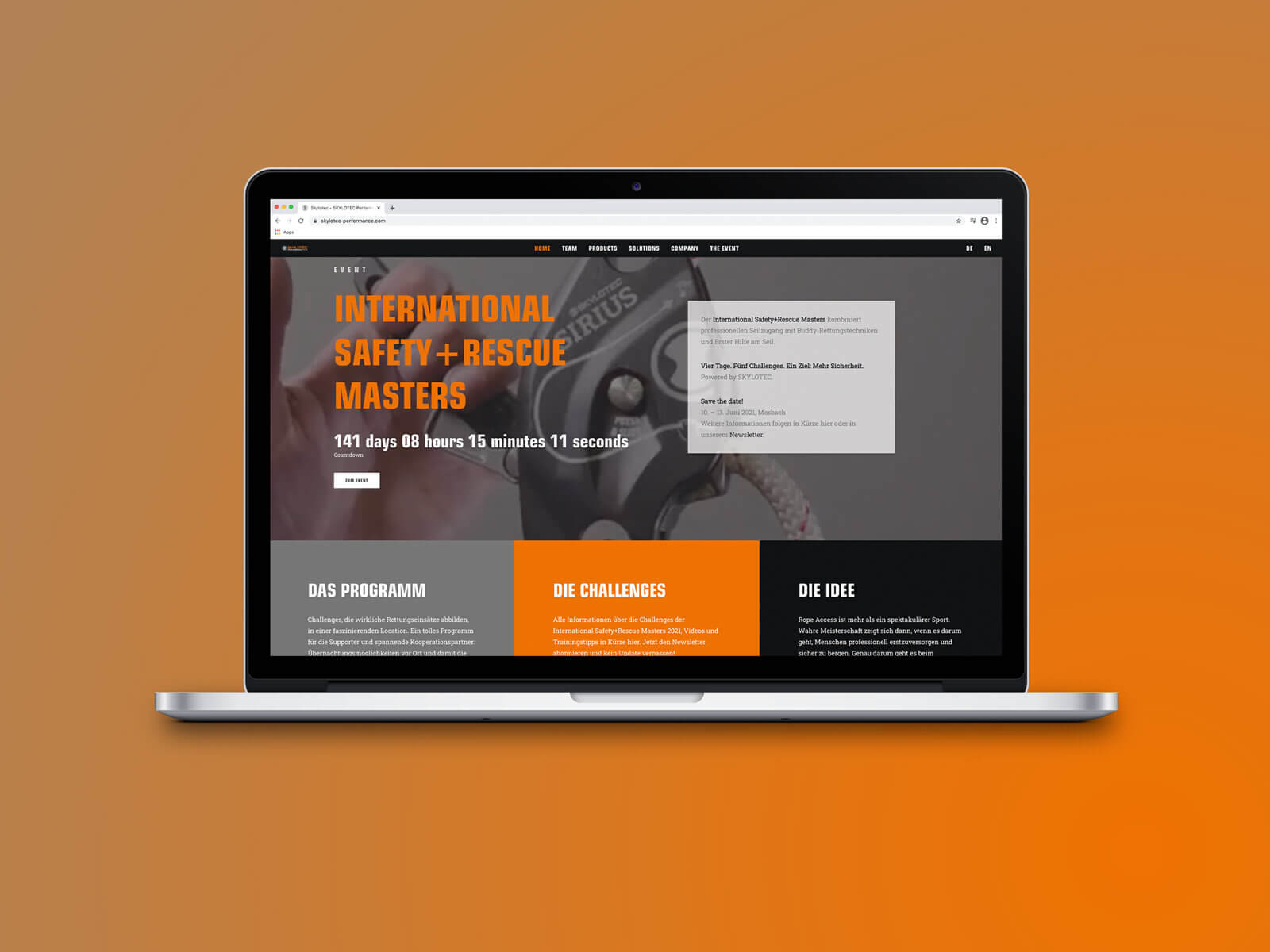
The solution: An own team for RBA competitions – but not bought together from professional climbers, but in the literal sense a Skylotec team, consisting of the people who develop and manufacture the products. The core message: Skylotec’s RBA products were developed by engineers and practitioners who are passionate RBA climbers themselves. They understand the specific requirements for safety and versatility of professional RBA climbers. Skylotec develops and tests products where it matters: In action.
On the Skylotec Performance Team website, conceived and created by evoq, the members of the team are presented in text, images, and videos; here, training and product videos can be found, and here the competition, to which the team challenges the stars of the industry, is also presented and registrations are managed.
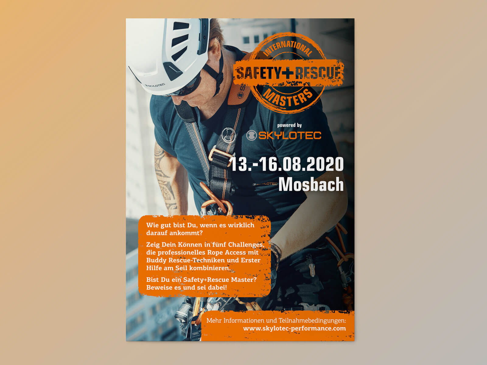
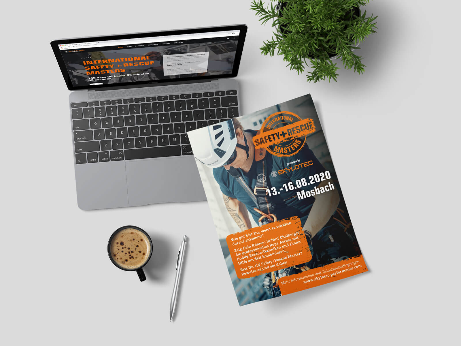
There are several RBA competitions.
The International Safety and Rescue Masters, initiated by Skylotec, is, just like the Skylotec team, different. It is not primarily about spectacular sport, but about true mastery, where it really matters: in rescuing and saving people.In a series of videos, the team captain presents the individual challenges. Via newsletters and web marketing, potential participants become aware of it and can then register for the event on the team page.
(Note: Due to Corona, the competition planned for summer 2020 unfortunately had to be postponed.)
Product presentations
In short videos, members of the team show their products, explain what was taken into account during the conception, and what the advantages are at work. Explanations from professionals for professionals.
Health Care
Safety first – in every situation of life.
The team’s motto received a completely new meaning due to Corona. The ‘Health’ sector, which was newly added at Skylotec and primarily includes masks, but also various cleaning and disinfection products for people and equipment, was therefore perfectly to be integrated into the team page. With the necessary speed, a sales platform with an interface to the Skylotec logistics system and a powerful web campaign could thus be developed and implemented.
The ‘living room’ of the team is the Vertical Rescue College, the training centers on the Skylotec premises. Thus, it made sense to also integrate the marketing of the courses here and at other Skylotec locations into the campaign – from the teaser video and banner advertising to online booking.
// Brand Management and CI-Support
As the brand agency of the DER Touristik Group, we take care of the continuous development of all travel brands as well as the stringent brand management. A demanding task, because more than 10,000 employees, agencies, travel agencies, and service providers in 14 countries work with the corporate identity (CI) of DER Touristik. In addition to the group brand, which DER Touristik uses for corporate communications, there are three sales brands. They orient themselves towards the umbrella brand, but interpret it independently. In addition, there are tour operator brands that are connected to the umbrella brand to varying degrees and have their own CI.
Scope of Work
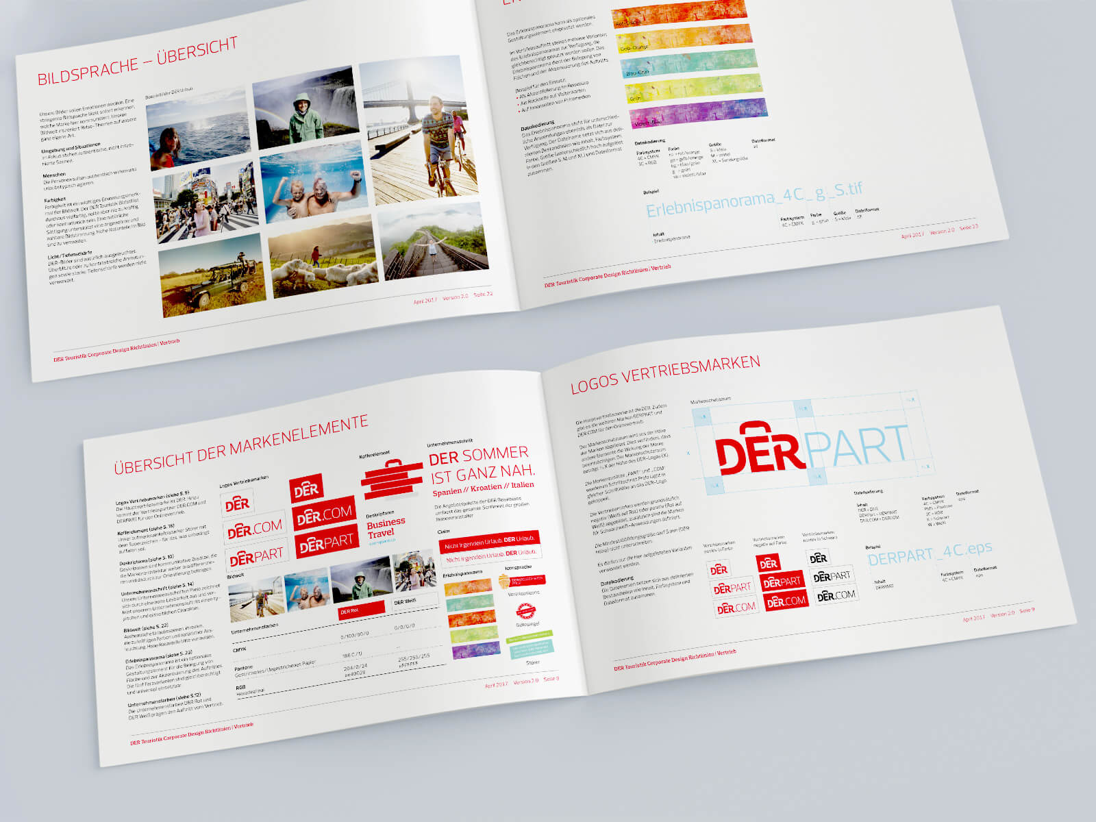
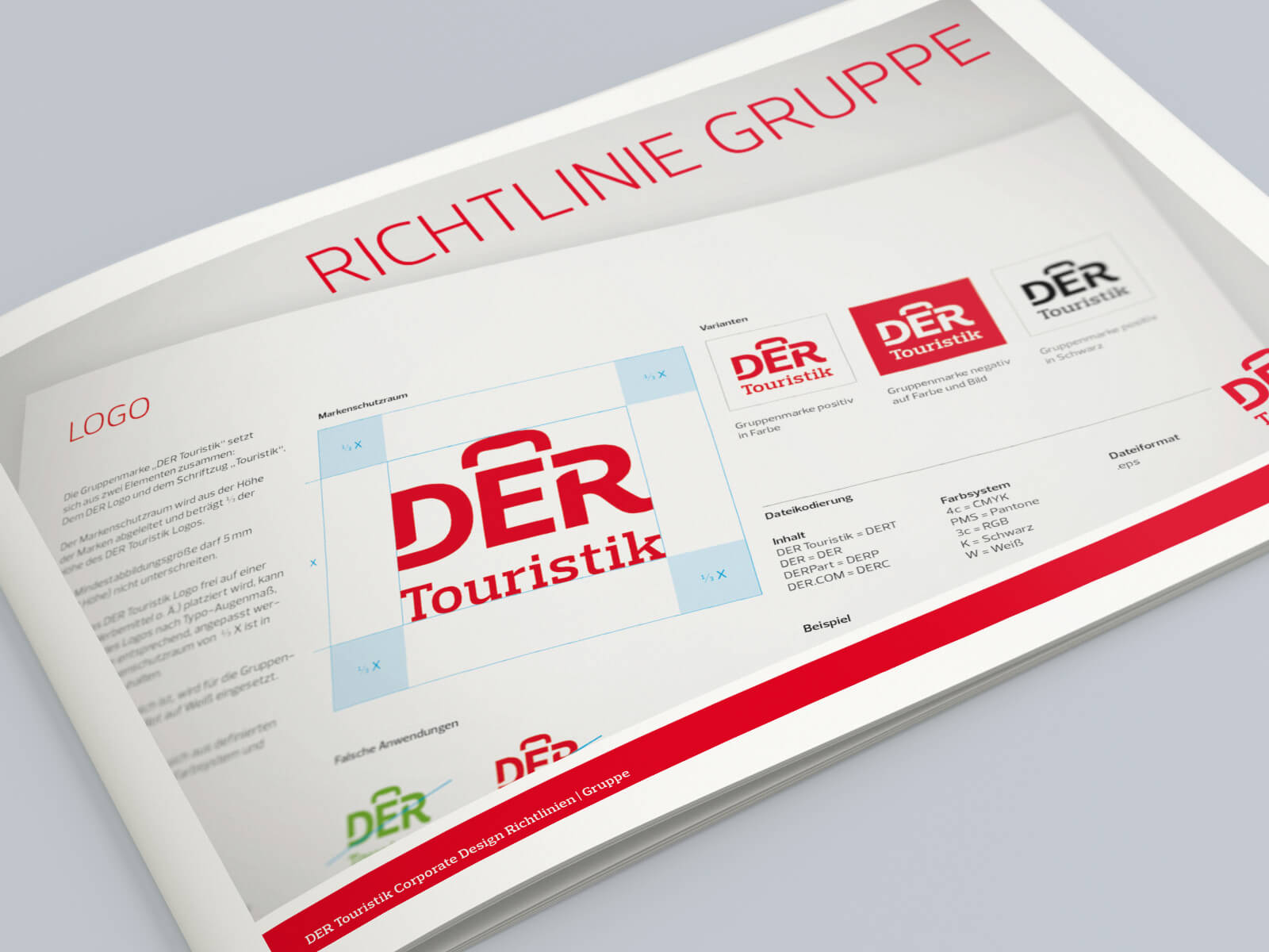
we restructured the grown number of CI guidelines and summarized them into one document each for sales and corporate communications. With this, we reduced 15 documents to two. This significantly eases the overview and minimizes the risk of outdated versions being in circulation.
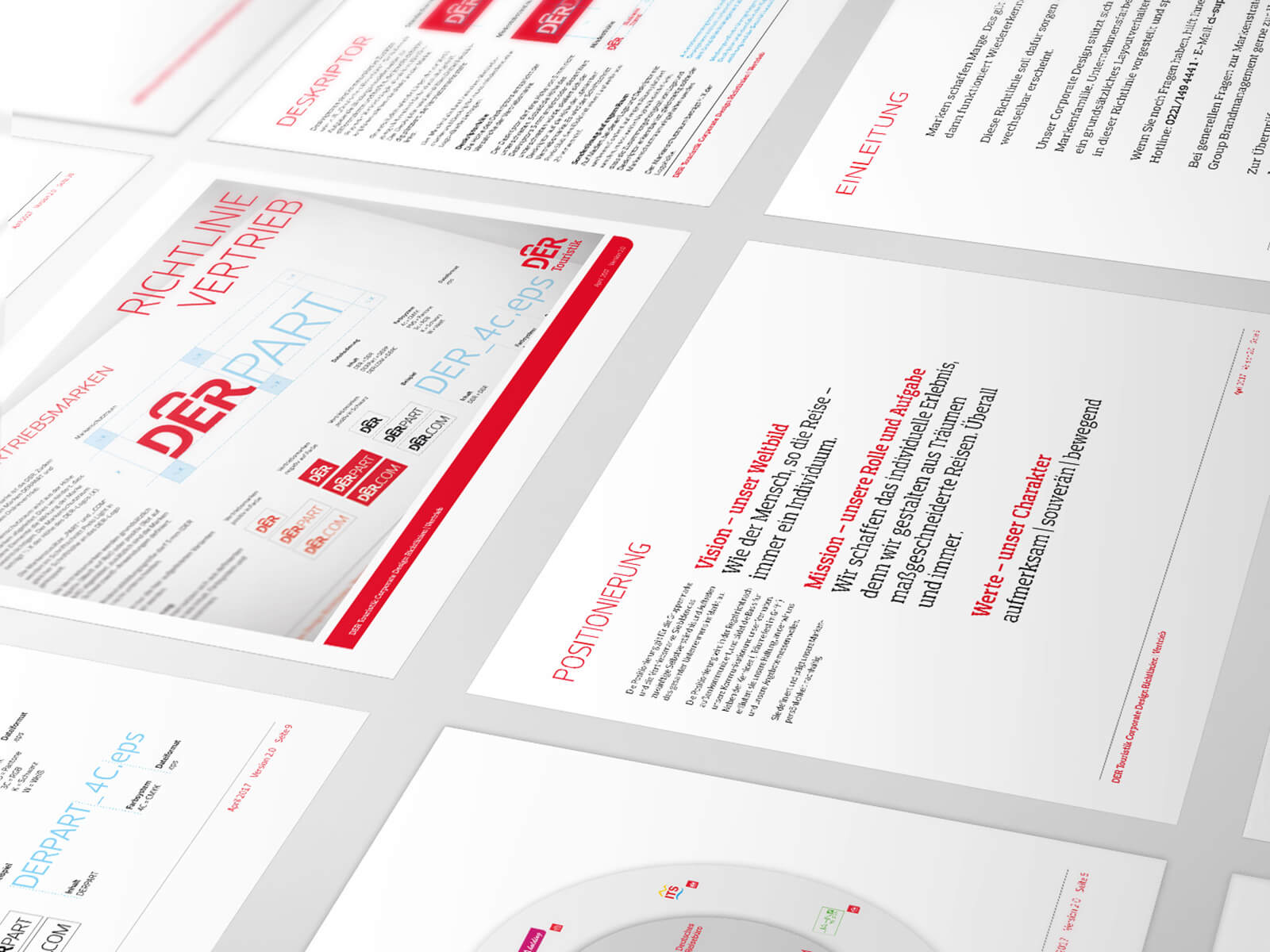
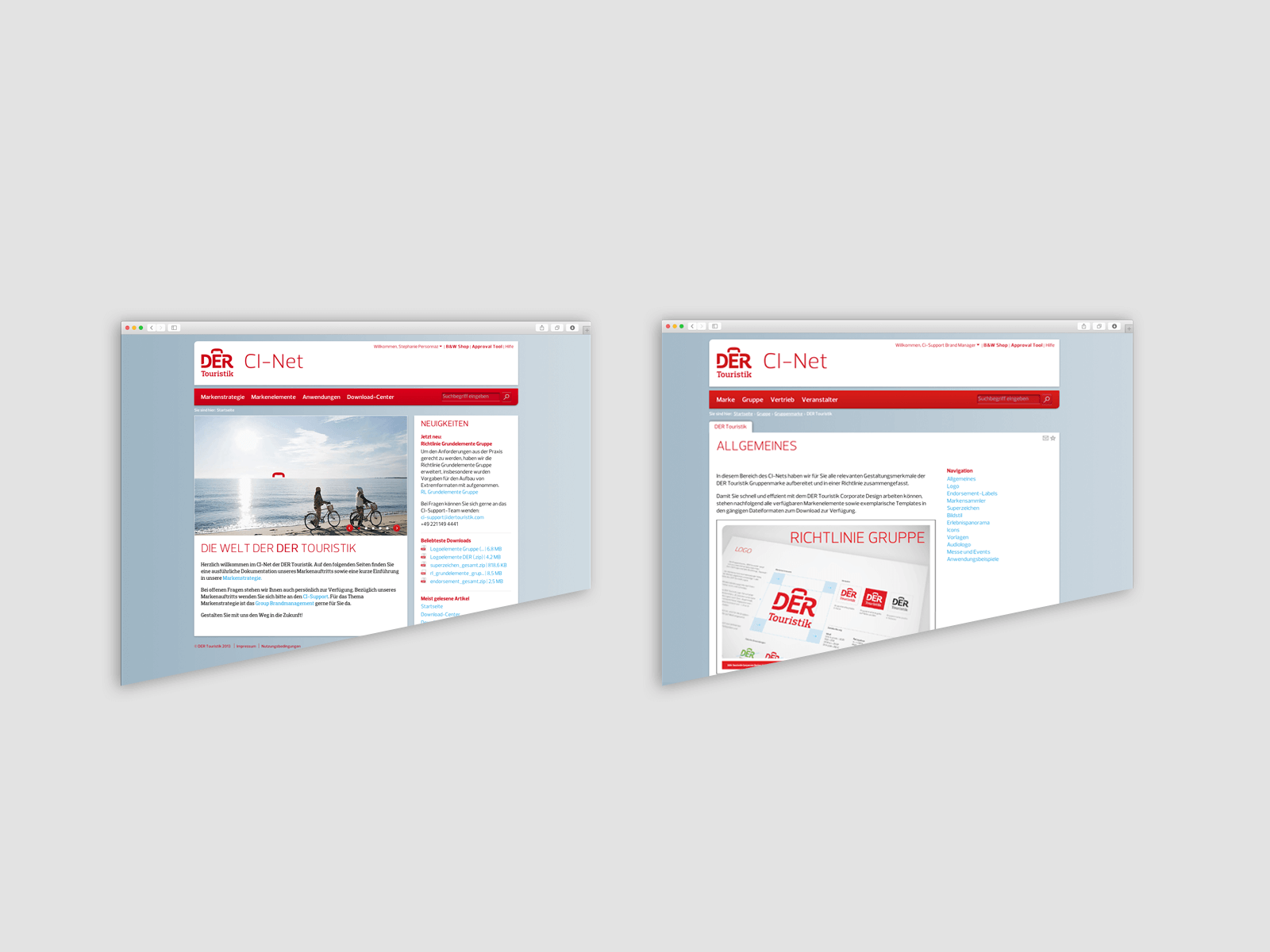
The up-to-date access to all brand information is provided by the CI Net – a web-based portal. There you can find the most current version of the guidelines, all relevant downloads, and all other CI information.The projects created on the basis of the CI guidelines can be checked for CI compliance by the users via the Approval Tool through the CI support from evoq. This tool is a web-based process management application. In accordance with our service level agreement, we ensure feedback within 24 hours.
By means of the CI hotline, we guarantee direct and immediate accessibility of the CI support during the customer’s usual business hours. With the up-to-date and at all times ready-at-hand data of the CI Net, as well as advice during the implementation, we can guarantee the stringent brand management even in decentralized application.
The brand work is supplemented
on an event-driven basis through internal communicative measures. On the one hand with the CI newsletter for all DER employees, on the other hand during brand repositionings. As most recently at DERTour through a Brand Book that explains the brand to all users, emotionally charges them, and makes them part of ‘Team Red’ – because brands live through the people who live them.
http://dertouristik.com/de
// Online Brand Manual
This is how brand becomes fun.
With the relaunch of the Unitymedia BrandNet, evoq has created a new brand platform for the telecommunications company that encourages agencies and employees – even outside of marketing and communications – to engage with the brand and move it forward together.
A new online brand platform for Unitymedia
With the new Corporate Identity launched in 2017, new benchmarks were set for the Unitymedia brand. More flexibility. More relevance. More fun. A standard that agencies and employees are meant to internalize and implement at the various touchpoints.
Scope of Work
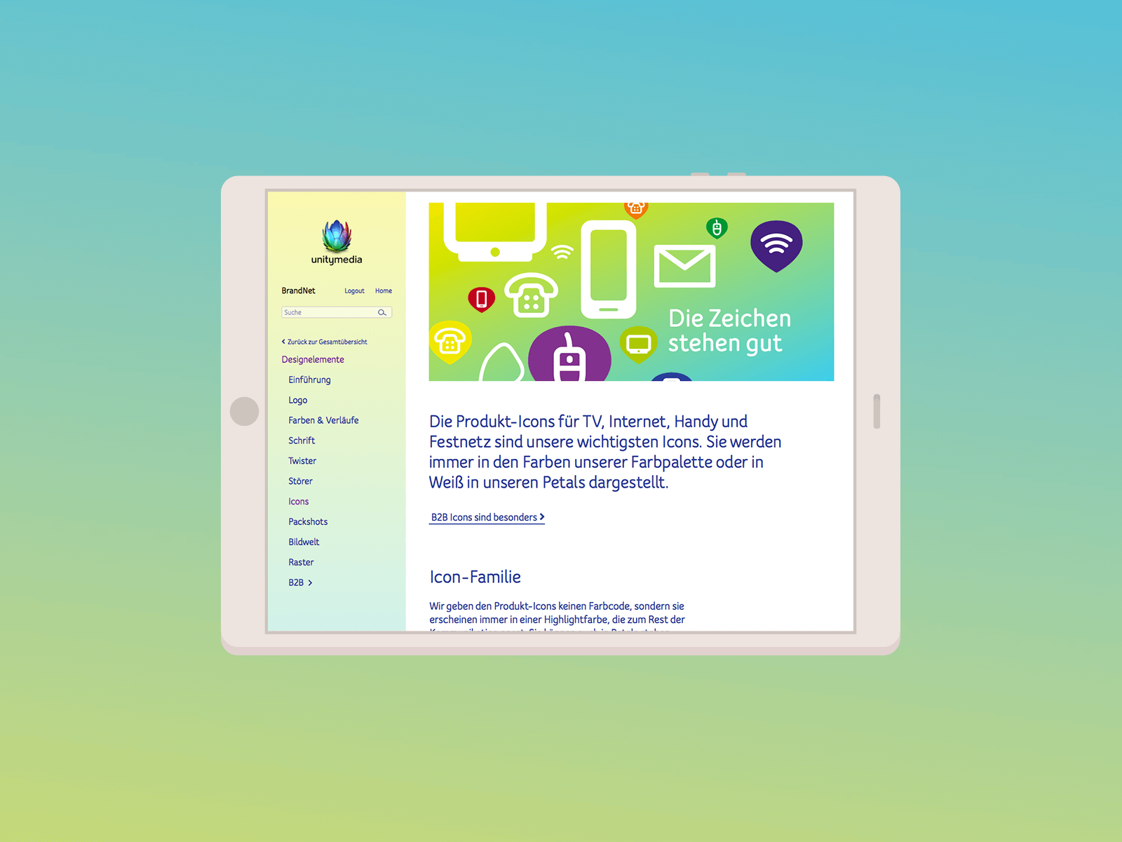
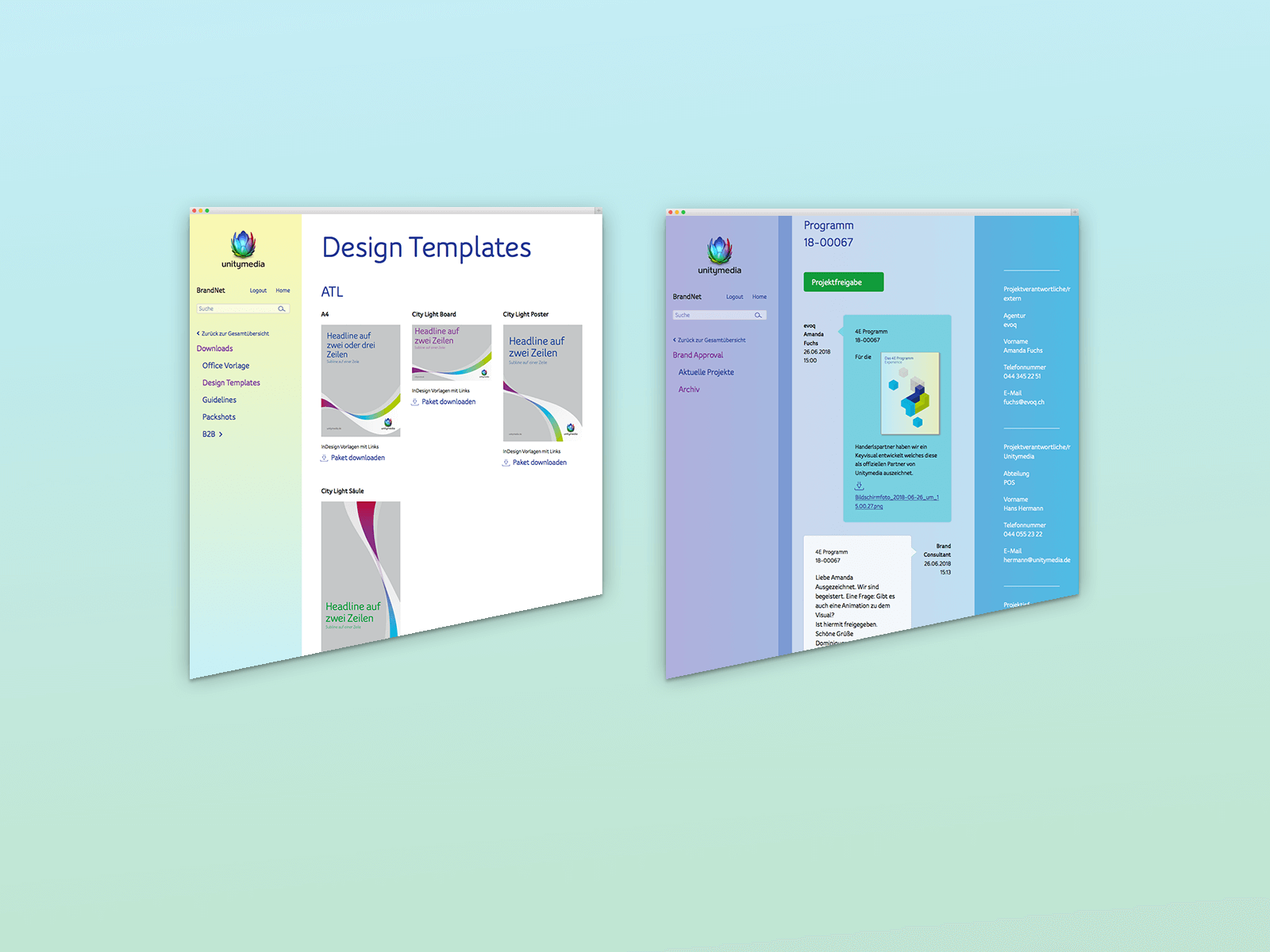
Smart tool for agencies and employees
To achieve this, evoq implemented the intelligent brand platform BrandNet. It facilitates interactive, efficient work while simultaneously inspiring a creative approach to the brand. All brand assets, such as positioning, guidelines, contents, and design elements, can be downloaded directly. However, the true value of the platform lies in the personalizable cockpit, the numerous multimedia examples, and the explainer videos.
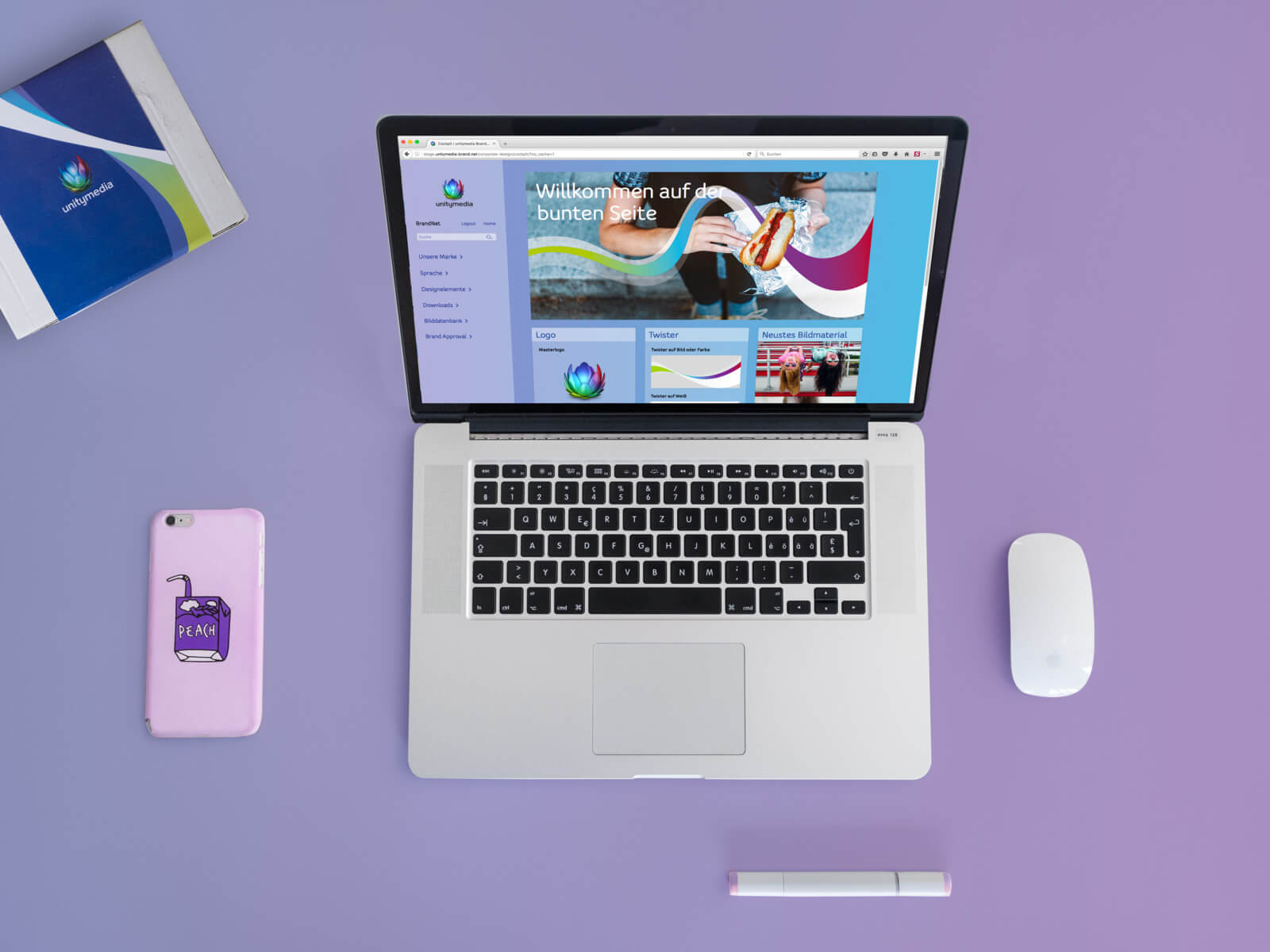
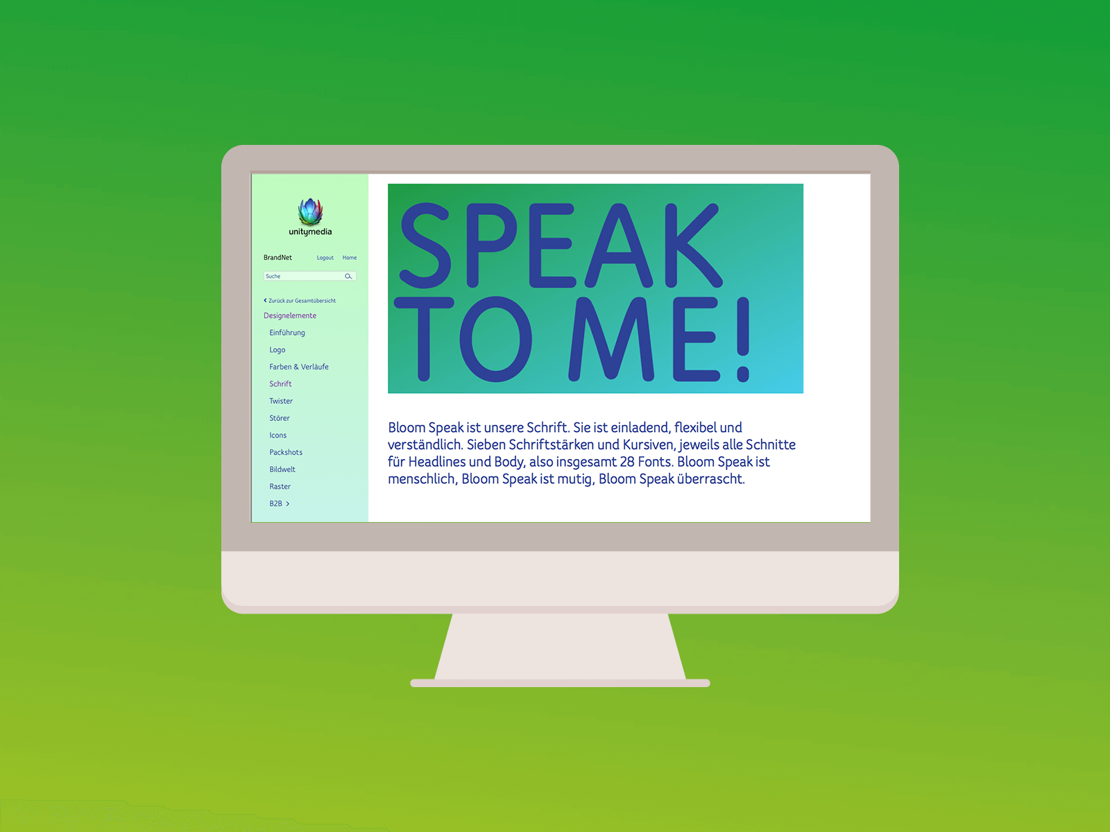
Tailored to the needs of the brand community
To ensure a consistent brand presence despite the new freedoms, various work tools are also made available on the platform. From the briefing template to target group segmentation and image concepts, through to the quick brand check – everything can be accessed directly in one place. This is complemented by ongoing CI support, which particularly assists agencies with conceptual and design questions. A dedicated support team provides feedback within 24 hours and is available to offer advice and practical assistance.
Moving the brand forward together
The BrandNet marks the beginning of a new chapter for Unitymedia. Everything revolving around the brand is now united on one central platform, encouraging people to engage with the brand. This means not only greater efficiency, but also more fun when working with the brand. The perfect conditions for moving Unitymedia forward together..
With its personalizable cockpit, numerous multimedia examples, direct downloads, and explainer videos, the new brand platform supports the transparent handling of all information revolving around the brand. From positioning to design and language. The size of the loop adjusts flexibly depending on the image motif and format. It always ends in the bottom right corner, forming the background for the logo. Its gradient consists of two colors and always begins with yellow. The headline explains who fiber-optic internet is important for and soon available to. The future can come!
Thorsten Träger, Brand Experience Management
Right now, brands must wake up and act as a beacon to provide guidance for customers. Consistency is the magic word. And this is exactly where the platform comes in, delivering real added value for consistent brand management.
André Schloemer, Senior Vice President Brand & Corporate Communications
// Exhibition stand
Client: Wacom
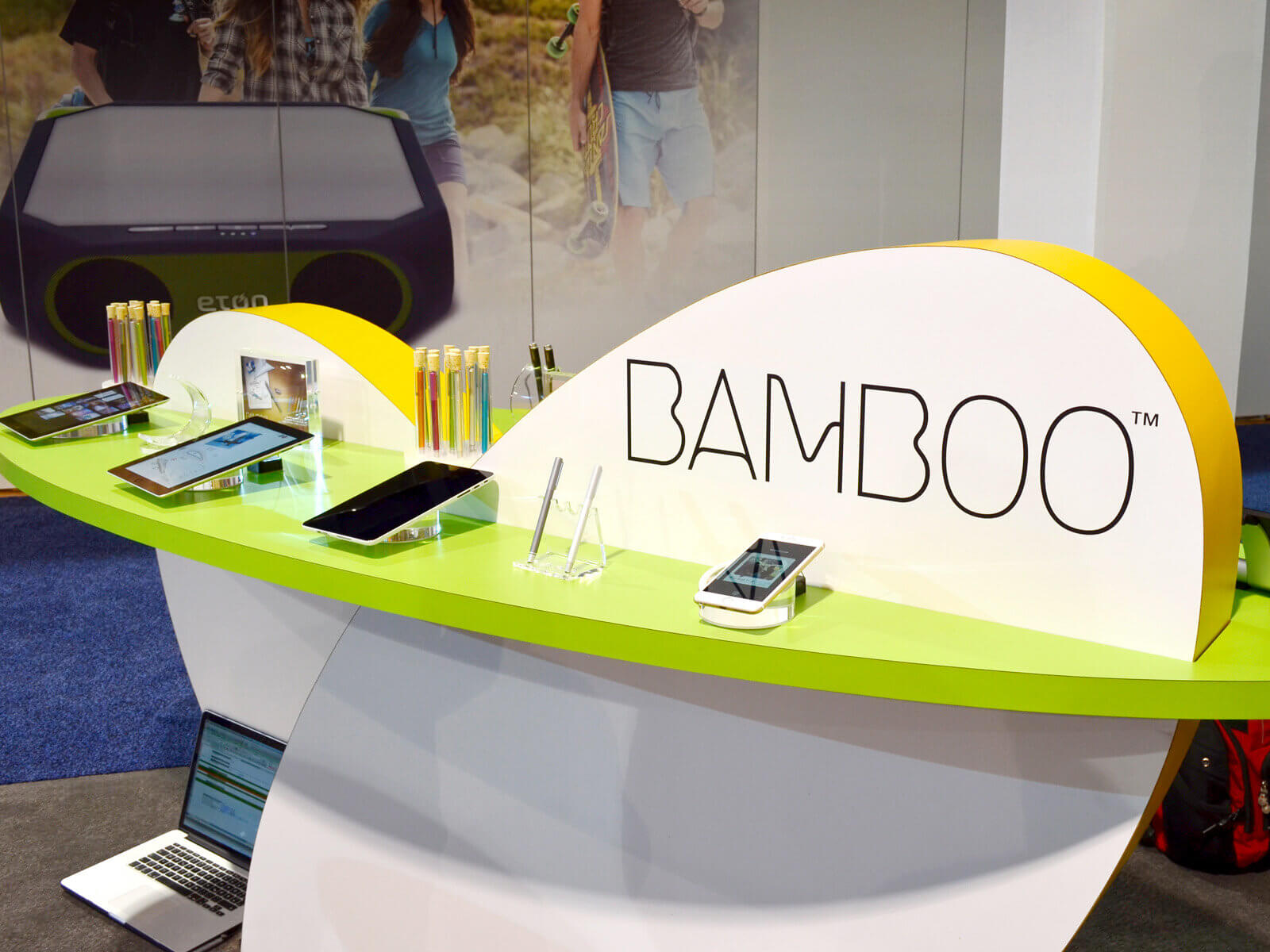
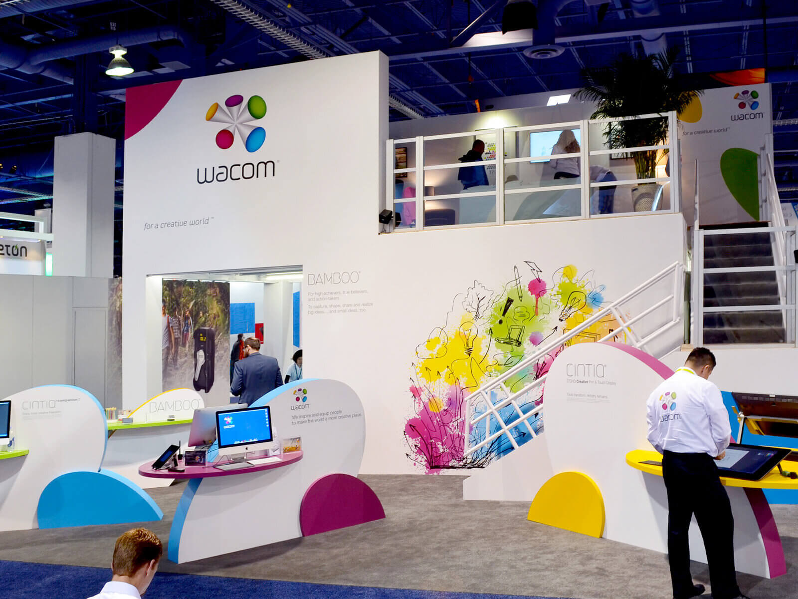
The Wacom exhibition stand at CES
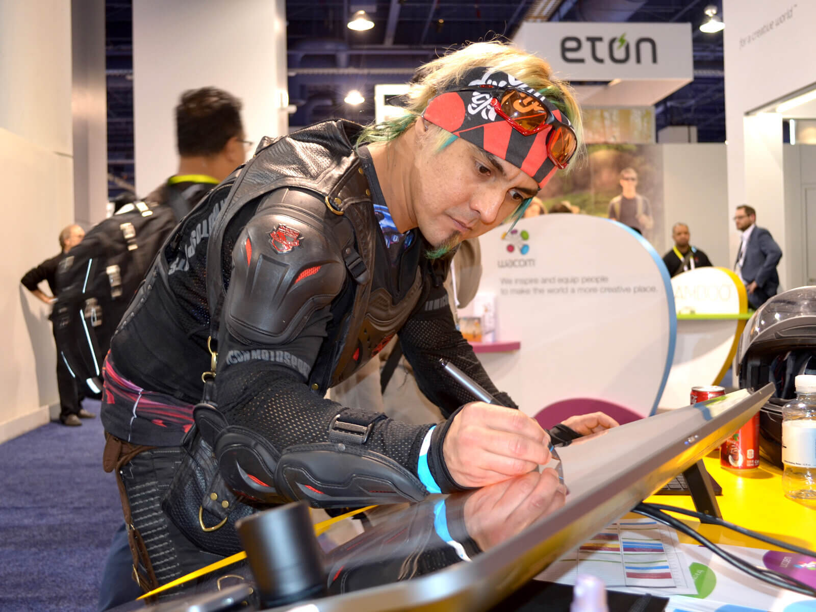
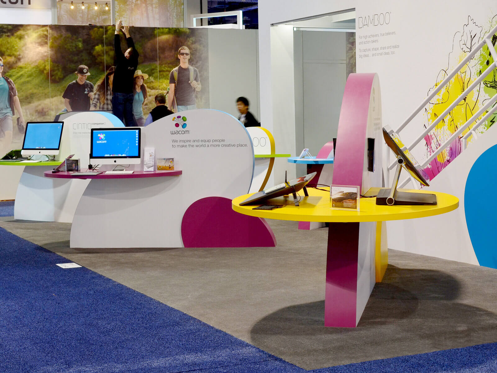
CES in Las Vegas is the world’s largest consumer electronics show. Here, Wacom wants to present more than ‘just’ products – the trade show appearance is meant to strengthen the brand.
Scope of Work
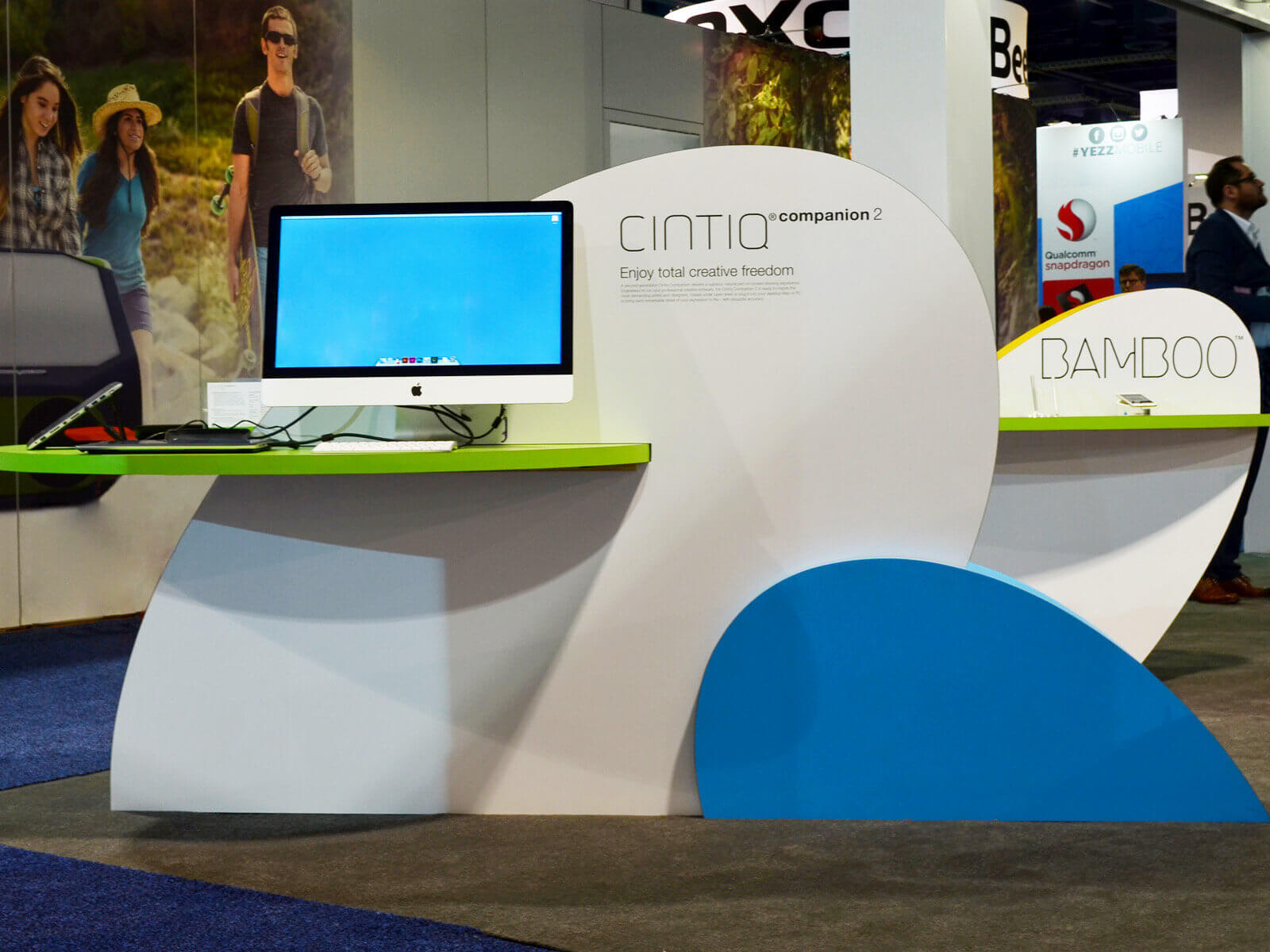
Corporate Area
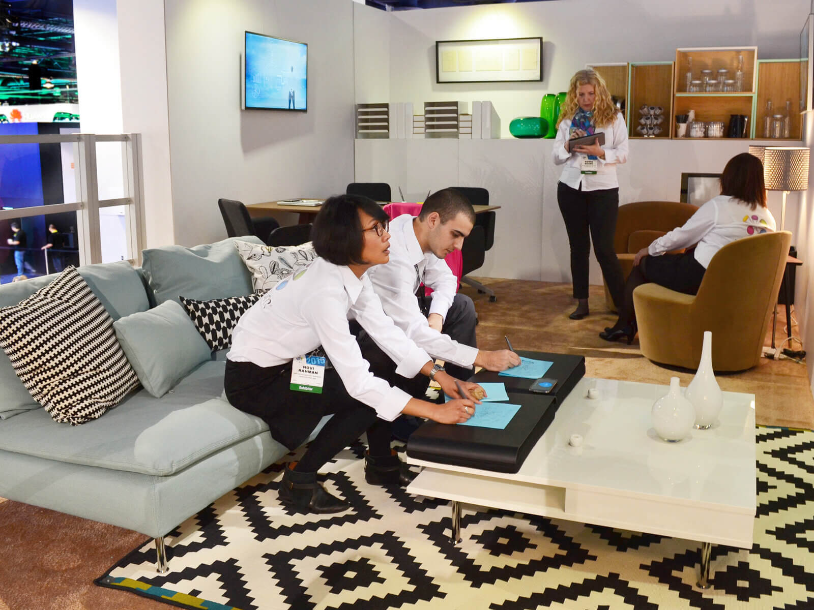
Invited business partners could catch a glimpse of the future in the Corporate Area: here, Wacom shows how ‘analog’ work with a pen on paper and digital worlds will unite in the future. Since this development does not only affect the business sector but will also take place in the private and educational sectors, the Corporate Area consists of an office, a living room, and a children’s room.
evoq’s implementation partner was Freeman, the largest trade show builder in the USA. From the first briefing until the doors opened at CES, just two months passed – including the Christmas season.
// Corporate Design und Website
Client: Lemonbeat
Welcome to a new world
Lemonbeat is the universal language for the IoT developed by RWE. A future technology that enables the connection of all ‘Smart Things’ for the first time and overcomes the barriers that currently exist between different systems.
Scope of Work
Branding
Logo
Website
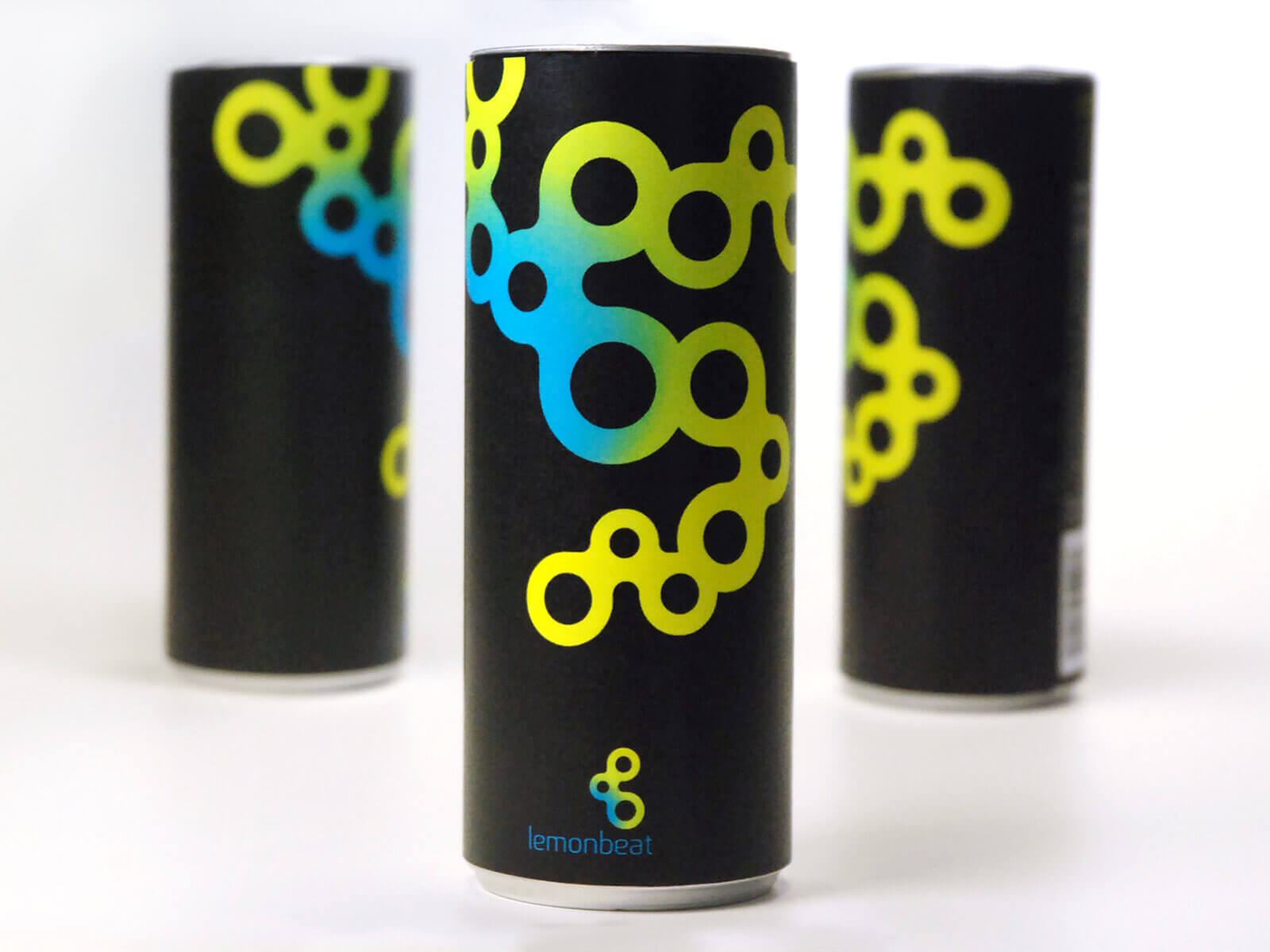
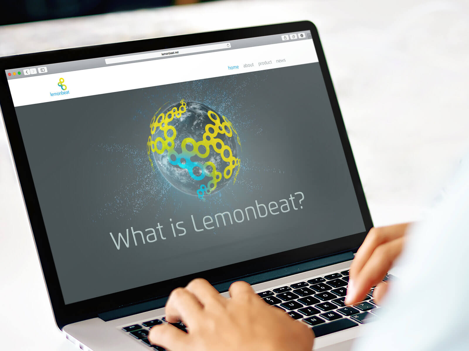
The branding
For this future technology, the goal was to develop a branding that matches the scale of the idea, makes it an emotional experience, showcases the possibilities of Lemonbeat, and inspires people to dive into this new world. The technical requirements were also high: the logo must work just as well as a tiny icon on a smartphone as it does as an embedded brand. It must be animatable and function as a super-sign.
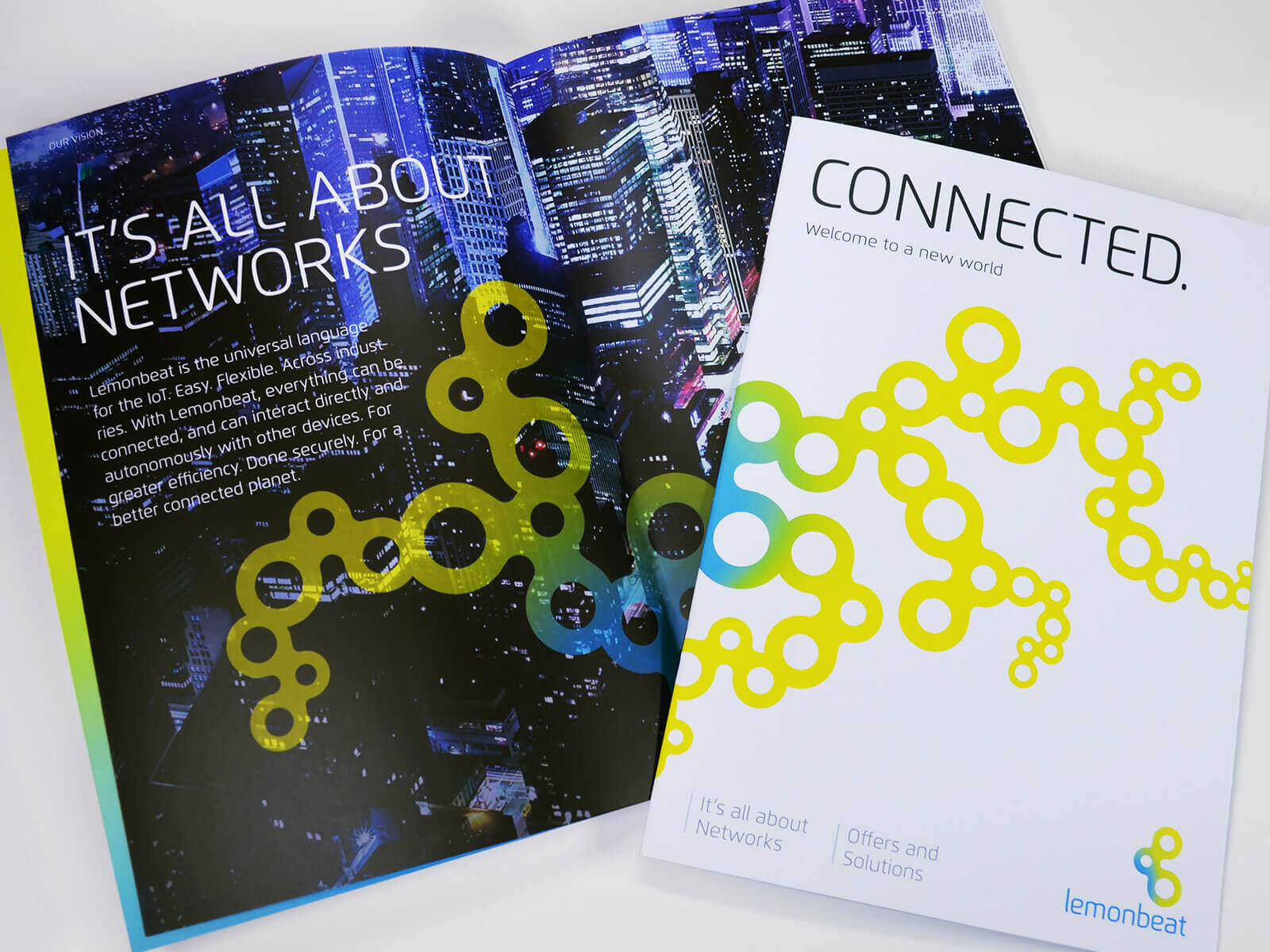
The logo
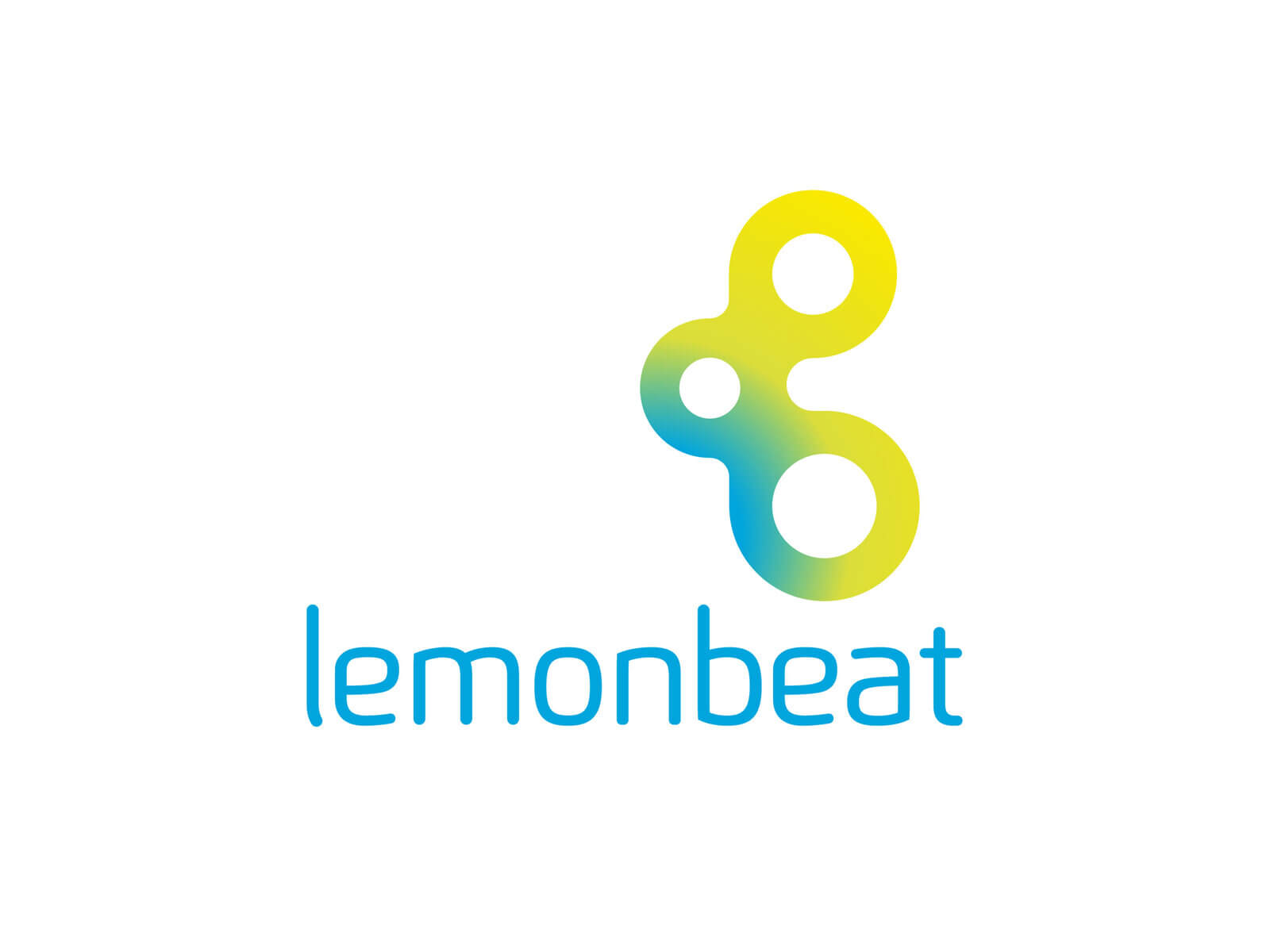
The result is a logo that visualizes the concept of networking just as simply as it does effectively: three dots, a radio field.
This network can connect with others and thereby expand in all directions: the animation of the logo emphasizes the product benefit once again and is also used as a secondary brand element.
The claim ‘Connected’ also sums up the essence of Lemonbeat perfectly.
Lemonbeat connects everything with everything. Welcome to the Internet of Things.
// Imagefilm
The next big idea
Nothing works without plastic. But plastic is also causing growing problems
It is high time for the next groundbreaking idea that has the potential to improve the world sustainably. An idea as big as antibiotics or the printing press.
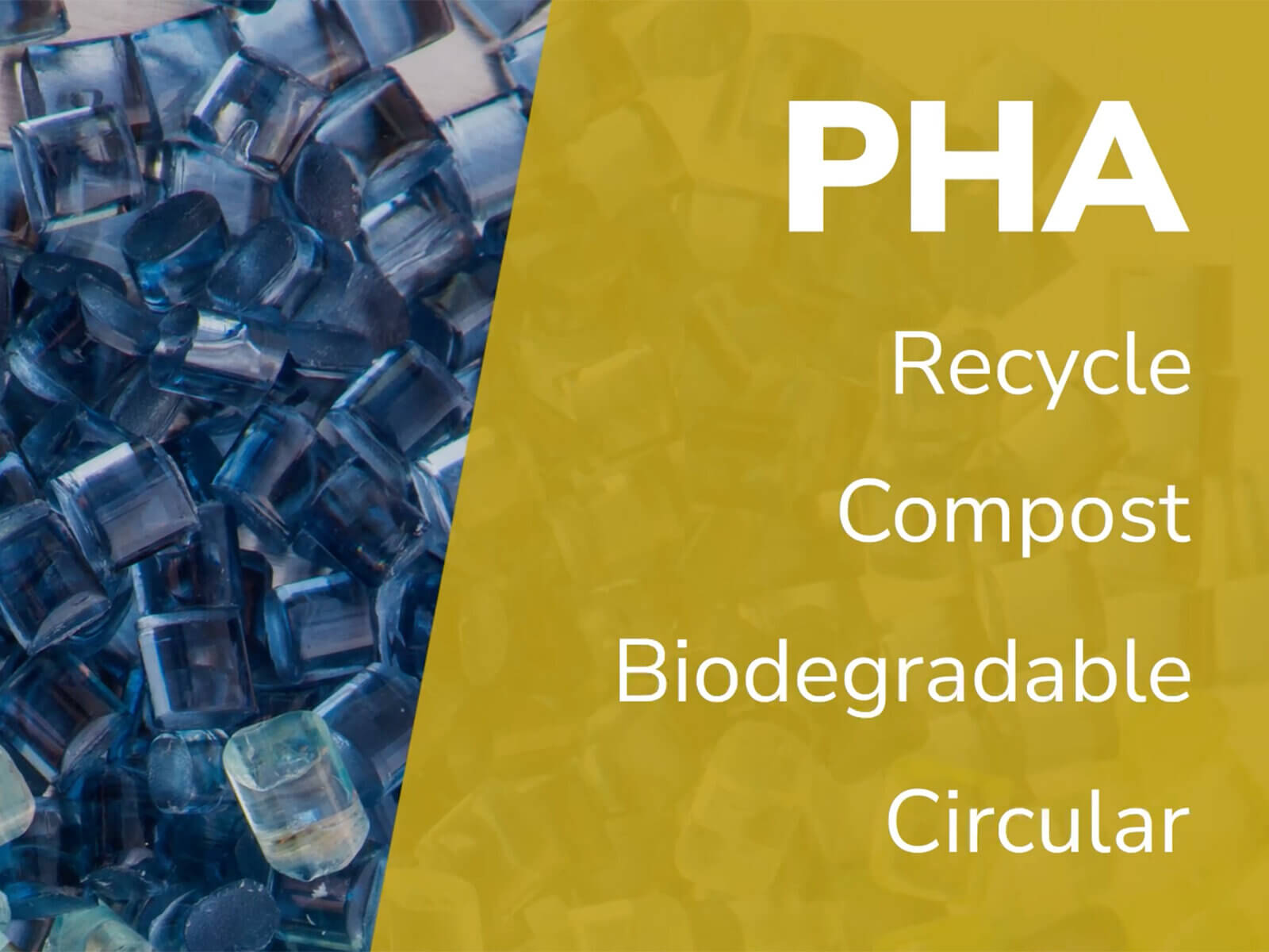
Phax can do everything plastic can do. But: it is biodegradable.
Leistungsumfang
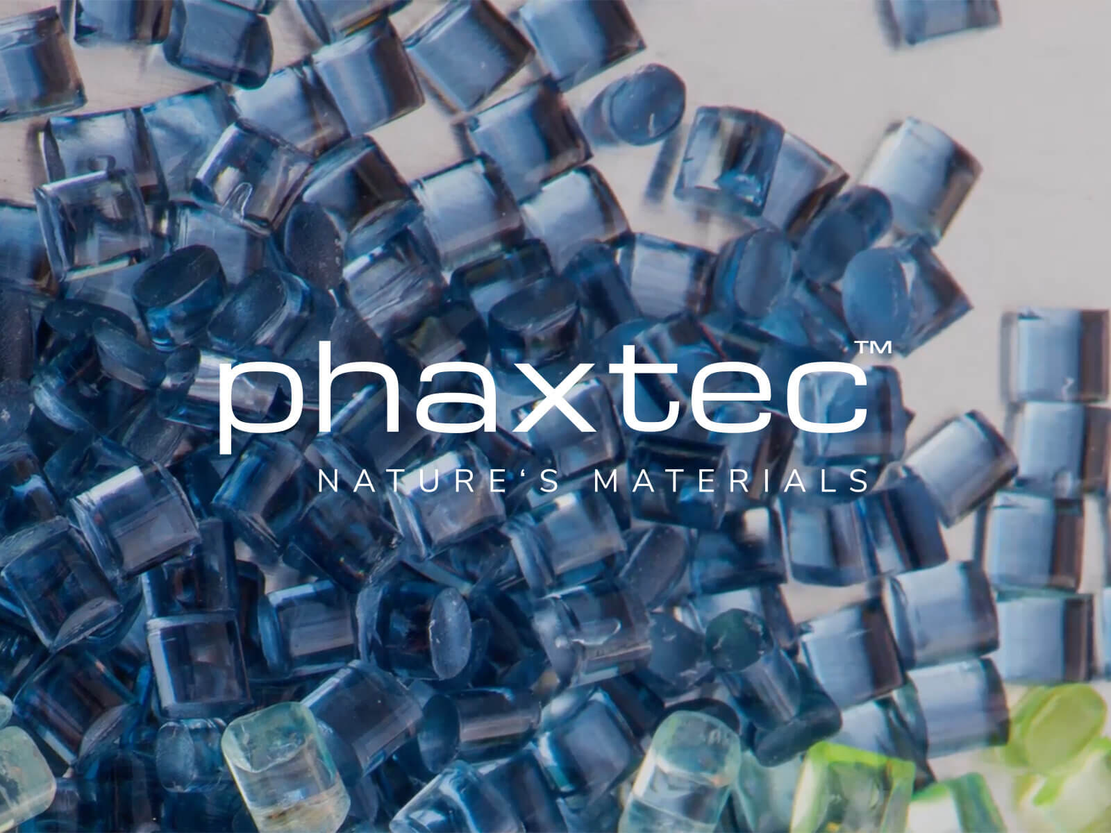
We place this big idea into historical context:
As a turning point in history and as an opportunity to solve one of, if not the greatest, challenges of humanity. The film also shows how massive the problem is on one hand, and how huge the market actually is on the other, highlighting the areas in which plastic plays a decisive role.
In addition, a social media presence was created, the ‘Phaxtec Ambassador’, which reports from the world’s oceans about the problems with plastic, but also about the mitigation efforts in various countries. ‘No need for plastic’ is the simple but important message he carries out into the world.
// Interior Design
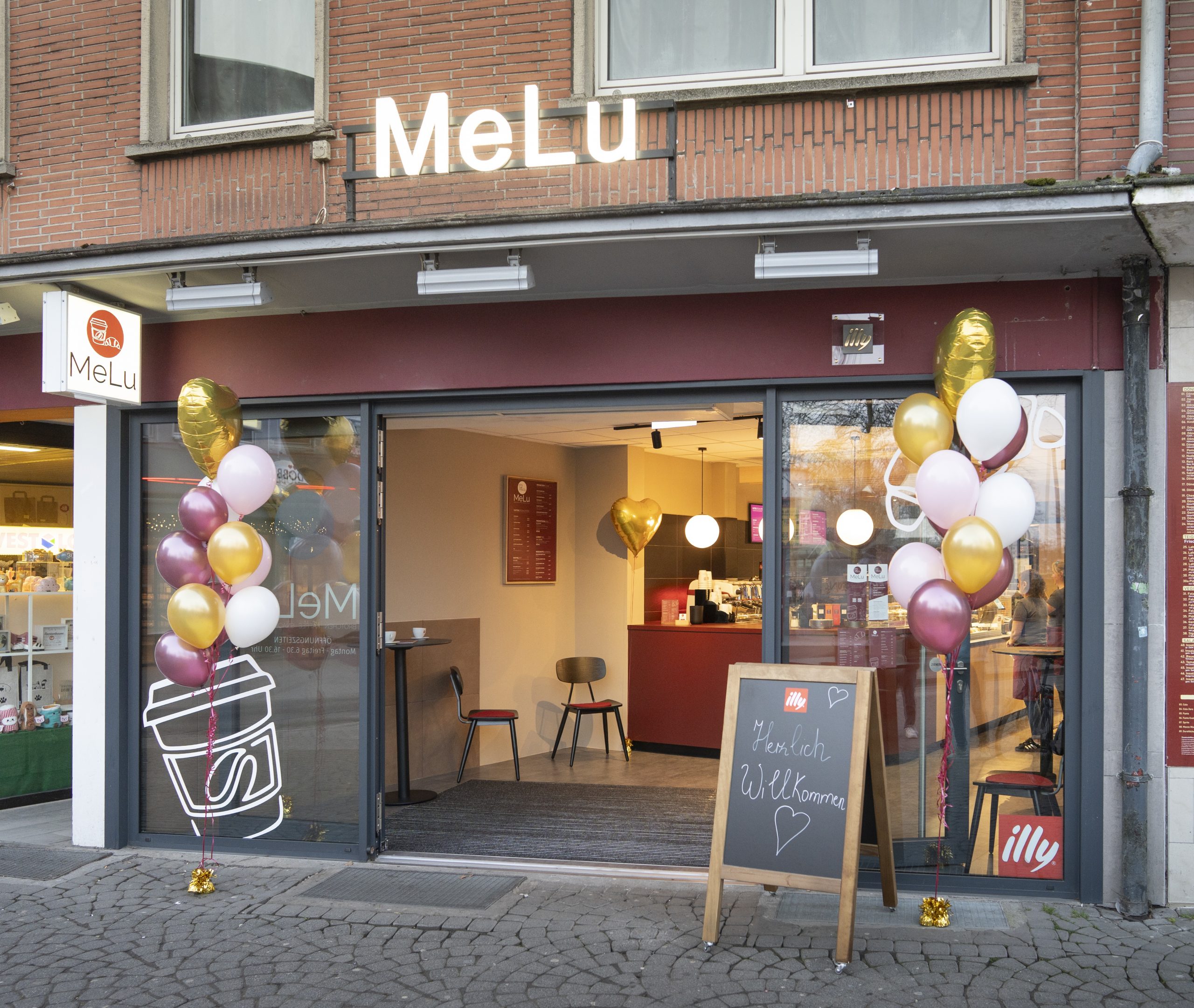
Client: MeLu Bistro
Interior design and comprehensive project development for a bistro concept in the heart of Moers.
For the MeLu Bistro in downtown Moers, we had the opportunity to carry out a project that was a real home run for us. Together with a dedicated couple who run the business, we supported the development of their dining concept from the very beginning—from the initial idea all the way through to the grand opening.
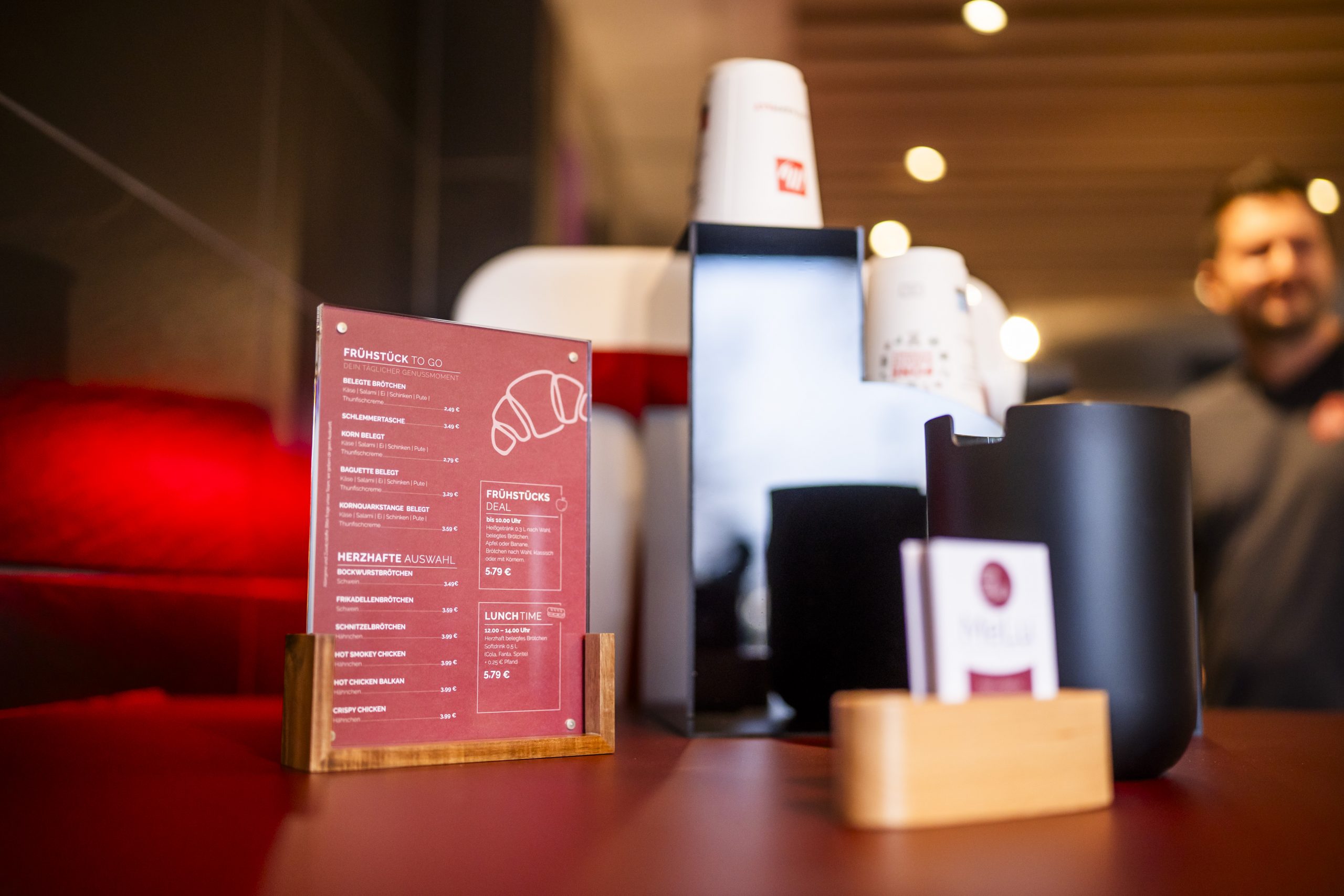
The focus was on creating an inviting space for a wide variety of target groups: students, working professionals, downtown visitors, and anyone looking for a quick break from their daily routine. The result is a bistro with a clean, inviting atmosphere, high-quality coffee, and freshly prepared snacks.
Scope of Work
Concept Development
Interior Architecture & Design
Technical Planning
Renovation Coordination
Coordination with Contractors
Graphic and Visual Identity Development
Coordination with Authorities
Project Management until Opening
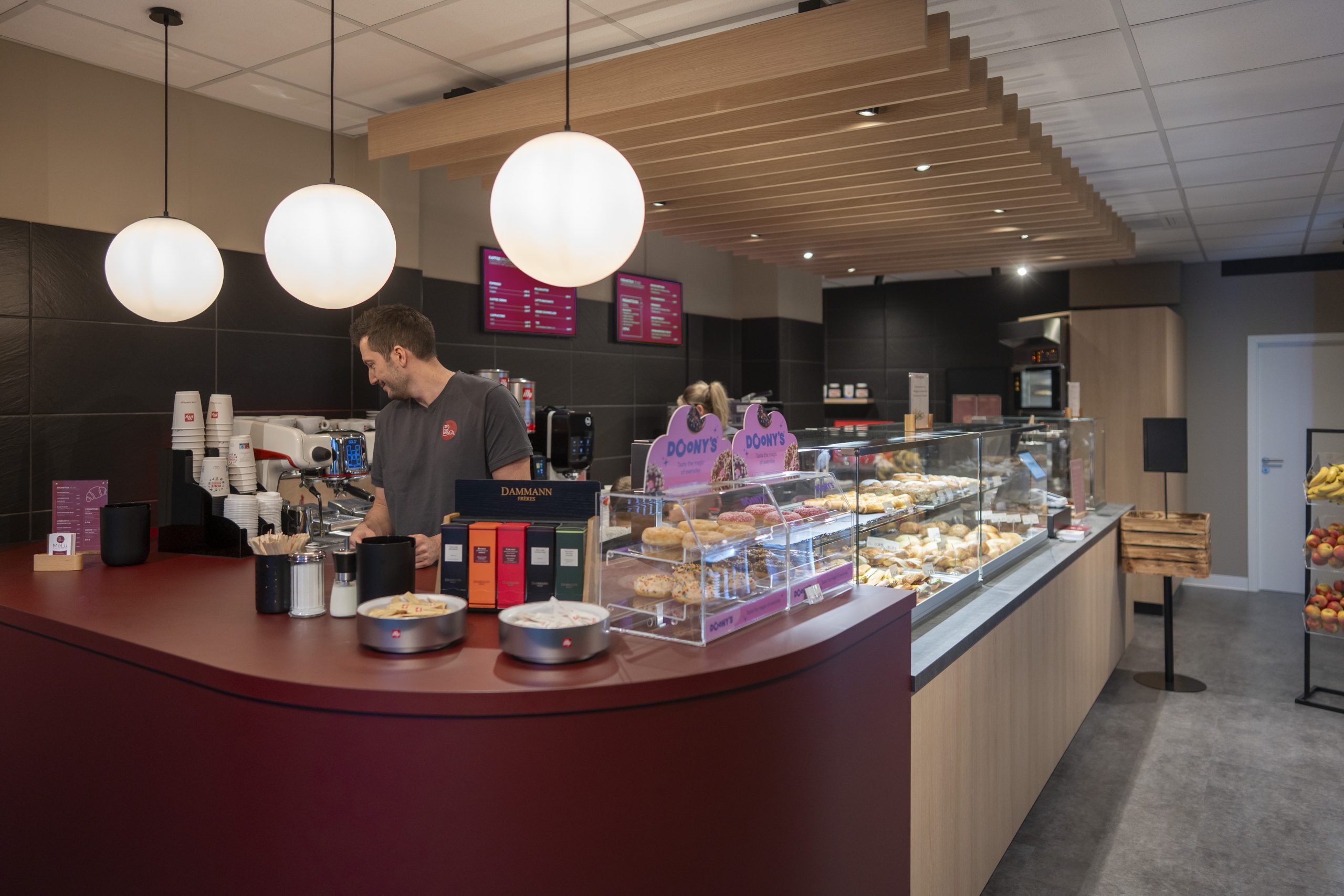
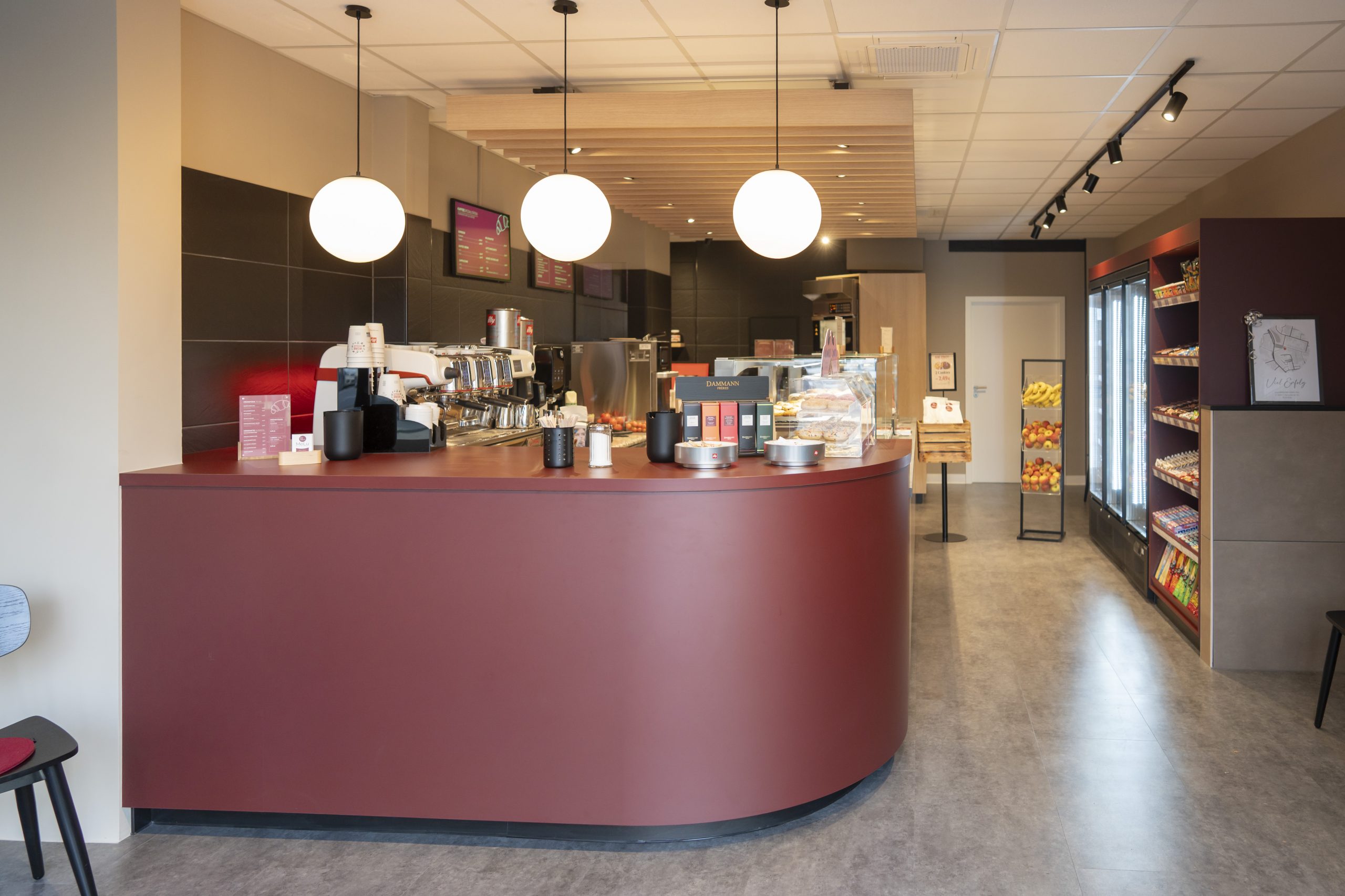
Our services encompassed the complete design and implementation: from concept development and technical planning to managing the renovation. Working closely with skilled trade partners, the space was developed step by step and realized with a clear design signature.
At the same time, we refined the graphic identity to create a consistent connection between the space and the brand. We were also responsible for coordinating with the city of Moers and providing support through to the grand opening.
The project exemplifies how the brand cycle works in practice: from the initial idea through planning and implementation to the further development of the space and visual identity—all underpinned by trust, close collaboration, and a shared commitment to quality.
#implement #hospitality #Moers


// Coordination of furniture, carpentry work, and assembly
Client: Uniprojekt GmbH
Implementation: 2026
For our partner uniprojekt GmbH, we had the pleasure of coordinating and supervising the furniture and carpentry assembly for the new American Vintage Store in Landquart, Switzerland. In an international retail environment that combines architecture, brand experience, and high quality standards, our focus was on a precise and timely implementation of all fit-out services. From sampling and logistics through to the final on-site installation, we closely coordinated all project participants to ensure a smooth process. The result is a high-quality retail space that authentically brings the modern brand world of American Vintage to life.
#implement #retail
Scope of Work
Coordination of furniture assembly and carpentry work
Sampling and material coordination
Technical planning
Schedule and quality management


// General Contracting – Understanding Brands. Delivering Spaces.
As part of the brandcycle group, we act as your general contractor, combining deep brand expertise, planning, and execution into one seamless process—from the initial concept to turnkey delivery.
We coordinate every trade and partner involved, ensuring quality, timelines, and budgets remain on track while bringing your brand identity to life consistently across every space.
From individual projects to international rollouts.
End-to-End Project Delivery
As your general contractor, we manage your project from initial planning through final handover.
- Planning
Concept development, budgeting, and detailed execution planning - Execution
Interior fit-out, technical installations, furniture, and brand integration - Project Management
Coordination of all trades, schedules, and budgets - Handover
Quality assurance, final acceptance, and commissioning
What We Deliver
- Retail & Brand Spaces
Stores, shop-in-shop concepts, showrooms, and flagship stores - Hospitality & Food
Restaurants, cafés, fast-casual concepts, and franchise rollouts - Workplaces
Modern workplaces, office fit-outs, and branded work environments - Industrial Transformation
Adaptive reuse of existing buildings, production facilities, and administrative spaces - Temporary Spaces
Trade fairs, brand experience centers, pop-up concepts, and event environments
// Projekte
Sephora
Retail Fit-Out
GNS
Workplace Transformation
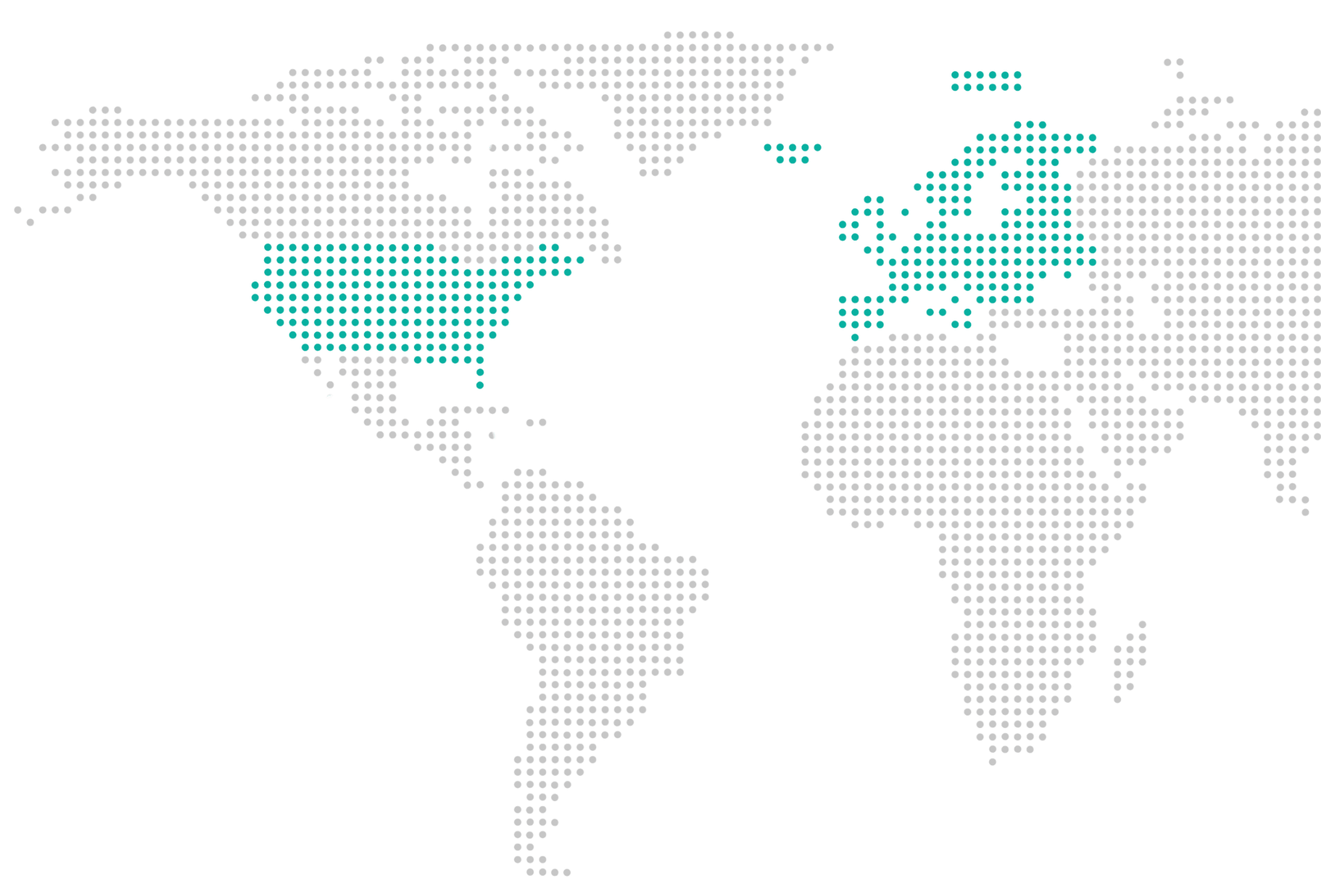
Serving clients across Europe and the United States
Let’s create spaces people remember.
Your partner for brand-driven fit-out and transformation projects.
// References
The senior management and team members of the brandcycle group have built up expertise through the successful management of complex challenges at the following companies:


Are you interested in our project work?
Ask us straight away for the right references for you:
// Our vision

Rethinking every day
In a world that is constantly changing, we see it as our job to support brands that not only achieve shortterm success, but also remain relevant in the long term.
Flexible and resistant
Our vision is to develop brands that react flexibly and resiliently to market changes without losing their identity.
Your added value of tomorrow
We create brands that offer real added value through emotional connection, innovative solutions and sustainability.
// Our mission
We are at your side
As a strategic partner, we support companies that want to future-proof their brand. Our mission is to empower brands from the inside out by internalizing the essence and values of your brand.
Creative and strategic
We combine strategy and creativity to bring brands to life across all touchpoints and build long-term customer relationships.
Reaching our goal with us
Through comprehensive analyses, creative design solutions and targeted implementation, we ensure that every action achieves measurable success.

// Downloads
Download whitepaper for free
Download our whitepapers for free. Learn more about brand development and valuation. Benefit from our expert knowledge.
